Sites 02 / 15
The Builder
One builder, three modes — Preview to browse your site untouched, Edit for point-and-click editing on the live canvas, and Code for the files behind it — with the AI Assistant always at your side.
The Builder
The builder has three modes, switched with the Preview / Edit / Code control at the left of the top bar (only the active mode shows its label; the others collapse to icons):
- Preview — your site as a visitor sees it. Click around, follow links, switch pages — nothing lights up, nothing selects, no editing chrome in the way.
- Edit — the same canvas, live. Click a section to edit its copy in a form, add sections from the library. This is the default when you open a site.
- Code — the file tree and the code editor, full width, for when you want the HTML itself. A split toggle brings the live preview back beside the code.
All three edit (or show) the same real files — Edit just gives them a friendlier surface. Anything you do visually, you could also do by hand in Code mode, and vice versa. The builder remembers which mode you left open, per site.
Down the left edge runs the activity rail — Assistant, Pages, Content, Media. Click an item and its panel opens beside the canvas; click it again (or press Esc) and the panel tucks away, giving the canvas the whole screen. Only one panel is open at a time, and everything contextual (a selected section's options, a page's settings) slides in over whichever panel is open, with a back arrow returning you to it. With everything closed, a floating "Ask AI…" composer waits at the bottom of the canvas.
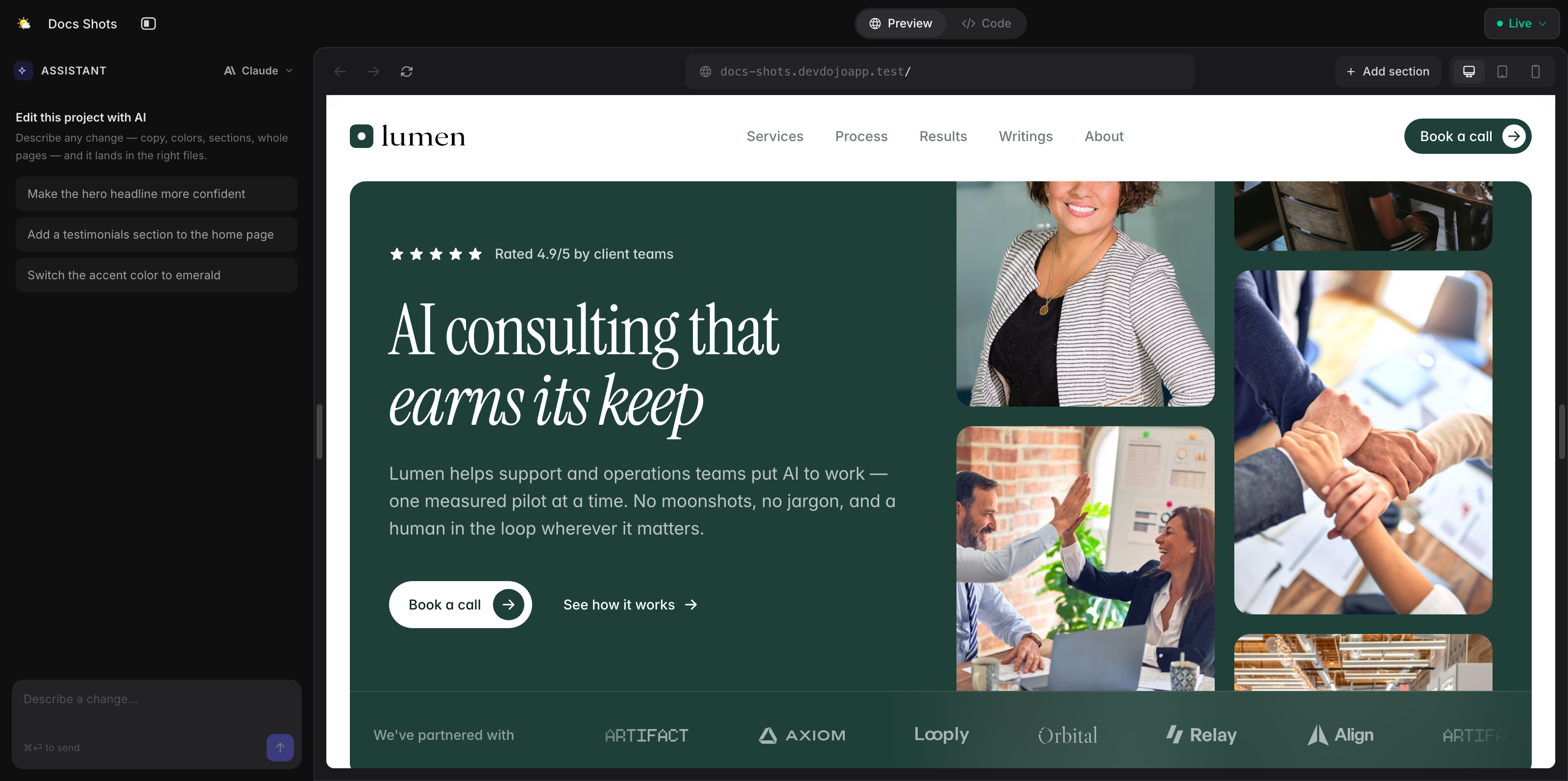
The top bar
The canvas lives on a white card floating on a warm ground, and the top bar is the card's own — the same in every mode:
- The sidebar toggle (always leftmost) collapses/reopens the panel region (⌘B), with the Preview / Edit / Code control right beside it — the mode control is the pane switch: flip it and the whole workspace changes face. (In Code mode a browser-window split toggle appears on the right, beside open-in-new-tab, bringing the preview back next to the editor.)
- Your site's icon and name, dead-center. Hover the bar and the identity swaps into the page pill — refresh + the page switcher (see below).
- On the right: the save state, the device button, open-in-tab (a full-tab preview of your latest edits — the live site is in the site menu once published), and Publish.
Your site's icon sits at the top of the activity rail — hover it and it becomes the menu button: site-level actions like Documentation, Settings, Upload, Export, and (once published) the live-site actions. (Settings opens your site's settings page in a new tab — that's where the name and the icon are changed.) Below it, Assistant, Pages, and Media open as panels beside the canvas, and Content opens full-screen (its tables want the room). See Pages, Content, and Media below. At the rail's foot, your account menu takes over whenever the panel is collapsed; with the panel open, an account pill leads the sidebar instead. The sidebar itself is resizable — grab the seam beside it and drag.
The canvas: Preview and Edit
Preview and Edit share the same canvas, kept almost chrome-free. Everything browser-ish lives in the top bar:
- Hover the bar and the centered site name swaps into the page pill: refresh tucked inside its left edge, and the current page — "Homepage" for
/, the route for everything else. Click it for a dropdown of every page (Homepage first by name, routes for the rest) — with an inline New Page, a gear for each page's settings, and open-in-tab (the editing rows step aside in Preview). - A device button (right side) that cycles Desktop → Tablet → Phone per click (also keys 1/2/3). At tablet or phone width the page floats as a framed artifact — rounded corners, hairline ring, soft shadow. You can still drag the preview's edge to check any width; a width badge floats over the canvas while you hold the handle.
- Open in a new tab, beside the device button — a preview of your latest edits, whether or not you've published yet. To visit the live site, use Open Live Site in the site menu.
- Sections are added right on the canvas — the + Add section pills between sections (or ⌘K → "Add Section…").
Below, while the Assistant is closed, the floating composer carries your request straight to the AI — it knows the page you're on, and if a section is selected it scopes the ask to that section (the placeholder says so).
In Preview, that's the whole story: the canvas behaves like your published site — links navigate, pages scroll, and nothing gets between you and the content.
Switch to Edit and the canvas wakes up. Hover it and each section lights up with an outline and a name chip — blue for the page's own sections, purple for sections that belong to the layout (the shared header and footer that appear on every page), which also carry a LAYOUT badge.
Sections can hold other sections — a hero often draws the site's header over its own background — and those count too: they outline in teal, and the chip names the section they live in (Navigation · HERO). Outlines nest, so the smallest thing under your cursor wins: over the menu you get the header, over the headline you get the hero. Editing one changes it everywhere that parent section is used, exactly like the layout's shared header.
Click a section to select it, and a floating toolbar appears with the essentials:
- ↑ / ↓ — move the section up or down the page
- Duplicate — copy it in place
- Edit content — open the section's options (sections that have them)
- Edit code — jump straight to the section's file in Code mode
- Delete — remove it (two clicks, so a stray tap can't nuke your hero)
Between sections, a blue + Add section pill inserts a new section exactly there. (A section nested inside another has no "here" to add to, so it offers no pills — add to the page, or open Edit code.) Around the layout's sections the pills read + Add to header / + Add to footer in purple — and at the boundary between layout and page, the pill row offers both side by side: shell and page.
Right-click any section for the full menu — move, add above/below, duplicate, edit, delete — and with a section selected the keyboard works too: ⌘D duplicates, ⌘↑ / ⌘↓ move, ⌫ deletes (press twice), Esc deselects.
Section options — over the Assistant
Select a section with editable options and its panel slides over the chat: a form with a field for each piece of the section's copy — headings, paragraphs, button labels and links, image URLs, colors — plus move, duplicate, edit-code, and remove actions. Type into a field and the canvas updates a moment later; every change autosaves and is tracked in the file's revision history. The ← back arrow (or Esc) deselects and returns you to the conversation.
The markup lives in components/sections/hero.blade.php — a component with @props for its copy and {{ $heading }} echoes in the HTML. What's editable comes from one of two places (see Components for the full contract): a companion .yml beside the component declares typed fields, and without one the panel derives a plain text field from each @props entry.
# components/sections/hero.yml
fields:
    heading:
        type: text
        label: Heading
The field's default value lives in the component's @props (@props(['heading' => 'Plan work without the busywork'])); the .yml just says how it's edited. That's also what the panel shows you before you've changed anything: a field you've never touched displays the copy the component actually renders, not a blank box. So changing a headline works either way:
Click the section on the canvas, type into the Heading field in the options panel, and watch the canvas catch up. It autosaves as you go.
Open the page and edit the attribute on the section's <x-…> tag — the per-page values live right there:
<x-sections.hero heading="Plan work without the busywork" />
Edits are per-page. The options panel writes values onto this page's <x-…> tag as attributes — the component's @props defaults (and every other page using the section) stay untouched.
Some sections sit inside another one — a page-heading mounted by an about section, a logo inside the header. You can select those too (their chip badges the section they live in), but when the parent hands down every value — <x-page-heading :title="$heading"/> passes the parent's heading straight through — there's nothing to fill in on the inner one. The panel says so and offers an Edit {parent} button that jumps to the section the copy actually belongs to.
Sections without a companion .yml (hand-written page markup, pasted library sections) are still first-class citizens — and their text and images are editable too: select one and the panel reads its markup and offers a field for every heading, paragraph, link label, and image it finds. For anything deeper, Edit code takes you straight to the markup.
Page settings
The gear on any row of the page pill's dropdown (or the Pages panel) opens that page's settings — its URL, title, and meta description, the layout it uses (the shared shell whose sections appear on every page), plus duplicate-page and delete-page. Like everything contextual, it slides over the open panel.
Adding sections
Add section (any of the canvas's between-section pills, ⌘K, or the Insert menu) opens the library popup:
- Library — 289 prebuilt sections across every category (heros, features, pricing, testimonials, footers…), with live previews, category filters, and search. Click one and it lands exactly where you asked. Every library section is built entirely from the platform's semantic design tokens — the same ones defined in your site's
resources/css/site.css(and, on a site built under the design.md mode, documented inresources/design.md) — so it arrives wearing your palette, fonts, and corner style, and follows along whenever you restyle by editing those tokens. The previews render with your site's own tokens when it has them, so what you see is close to what you'll get. - Community — shared designs from the community catalog: official DevDojo blocks and designs the community has contributed. Insert one and it becomes a component in your site (
components/designs/…), included on the page like any other section. - My designs — your published Designer designs. Insert one and it becomes a component in your site (
components/designs/…), included on the page like any other section. Design something once, drop it into any site.
The Library and Community tabs are two views of the same catalog: the whole section library is published into the community catalog at /designs, which is the one home for shared, reusable designs across DevDojo.
Pages, Content, and Media
Preview, Edit, and Code are views of the same site. The rail's Pages, Content, and Media entries manage what's in it:
-
Pages opens a compact panel — every page with its URL, a filter when the list grows, an inline + for new pages (name it; the URL is derived), a gear for each page's settings, and open-in-tab. Click a row and the canvas hops there.
-
Content opens full-screen (collections need the width), with esc taking you straight back to your site.
-
Pages lists every page on the left; pick one to edit its title, meta description, URL, and layout beside a live preview, duplicate or delete it, create a new page, or jump into the editor with Edit page.
-
Content is your data: every collection as a spreadsheet-style grid — browse, search, edit entries in a slide-over, add rows, and create new collections. (For an App Mode site this is the Database — the same grid over your app's real tables.)
-
Media is your image library — everything under your site's
public/folder, in a compact panel beside the canvas. Upload by button or drag-and-drop onto the panel, hop into folders, and search everything at once. Double-click an image (or select it and press Space) to zoom it fullscreen — use ← → to flip through the folder like a gallery, and Esc to drop back to the grid. Right-click any file for the quick menu: View File, Rename, Move, Duplicate, Copy URL (the exact address to paste into a page —<img src="…">), Delete.
Code: the tree and the editor
Flip to Code and the main area becomes the code workspace: a file tree mirroring a Laravel site — resources/views/pages/, resources/views/components/ (with layouts/ and sections/ inside), resources/data/, resources/css/, and public/ — with a toolbar for uploading files, creating files and folders, and deleting the open file, and the code editor filling the rest. Changes autosave and roll the preview.
By default the code takes the full width — the split button in the top-right brings the live preview back beside the editor, with a draggable seam between the two.
The Assistant
The AI chat is one rail-click (or one floating-composer keystroke) away — in every mode. It opens by itself whenever it matters: while a site is being generated, when a turn you started from the canvas is running, and when something fails. Finish a canvas-started request and leave it alone, and it politely tucks itself away after a few seconds so the result owns the screen. A fresh chat greets you by name and waits; once you're talking, your messages sit in blue bubbles and each reply lands in a card. When a change touches files, the reply stays clean — a More details toggle at the card's foot expands to show exactly what was created, modified, or deleted. Pick your engine right in the composer (next to the send button), and collapse the whole sidebar with ⌘B (⌘I brings it back focused).
Your conversations are saved. Every chat on a site is kept, so closing the tab — or coming back a week later — picks up exactly where you left off. The history button in the Assistant's header lists your past conversations on this site, newest first; click one to reopen it, complete with the snapshots you attached. The + button starts a fresh conversation without touching the old one (nothing is saved until you send your first message), and any conversation you no longer want can be deleted from that same list.
Ask it for the bigger changes — it builds pages the same way you do, as section components (<x-sections.…>) with @props for their copy, so its work shows up on the canvas ready for you to fine-tune.
Pointing at things: Select and Snapshot
Two small buttons in the composer's footer let you show the AI instead of describing:
- Select an element (the arrow) — the canvas gets a crosshair; hover outlines any element with its tag and size, click to pick it. A selector chip attaches to your next message and the AI scopes its change to that element. Click again to change the pick, or press Esc to drop it.
- Snapshot an area (the crosshair, or ⌘⇧S) — drag a rectangle over any part of the preview, exactly like taking a screenshot. The capture opens in an annotation lightbox where you can mark it up in red — rectangles, arrows, lines, and text notes (press R / A / L / T to switch tools, ⌘Z to undo) — then Attach snapshot pins it to your next message. The AI sees the image and treats your red markings as the request ("this button", "move this here"). Up to four snapshots per message; click a chip to annotate it further.
One thing to know: text-only engines (Z.ai, Kimi, Qwen, DeepSeek, MiniMax) can't receive images — the composer will ask you to switch to a vision engine (Claude, GPT, Gemini, or Grok) before sending snapshots. The same two tools live in the Designs workspace, so pointing at things works the same everywhere.