Apps (Coming Soon) 31 / 32
Components
A copy-in Blade UI library for Laravel built on Tailwind v4 and Alpine — preview all 41 components, then add the ones you need straight into your app so you own the markup, with no runtime lock-in.
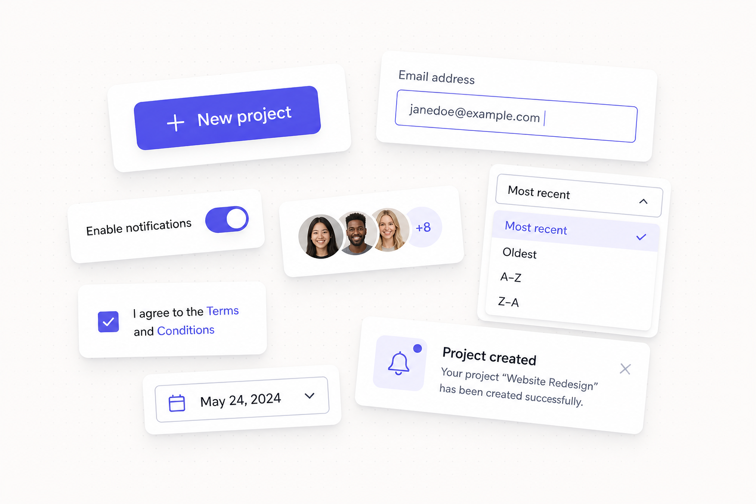
devdojo/components is a Blade UI component library that works like shadcn/ui rather than a traditional dependency: you preview every component from the package, then add the ones you want straight into resources/views/components/, where they become ordinary anonymous Blade components you own and can edit freely. There are no black boxes and no runtime lock-in — the package is a source and a set of CLI tools, and the code you ship is yours.
Everything is built with Tailwind CSS v4 and Alpine.js, works well with Livewire, and is themeable through CSS variables.
Requirements
- PHP 8.2+ and Laravel 11, 12, or 13.
- Tailwind CSS v4 — the theme file uses v4 syntax (
@theme inline,@custom-variant,@source) and won't compile on v3. - Alpine.js — interactive components (dropdowns, modals, tabs, …) are Alpine-driven. Alpine ships with Livewire; include it manually otherwise.
- Livewire is optional — only needed for the showcase "Add" buttons and
wire:*loading states. gehrisandro/tailwind-merge-laravelis installed automatically as a dependency for class merging.
Overview
The "add, don't depend" model has three moving parts:
- Preview namespace — every bundled component is registered under a
componentsnamespace so you can use it instantly as<x-components.button />before adding anything. - The
components:addcommand — copies a component's source into your app asresources/views/components/{name}/index.blade.php, so you use it as<x-button />and can edit it however you like. - A shared theme — design tokens (colors, radii) live in one CSS file, so restyling every component is a matter of changing a few variables.
<x-button>Get started</x-button>
<x-input label="Email" type="email" wire:model="email" />
<x-alert variant="success" title="Saved!" description="Your changes are live." />
Installation
composer require devdojo/components
Run the installer to publish the theme and wire it into your CSS:
php artisan components:install
This copies resources/css/components.css (the design tokens) and inserts @import './components.css'; into your resources/css/app.css — placed right after the @import 'tailwindcss'; line when present. Then rebuild assets:
npm run build # or: npm run dev
Note — the theme enables class-based dark mode. Add the dark class to your <html> element to switch; component tokens swap automatically, so you rarely need dark: overrides.
Previewing and adding components
Before adding anything, every component is available under the preview namespace:
<x-components.button variant="primary">Preview me</x-components.button>
List what's available, then add components interactively or by name:
php artisan components:list             # every component, grouped by category
php artisan components:add              # interactive multi-select picker
php artisan components:add button alert # add specific components
php artisan components:add --all        # add everything
php artisan components:add button --force  # overwrite an existing copy
Each component is written to its own folder as an index component — e.g. resources/views/components/button/index.blade.php, used as <x-button>. Dependencies are resolved automatically: adding input also adds label; adding modal also adds button. The whole component directory is copied, so components with sub-views (like tiptap's toolbar) come across intact, and source references to sibling components (<x-components.button />) are rewritten to the published form (<x-button />) on the way in.
Tip — the public gallery at /components is guest-visible, with live component cards and a per-component page at /component/{name} that runs a wasm-backed playground. The local-only Component Studio — one-click "Add" buttons that copy a component (and its dependencies) straight into your project — now lives at /package/components, still local-environment only.
Configuration
components:install and vendor:publish --tag=components-config expose config/components.php:
| Key | Default | Purpose |
|---|---|---|
preview |
true |
Register bundled components under the components preview namespace (<x-components.*>). Set false to stop registering them entirely. |
path |
views/components |
Destination (relative to the resource path) where components:add copies components. |
showcase.enabled |
env('COMPONENTS_SHOWCASE', true) |
Enable the local-only gallery. |
showcase.route |
/package/components |
The route the local-only Component Studio renders at. |
showcase.middleware |
['web'] |
Middleware for the showcase route — must include the session + CSRF (web) stack so the Livewire "add" buttons post back without a 419. |
The showcase route (devdojo-components.showcase) is only registered when showcase.enabled is truthy and the app is in the local environment.
The component catalog
The package ships 41 components. Adding one via components:add copies its Blade source into your app; the "Use it as" column is the published tag.
| Category | Component | Use it as |
|---|---|---|
| Forms | Button | <x-button> |
| Input | <x-input> |
|
| Textarea | <x-textarea> |
|
| Label | <x-label> |
|
| Checkbox | <x-checkbox> |
|
| Radio | <x-radio> |
|
| Toggle | <x-toggle> |
|
| Select | <x-select> |
|
| Slider | <x-slider> |
|
| Number Input | <x-number-input> |
|
| OTP Input | <x-otp> |
|
| Rating | <x-rating> |
|
| Date Picker | <x-date-picker> |
|
| Avatar Upload | <x-avatar-upload> |
|
| Layout | Card | <x-card> |
| Accordion | <x-accordion> |
|
| Tabs | <x-tabs> |
|
| Separator | <x-separator> |
|
| Splitter | <x-splitter> |
|
| Infinite Canvas | <x-infinite-canvas> |
|
| Navigation | Breadcrumbs | <x-breadcrumbs> |
| Pagination | <x-pagination> |
|
| Sidebar | <x-sidebar> (multi-part: <x-sidebar.nav-item>, <x-sidebar.group>, …) |
|
| Display | Avatar | <x-avatar> |
| Badge | <x-badge> |
|
| Table | <x-table> |
|
| Empty State | <x-empty-state> |
|
| Kbd | <x-kbd> |
|
| Overlays | Modal | <x-modal> |
| Drawer | <x-drawer> |
|
| Dropdown | <x-dropdown> |
|
| Popover | <x-popover> |
|
| Tooltip | <x-tooltip> |
|
| Command Palette | <x-command> |
|
| Feedback | Alert | <x-alert> |
| Toast | <x-toast> |
|
| Progress | <x-progress> |
|
| Skeleton | <x-skeleton> |
|
| Spinner | <x-spinner> |
|
| Editors | Monaco Editor | <x-monaco-editor> |
| Tiptap Editor | <x-tiptap> |
Components declare their props, dependencies, and examples in a {name}.json manifest alongside their Blade file (the multi-part sidebar is the one exception). For example, <x-button> supports type (button / submit / a), variant (primary, secondary, destructive, outline, ghost, link), size (xs–3xl), href, and loader / loading for Livewire loading states. Compound components ship their sub-views too — <x-tabs.list> / <x-tabs.tab> / <x-tabs.panel>, <x-table.columns> / <x-table.row> / <x-table.cell>, <x-accordion.item>, and so on.
Note — two components pull a helper library from a CDN at runtime: avatar-upload (Croppie) and splitter (Split.js). Everything else is self-contained Blade + Alpine.
Asset-backed components
monaco-editor and tiptap lazy-load a compiled JavaScript bundle instead of adding to your main app bundle. After adding either, publish the bundles once:
php artisan vendor:publish --tag=devdojo-assets
This copies the editors' JS/CSS into public/devdojo/, loaded on demand the first time the component appears on a page.
Note — the bundles are self-hosted: no CDN requests, and everything is served from your own public/devdojo directory. Re-run the publish with --force after package updates to refresh them.
Toast usage
Drop a single <x-toast /> into your layout, then trigger notifications from anywhere:
// JavaScript / Alpine
window.toast('Saved successfully!', 'success', 'Optional description.');
// Livewire
$this->dispatch('pop-toast', message: 'Saved!', type: 'success');

// Or flash from a controller
return back()->with('toast', ['message' => 'Saved!', 'type' => 'success']);
Theming and class merging
All colors and radii are CSS variables in resources/css/components.css (a :root + .dark pair mapped through Tailwind's @theme inline). Change a token once and every component updates in both light and dark mode:
:root {
    --primary: oklch(0.55 0.21 264); /* re-skin the brand color */
}
Components use semantic tokens (bg-card, text-foreground, border-input, rounded-medium) rather than hard-coded Tailwind colors, which is what makes retheming instant. Classes you pass are merged via tailwind-merge-laravel, so your overrides win:
<x-button class="rounded-full px-10">Pill</x-button>
How it's wired
ComponentsServiceProvider@boot performs the setup:
registerTailwindMergeFallbacks()— providestwMerge/twMergeFor/withoutTwMergeClassesmacros onComponentAttributeBagso published components keep working even if the merge package is removed.registerPreviewComponents()— registersresources/componentsunder thecomponentsnamespace viaBlade::anonymousComponentPath()(skipped whencomponents.previewisfalse).registerLivewireComponents()— registers thedevdojo-components.cardLivewire component, only when Livewire is installed, keeping the core package Livewire-free.registerShowcase()— loads the package views (devdojo-componentsnamespace) and, inlocalonly, registers the single showcase route (devdojo-components.showcase) behind the configured middleware.registerPublishing()— exposes thecomponents-config,components-theme, anddevdojo-assetspublish tags.
It also registers the components:list, components:add, and components:install commands. The Components class parses each {name}.json manifest into an in-memory catalog and resolves dependency graphs (withDependencies()), and the Publisher copies a component's directory into the app while rewriting the preview namespace.
Extension points
- Own and edit — added components are plain Blade files in your app; change markup, props, and defaults freely.
- Retheme globally — edit the tokens in
components.css; every component (added or previewed) follows. - Author your own — drop a component folder with an
index.blade.phpand{name}.jsoninto your app to extend the library locally. - Turn off previews — set
components.previewtofalseto stop registering the bundled<x-components.*>namespace once you've added everything you need.
The database browser consumes components from this library, and it pairs naturally with blog and changelog for building content UIs.