It's 2021, and it's time for a change. Bootstrap has held its reign as the top CSS framework for quite some time; however, that's all about to change.
TailwindCSS is the cat's pajamas, it's the bee's knees, it's the coolest thing since peanut butter and jelly 🍇. If you don't believe me, perhaps this article will change that.
Never Write CSS Again
It sounds weird that you can use a CSS library to no longer write CSS, and that's because any styles you'll ever need to implement can be created using the TailwindCSS utility classes.
Tailwind has a large set of utility classes that add padding, margin, width, height, and other CSS properties to an HTML element. Here is a quick example of creating a small black square utilizing Tailwind.
<div class="w-10 h-10 bg-black"></div>
These utility classes can be used to craft some beautiful websites. Another great reason is that you will never have to create a new class name ever again.
Woah Woah Woah! You're telling me to stop using traditional CSS and start relying solely on Tailwind?
I was a little hesitant to adopt this new mindset of using only classes to design my websites. But, when I look back, I used to do this with bootstrap and wrote custom CSS on top of it. This would result in bloated CSS files and heavy websites.
After embracing Tailwind, your productivity will sky-rocket 🚀. You will be able to craft beautiful interfaces in record time, and it will be more fun than ever before.
If you want to give it a try, you can do so by visiting the official TailwindCSS playground at https://play.tailwindcss.com.
 View Website
 View Website
 View Website
Responsive Bad-assary
Creating mobile-first responsive designs with TailwindCSS is super easy. Every utility class can be used in conjunction with a responsive modifier. Take a look at the CSS below.
<div class="w-10 h-10 md:w-16 md:h-16 bg-black"></div>
If you view the above HTML on a medium-sized screen (768px), you will see a larger square. If you view it on a smaller screen (less than 768px), you will see a smaller square.
Leveraging the responsive classes allows you to create awesome designs for any screen size. Be sure to check out the Tailwind responsive documentation to learn more.
Beautiful Color Palette
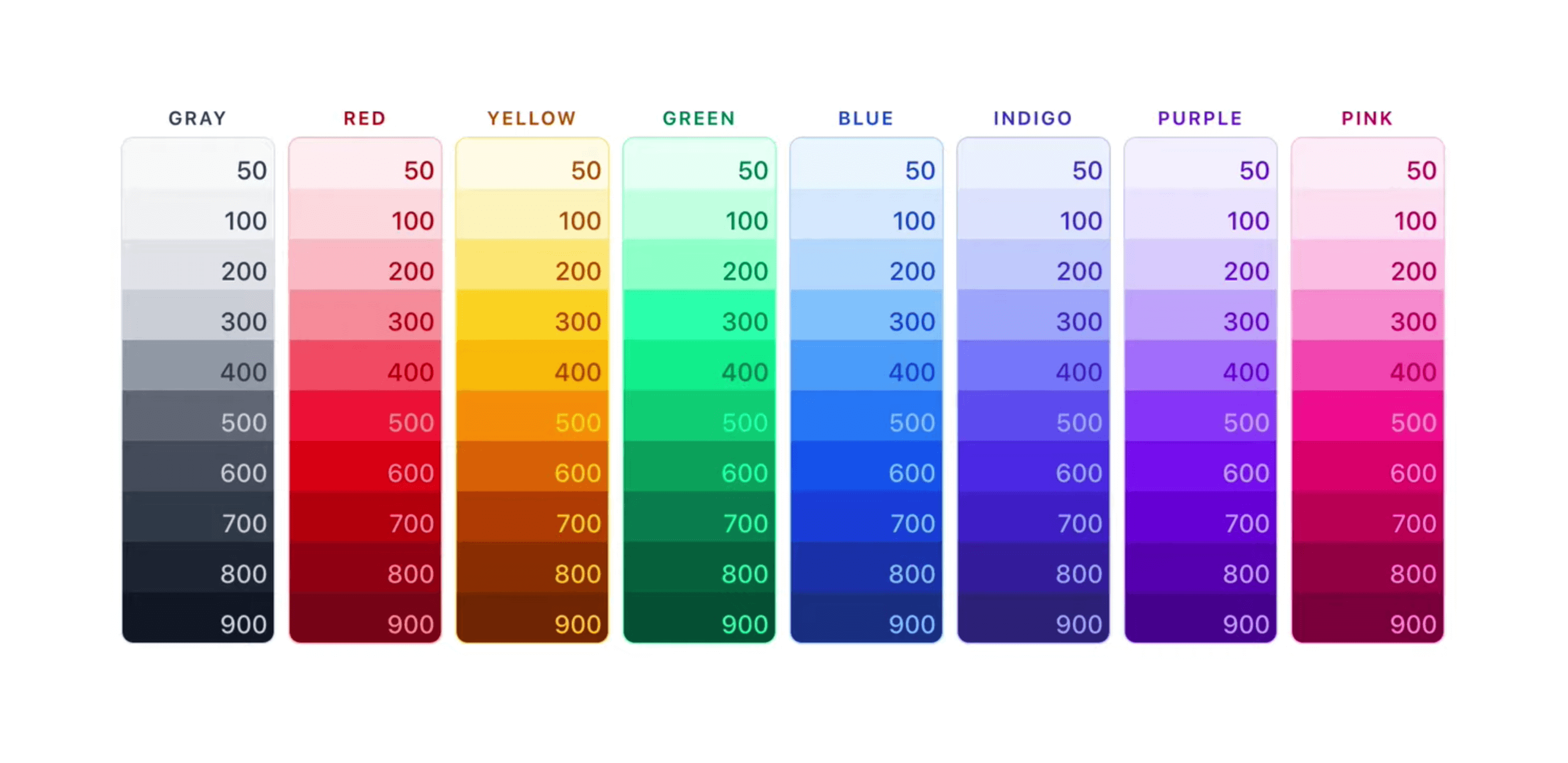
Tailwind has a beautiful color palette, incluing 8 basic colors with 10 different shades.

We can use these colors on any element of our website. We can apply a color to our background, text, border, and more. Here is our square element with a blue background and white text.
<div class="w-10 h-10 bg-blue text-white">YO</div>
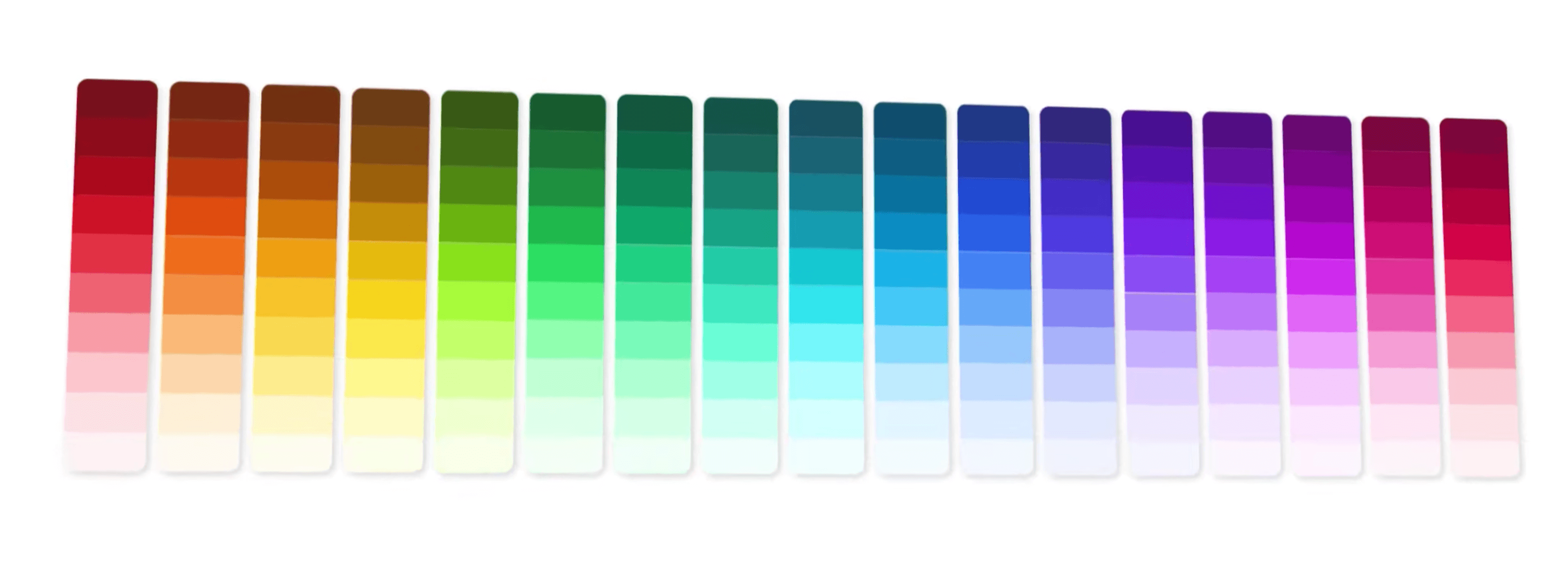
We also have access to an extended color pallette in the latest version of tailwind.

To use these extended colors, you will need to include some additional colors in your Tailwind config file.
This is a perfect segway into the final reason to use Tailwind. You can customize colors, spacing, and everything else inside of Tailwind. The ability to customize every bit of Tailwind is truly powerful. 🤯
Fully Customizable
Everything in Tailwind is fully configurable. You can override, extend, and add your own utility classes. All this customization lives in a file called tailwind.config.js.
This config file will typically live in the root of your project. If you modify your config file, you can re-build your new styles and apply them to your website.
The amount of customizations is endless, and you can also benefit from the multiple Tailwind plugins available.
Small CSS Files
Tailwind has a ton of utility classes, which means that the initial file size is pretty large; however, Tailwind utilizes PurgeCSS to scan your files and detect the classes you are using. This means your final CSS file will only contain the utility classes you are using. This will result in a really small CSS file size!
Smaller CSS file sizes will result in faster page loads, a better user experience, and better SEO.
All hail the bad-assary of TailwindCSS! 🏆
In the past, if you were writing custom CSS and you have multiple developers (adding their own custom CSS), you will end up with bloated and large CSS files. All of this can be resolved by using Tailwind. 😉
If you haven't gotten on the Tailwind bandwagon, I would highly recommend that you strap on your boots and saddle up 🐴 because Tailwind is going to dominate the CSS arena for years to come.


Comments (0)