

If you want to display any additional information or feature that does not require to take any extra space in the web/mobile UI screen then what better to use than Modals. Modals are the dialog that helps us with any extra information or feature without having to navigate to another screen. Modals pop up over the same screen which will minimize the setup screens to navigate to in any application. They are very effective and efficient in terms of optimizing the overall user experience. They make the web application more intuitive and standard.
In this tutorial, we are going to explore the use of modals in React coding environment. For that, we are going to make use of the react-modal package. We are going to begin with basic modal integration as well as style them later using bootstrap to create more standard-looking modals.
So, let's get started!
Installation
First, we need to install the react-modal package. This package offers a Modal component with many properties that we can customize on basis of need. To install, we need to execute the following command in the project terminal:
npm install react-modal --save
Then, we need to import the Modal component in App.js file as shown in the code snippet below:
import React, { useState } from "react";
import Modal from "react-modal";
Now, we need to initialize the state that handles the modal open and close state. Then, we need to create two functions for opening and closing of modal as shown in the code snippet below:
export default function App() {
  const [modalIsOpen, setIsOpen] = useState(false);
  function openModal() {
    setIsOpen(true);
  }
  function closeModal() {
    setIsOpen(false);
  }
Now, we can apply the Modal component to the render template as shown in the code snippet below:
<div className="App">
      <button onClick={openModal}>Open Modal</button>
      <Modal
        isOpen={modalIsOpen}
        onRequestClose={closeModal}
        contentLabel="Example Modal"
      >
        <button onClick={closeModal}>close</button>
        <div>I am a modal</div>
      </Modal>
    </div>
Here, we have used two events isOpen and onRequestClose. Both the events are assigned a function to close and open the modal. Inside the Modal component, we have a div element and a button upon trigger closes the Modal.
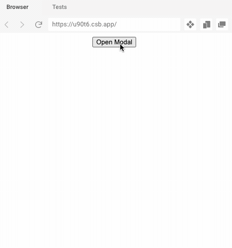
Hence, the result is shown in the demo below:
 View Website
 View Website
 View Website
After the open modal event
Here, are going to make use of the onAfterOpen event provided by the Modal component. This event helps to trigger a function just after the modal opens up on the UI. First, we need to define a variable as shown in the code snippet below:
var modal_text;
Then, we need to assign a p element with reference with will copy the text inside the p element to modal_text variable:
<p color="blue" ref={(_modal_text) => (modal_text = _modal_text)}>
          I am a modal
</p>
Now, we are creating a function to place in the onAfterOpen event. This function will change the color of the text inside the modal after 2 seconds. For the delay, we are using setTimeout callback function as shown in the code snippet below:
function afterOpenModal() {
    setTimeout(function () {
      modal_text.style.color = "blue";
    }, 2000);
  }
Now, we need to call the function in the required event as shown in the code snippet below:
<Modal
        isOpen={modalIsOpen}
        onAfterOpen={afterOpenModal}
        onRequestClose={closeModal}
        contentLabel="Example Modal"
      >
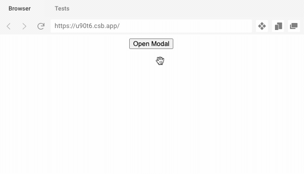
Now, once we open the modal the text will be visible and its color changes to blue after 2 seconds as shown in the demo below:
Integrate bootstrap
Now, we are going to integrate the Bootstrap CSS framework to give better styling to our modal. First, we need to import the bootstrap package to our React project. For that, we are going to make use of the CDN link. We just need to copy the CDN link to our index.html file as shown in the code snippet below:
<link rel="manifest" href="%PUBLIC_URL%/manifest.json" />
    <link rel="shortcut icon" href="%PUBLIC_URL%/favicon.ico" />
    <link
      rel="stylesheet"
      href="https://maxcdn.bootstrapcdn.com/bootstrap/4.0.0/css/bootstrap.min.css"
      integrity="sha384-Gn5384xqQ1aoWXA+058RXPxPg6fy4IWvTNh0E263XmFcJlSAwiGgFAW/dAiS6JXm"
      crossorigin="anonymous"
    />
Next, we need to add some CSS animation style to the App.css file to apply different animation styles to the Modal:
.ReactModal__Overlay {
  -webkit-perspective: 600;
  perspective: 600;
  opacity: 0;
  overflow-x: hidden;
  overflow-y: auto;
  background-color: rgba(0, 0, 0, 0.5);
}

.ReactModal__Overlay--after-open {
  opacity: 1;
  transition: opacity 150ms ease-out;
}

.ReactModal__Content {
  -webkit-transform: scale(0.5) rotateX(-30deg);
  transform: scale(0.5) rotateX(-30deg);
}

.ReactModal__Content--after-open {
  -webkit-transform: scale(1) rotateX(0deg);
  transform: scale(1) rotateX(0deg);
  transition: all 150ms ease-in;
}

.ReactModal__Overlay--before-close {
  opacity: 0;
}

.ReactModal__Content--before-close {
  -webkit-transform: scale(0.5) rotateX(30deg);
  transform: scale(0.5) rotateX(30deg);
  transition: all 150ms ease-in;
}

.ReactModal__Content.modal-dialog {
  border: none;
  background-color: transparent;
}
Lastly, we need to add the new bootstrap class elements to the App.js as shown in the code snippet below:
<button type="button" className="btn btn-primary" onClick={this.openModal}>Open Modal</button>
<Modal
className="Modal__Bootstrap modal-dialog"
closeTimeoutMS={150}
isOpen={this.state.modalIsOpen}
onRequestClose={this.handleModalCloseRequest}
>
<div className="modal-content">
<div className="modal-header">
<h4 className="modal-title">Modal title</h4>
<button type="button" className="close" onClick={this.handleModalCloseRequest}>
<span aria-hidden="true">×</span>
<span className="sr-only">Close</span>
</button>
</div>
<div className="modal-body">
<h4>My Modal...</h4>
<p>Pellentesque habitant morbi tristique senectus et netus et malesuada fames ac turpis egestas. Vestibulum tortor quam, feugiat vitae, ultricies eget, tempor sit amet, ante. Donec eu libero sit amet quam egestas semper. Aenean ultricies mi vitae est. Mauris placerat eleifend leo. Quisque sit amet est et sapien ullamcorper pharetra. Vestibulum erat wisi, condimentum sed, commodo vitae, ornare sit amet, wisi. Aenean fermentum, elit eget tincidunt condimentum, eros ipsum rutrum orci, sagittis tempus lacus enim ac dui. Donec non enim in turpis pulvinar facilisis. Ut felis. Praesent dapibus, neque id cursus faucibus, tortor neque egestas augue, eu vulputate magna eros eu erat. Aliquam erat volutpat. Nam dui mi, tincidunt quis, accumsan porttitor, facilisis luctus, metus</p>
</div>
<div className="modal-footer">
<button type="button" className="btn btn-secondary" onClick={this.handleModalCloseRequest}>Close</button>
<button type="button" className="btn btn-primary" onClick={this.handleSaveClicked}>Save changes</button>
</div>
</div>
</Modal>
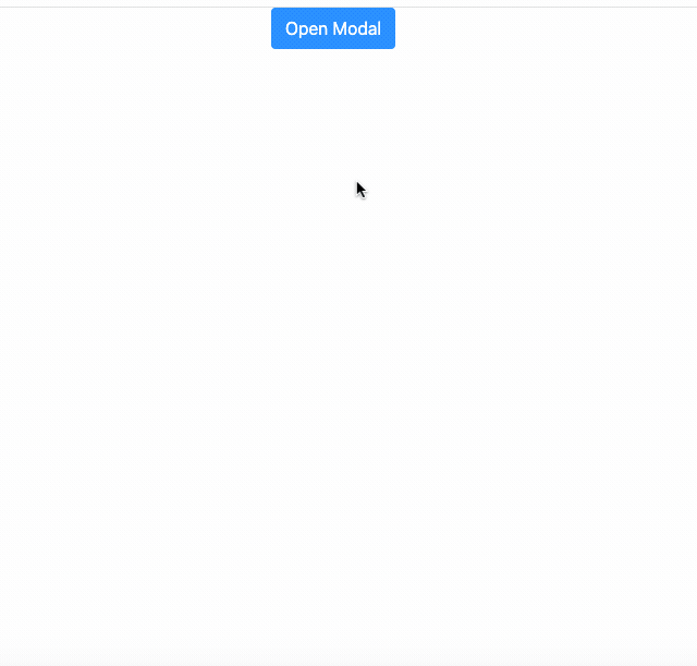
Hence, we will get the better looking and standard Modal with animations as shown in the demo below:
Conclusion
The main aim of this tutorial was to explore the use of modal in the React app development ecosystem. The whole process was made simpler due to the availability of a react-modal package that provides a simple Modal component with a multitude of properties. Then, we assigned the correct event props with a function to display the modal. Lastly, we added animation styles and element styles to the modal by using bootstrap. These types of modals are highly useful and can help display any piece of information or feature efficiently. It also saves an extra page and navigation. Hence, they are widely used in any web or mobile application.
The overall code and demo is available in Codesandbox.
Comments (0)