Toast is an easy way to show the pop-up notification in any web application. It is easy and convenient to use as it can be triggered in response to any event in a web app. Showing a toast doesn't distort the overall UI as it appears in front of the overall UI as an overlay. They can be used to show any type of notifications including app messages, error messages, etc. It improves the user experience and helps users interact with the app more easily and intuitively.
In this tutorial, we are going to learn how to show toast notification in a React application. For this, we are going to make use of the react-toastify package. This package allows us to add notifications to the React app with ease. The toast component provided by this package is easy to integrate and customize as well.
Installation
First, we need to install the toastify package by executing the following command in the root project terminal:
npm i react-toastify
Integrating Toast
Now, we can import the ToastContainer component and toast module from the react-toastify package. The ToastContainer component is used to register the toast to the web UI so that it can be visible in the UI once triggered. The toast module is used to handle the overall options of the toast itself. Here, we have a simple example of using the toast from the react-toastify package. The button is used to trigger the runToast function which triggers the toast module to show the message inside it, The implement is provided in the code snippet below:
import React from "react";
import { ToastContainer, toast } from "react-toastify";
import "react-toastify/dist/ReactToastify.css";

function App() {
  function runToast() {
    toast("here simple toast");
  }

  return (
    <div className="App">
      <ToastContainer />
      <button onClick={runToast}>show notification</button>
    </div>
  );
}

export default App;
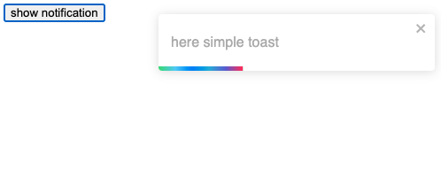
Hence, we get the result as shown in the screenshot below:

Changing toasts position
The toast module also provides us with an option to change the position of the toast displayed on the screen. For that, we can apply the position option to the toast module along with the notification message as shown in the code snippet below:
toast("here simple toast",{
        position: "bottom-left"
    });
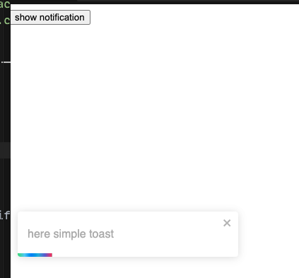
Now the toast will appear at the bottom left of the webpage as soon as we click the show notification button:

 View Website
 View Website
 View Website
The position can be anywhere: top-left, top-right, top-center, bottom-left, bottom-right, and bottom-center.
Closing toasts or disable
We can also handle the time for which the toast is to be displayed on the screen by applying the autoClose option to the toast module as shown in the code snippet below:
function runToast() {
    toast("here simple toast",{
      position: "bottom-left",
      autoClose: 5000
  });
Here, the time value is kept in milliseconds.
Apply Different Style to toast
We can apply different shades of color to our toast by using the type option in the toast module as shown in the code snippet below:
function runToast() {
    toast("here simple toast",{
      position: "bottom-left",
      autoClose: 5000,
      type:'success'
  });
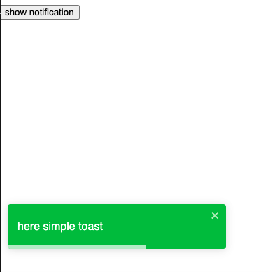
As we can see, the toast now appears green as shown in the screenshot below:

Likewise, we can apply any type style such as: info, success, warning, error, default, and dark.
Conclusion
The main objective of this tutorial was to explore the use of toast in the React application. With the availability of the react-toastify package, everything became much more easier. Apply the Toast component and control it using the toast module is an easy mechanism. The options to customize the toast also is pretty handy and easy to apply. For more examples of the toast in React application, you can check here.


Comments (0)