
In this post, we'll discuss about the **::before and ::after use cases.
Intro
The ::before and ::after are CSS pseudo elements, and they allow you to add content to the page without having any additional HTML. While they are not technically part of the DOM they will appear as if they are.
These pseudo elements are mostly used to add additional visuals to a page.
How they work?
Both pseudo-elements appear inside the element they are applied to, the main difference is that ::before will appear before the rest of the content and children within the element and ::after will, well come after the content.
Both must have the content property to show up (even if it's empty).
EXAMPLES:
Here are some potential use cases where you might want to use the ::before and ::after pseudo-elements in your project.
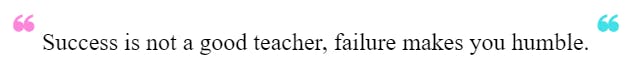
- Quotes
<blockquote class="quote">
   Success is not a good teacher, failure makes you humble.
</blockquote>
.quote::before {
    content: '\275D';
    color: #FC87DA;
    font-size: 2rem;
}

.quote::after {
    content: '\275D';
    color: #41E0E7;
    font-size: 2rem;
}
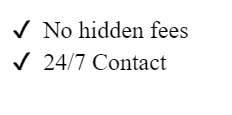
- Icons
<ul class="list">
  <li>No hidden fees</li>
  <li>24/7 Contact</li>
</ul>
.list {
    list-style: none;
}

.list > li::before {
    content: "\2714";
    margin: 0 0.5rem 0 -1rem;
}
 View Website
 View Website
 View Website
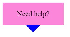
- Arrows
<div class="tooltip">Need help? </div>
.tooltip {
    display: inline-block;
    padding: 1rem 2rem;
    background-color: #FC87DA;
    position: relative;
}

.tooltip::after {
    content: '';
    position: absolute;
    width: 0;
    height: 0;
    border-left: 1rem solid transparent;
    border-right: 1rem solid transparent;
    border-top: 1rem solid blue;
    left: 50%;
    bottom: -1rem;
    transform: translateX(-50%);
}
- Borders
<h1 class="border"> RAHULISM </h1>
.border {
    position: relative;
    display: inline-block;
}

.border::after {
    content: '';
    position: absolute;
    left: 0;
    bottom: -2px;
    width: 100%;
    height: 4px;
    background: linear-gradient(90deg, rgba(138,179,129,1) 0%, rgba(67,86,125,1) 100%, rgba(9,9,121,1) 100%, rgba(144,190,156,1) 100%);;
}

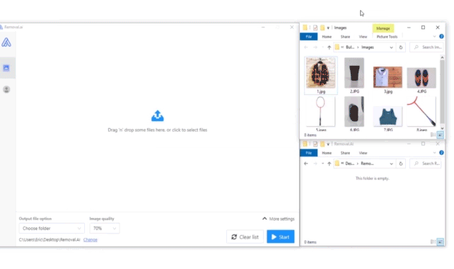
Removal.AI - [SPONSOR]
Remove background from multiple images in a single upload straight to your desktop using Bulk Photo Background Remover for Windows.
- ✅ Drag & Drop Multiple Images
- ✅ Optimize Product Images
- ✅ Select Your Background
- ✅ Set Your Output Size
- ✅ Exceptional Results
Visit -> Removal AI
Comments (0)