
Have you ever tried to make your website look good on both a phone and a computer? It can be tricky! One of the biggest challenges in web design today is creating websites that look great on any device. This is where understanding different CSS units becomes super important.
Today, we're going to talk about two popular CSS units - pixels (PX) and REMs - and how our PX to REM converter can make your life easier.
What Are Pixels (PX) and Why Do We Use Them?
Let's start with something familiar. Pixels (PX) are the tiny dots that make up your screen. When you set a font size to "16px" in CSS, you're telling the browser to make that text exactly 16 pixels tall.
Pixels are easy to understand because they're fixed-size units. What you set is exactly what you get. This is why many designers love using pixels - they're predictable!
But pixels have a big problem: they don't adjust well when users change their screen size or zoom level. This can make your website less accessible to people who need larger text.
What Are REMs and Why Should You Care?
REM stands for "Root EM." Without getting too technical, it means that all your measurements are based on the font size of your website's root element (the <html> tag).
By default, most browsers set the root font size to 16px. So, if you set something to "1rem," it's equivalent to 16px. If you set something to "2rem," it's equivalent to 32px.
Here's why REMs are amazing:
-
Better accessibility: When users change their preferred font size in the browser, REM-based designs will adjust automatically.
Our Amazing SponsorsDigitalOcean offers a simple and reliable cloud hosting solution that enables developers to get their website or application up and running quickly. View Website
Laravel News keeps you up to date with everything Laravel. Everything from framework news to new community packages, Laravel tutorials, and more.
View Website
Laravel News keeps you up to date with everything Laravel. Everything from framework news to new community packages, Laravel tutorials, and more. View Website
A Laravel Starter Kit that includes Authentication, User Dashboard, Edit Profile, and a set of UI Components. Learn more about the DevDojo sponsorship program and see your logo here to get your brand in front of thousands of developers.
View Website
A Laravel Starter Kit that includes Authentication, User Dashboard, Edit Profile, and a set of UI Components. Learn more about the DevDojo sponsorship program and see your logo here to get your brand in front of thousands of developers. View Website
-
Easier to maintain: When you need to adjust your design, you can simply change the root font size, and everything proportionally adjusts.
-
More responsive: REMs help your design scale smoothly across different devices without having to rewrite everything.
The Challenge: Converting Between PX and REM
The biggest hurdle for many designers is doing the math to convert between pixels and REMs. It's not complicated math, but it gets tedious when you're designing a whole website.
The formula is:
REM value = PX value ÷ root font size
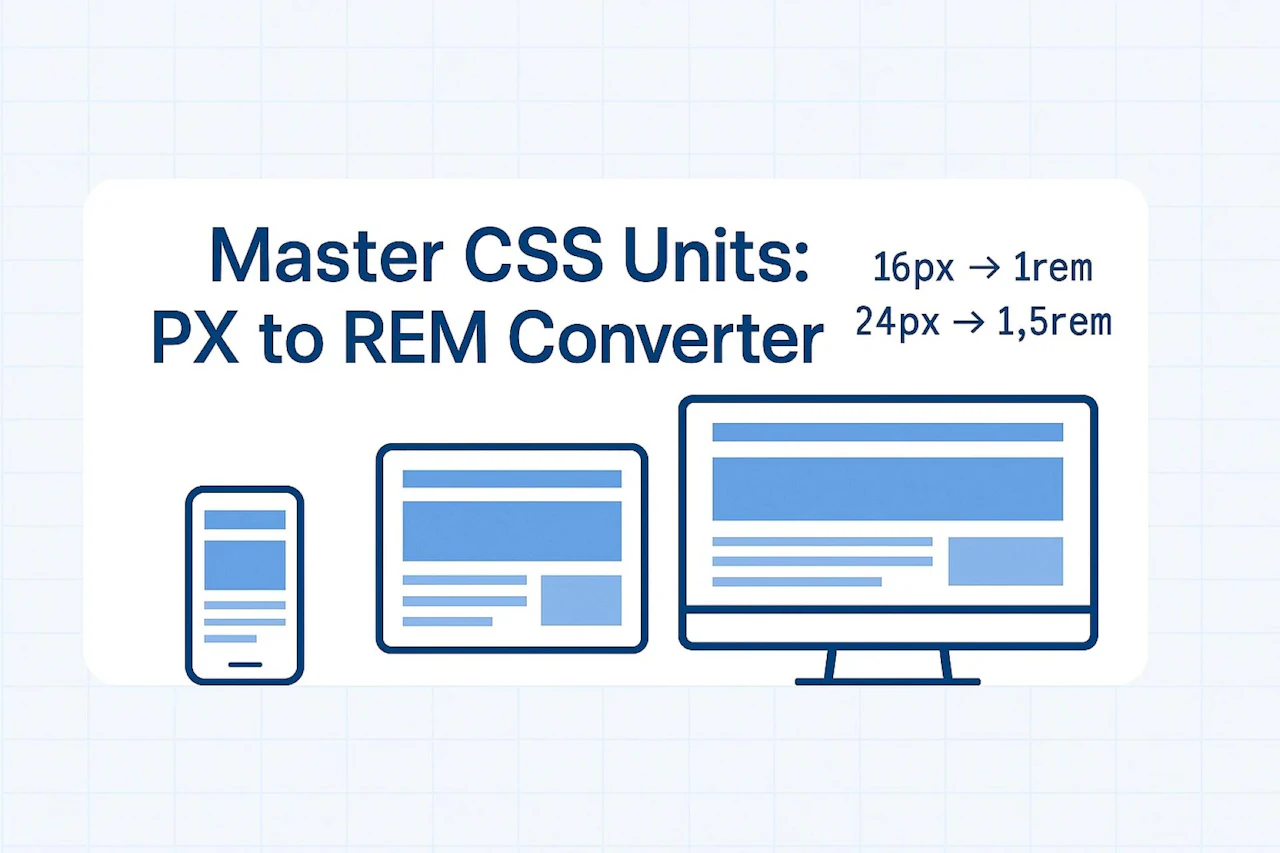
So if your root font size is 16px (the default):
- 16px = 1rem
- 24px = 1.5rem
- 32px = 2rem
- 8px = 0.5rem
Doing these calculations manually for every element in your design can be time-consuming and prone to errors. That's where our converter comes in!
Introducing Our PX to REM Converter
We created the PX to REM Converter to make your life easier. Here's how it works:
- Visit allpxconverter.online/px-to-rem
- Enter the pixel value you want to convert
- Select your base font size (16px is the default for most browsers)
- Click "Convert" and get your REM value instantly!
No more manual calculations or struggling with formulas. Our tool handles everything for you in seconds.
When to Use REMs in Your Designs
Not sure when to use REMs in your CSS? Here are some perfect scenarios:
Font Sizes
Using REMs for font sizes ensures that text will scale properly when users adjust their browser settings. This is crucial for accessibility.
/* Instead of this */
p { font-size: 16px; }
h1 { font-size: 32px; }

/* Do this */
p { font-size: 1rem; }
h1 { font-size: 2rem; }
Margins and Padding
Using REMs for spacing helps maintain consistent proportions across your entire design.
/* Instead of this */
.card {
  margin: 24px;
  padding: 16px;
}

/* Do this */
.card {
  margin: 1.5rem;
  padding: 1rem;
}
Layout Components
Even entire layout structures benefit from REM units:
.container {
  max-width: 75rem; /* 1200px with a 16px base */
  padding: 2rem;
}
Real-World Example: Before and After
Let's look at a simple example of converting a component from pixels to REMs:
Before (using pixels):
.card {
  font-size: 16px;
  padding: 20px;
  margin-bottom: 24px;
  border-radius: 4px;
}

.card h2 {
  font-size: 24px;
  margin-bottom: 16px;
}

.card p {
  font-size: 14px;
  line-height: 20px;
}
After (using REMs):
.card {
  font-size: 1rem;
  padding: 1.25rem;
  margin-bottom: 1.5rem;
  border-radius: 0.25rem;
}

.card h2 {
  font-size: 1.5rem;
  margin-bottom: 1rem;
}

.card p {
  font-size: 0.875rem;
  line-height: 1.25rem;
}
Can you see how the second version would be easier to maintain? If you need to adjust your entire design, you can simply change the root font size and everything will scale proportionally!
Tips for Using REMs Effectively
Here are some pro tips to get the most out of REMs:
-
Set a base font size on your HTML element: This makes your calculations more intuitive.
html { font-size: 16px; /* Or whatever base size you prefer */ } -
Use REMs for most things, but not everything: Some properties, like borders, often work better with pixels.
-
Create a system: Stick to a pattern like 0.5rem, 1rem, 1.5rem, 2rem to keep your design consistent.
-
Bookmark our converter: Keep our PX to REM converter handy for quick calculations.
Why You Shouldn't Convert Everything
While REMs are powerful, not everything needs to be converted:
- Border widths: 1px borders are often best left as pixels.
- Very small details: Elements smaller than 4px might behave inconsistently as REMs.
- Media queries: Many developers prefer to keep media query breakpoints in pixels for more predictable results.
Wrapping Up
Converting from pixels to REMs might seem like extra work at first, but the benefits for responsive design and accessibility are huge. With our PX to REM converter, the process becomes quick and painless.
Next time you're working on a website, try using REMs instead of pixels for your font sizes, margins, and padding. Your future self (and your users) will thank you when your design looks great on everything from phones to large desktop monitors!
Remember, good web design isn't just about making things look nice—it's about making them work well for everyone. Using REMs is a simple step that can make your websites more accessible and adaptable.
Visit allpxconverter.online for more helpful web design tools and converters to make your development process smoother!
Comments (0)