

In this article, we will create a custom utility classes for your Theme colors using CSS variables and Tailwindcss.
1. Define your variables
// On your main css file
:root {
	--primary: theme("colors.blue.500");
  --secondary: theme("colors.blue.200");
}

.th-theme {
  --primary: theme("colors.red.500");
  --secondary: theme("colors.red.200");
}
The :root selector matches the document's root element, so no need for a class or an id on your html code. Anything under :root would be the default theme.
To apply a custom theme you have to apply that .th-theme class to the component, or even use it on the <body> tag to apply a page-wide theme.
2. Configure Tailwind
Now open the tailwind.config.js file and we going to add in the new colors under the extend object.
// tailwind.config.js
module.exports = {
  theme: {
     extend: {
         colors: {
                ...defaultTheme.colors,

                'primary': 'var(--primary)',
                'secondary': 'var(--secondary)',
            },
     },
}
3. How to use theme on HTML
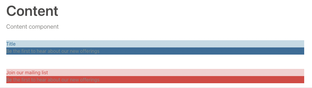
<div class="flex flex-col space-y-12" title="content">

    <!--Component with default (blue) theme-->
<div class="bg-primary">
  <h3 class="bg-secondary text-primary">Title</h3>
  <div>
    <p>Be the first to hear about our new offerings</p>
  </div>
</div>

<!--Component with red theme-->
<div class="th-theme bg-primary ">
  <h3 class="bg-secondary text-primary">Join our mailing list</h3>
  <div>
    <p>Be the first to hear about our new offerings</p>
  </div>
</div>

</div>
Comments (0)