
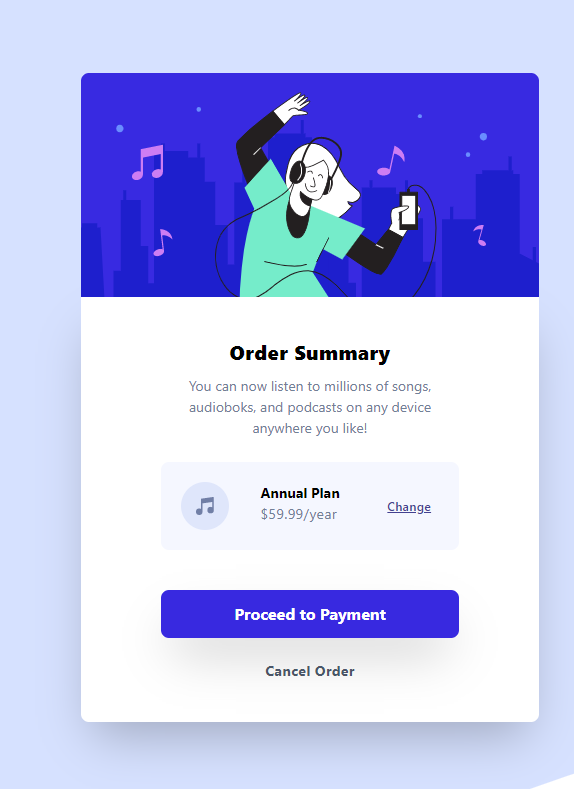
The first project that I will be working on is the first newbie level project the order summary confirmation page. This project is pretty easy, but will really challenge your CSS positioning skills.
Learning Outcome
Library used
I used the TailwindCSS library for this project. Personally after working on this project I felt that it was a little overkill to use for such a simple project. But I wanted to use this opportunity to get familiar with this library because I will be using it a lot to speed up the styling process for bigger projects. So building tiny components like this will get me familiar with traversing through the documentation and building my knowledge on the CSS classes that are used in tailwind.
Techniques used
I learned a lot about grid in this project. I understood the principles behind it but what I really learned is how to properly contain elements I want to manipulate and what are the styling hierarchies I need to understand to properly get columns to fall in line within the proper container elements.
Secondly, I learned about properly setting up my global styles. I am learning that the more detail I iron out with the set up of the project makes the process of building it so much easier because you aren't flipping through designs and fumbling trying to figure out which font goes with which heading, what are the proper font colors to use, etc.
Don't let the simplicity of this project fool you. If you aren't solid on your CSS and positioning skills this project will surely stretch you. But fight through and gain a bunch of knowledge out of it!
How to set up TailwindCSS
if you look in the Tailwind documentation you will see a long instructional way of setting up tailwind using npm packages. This will be great for larger projects we will be working on in the future but for today we will be using the Tailwind CDN.
 View Website
 View Website
 View Website
<html>
<head>
    <title>Order Summary</title>
    <link href="https://unpkg.com/tailwindcss@^2/dist/tailwind.min.css" rel="stylesheet">
    <link rel="stylesheet" href="style.css">
</head>
<body>

</body>
</html>
This is the easiest way to connect to TailwindCSS but we won't always use this way. We need to install tailwind into our project if we want to make customizations and if we are working on a larger project that will be a god send rather than crowding our code with repetitive classes or writing unnecessary styles into our style sheet.
If you are not using Tailwind CSS I have created a list of different project set ups for the different libraries I have used over this challenge process. So if there is another framework or library you'd like to practice using check the list and see if I wrote an article on that particular set up.
Creation Process
I have a way that I go about creating projects so that I can forecast where I may need something later on down the line in the project. This also gets the brain turning and figuring out what are the important things that need to go into this project so that it can be shipped.
The process looks a little something like this.
- HTML Layout
- Global Styles
- Style and Responsiveness
- Logic
- Refractor
- Deploy
HTML Layout
Step one is structuring the project. This is an important part of the process. This will make the process of building your project a breeze or cause you hours of agony. This is my html set up for this project.
<body>
    <div id="container">
        <div id="summary-card-container">
            <div id="hero-container">
                <div id="hero-image">
                    <img src="images/illustration-hero.svg" alt="">
                </div>
            </div>
            <div id="order-summary-info-container">
                <div id="order-summary-title">
                    <h1>Order Summary</h1>
                </div>
                <div id="order-summary-description">
                    <p>You can now listen to millions of songs, audiobooks, and podcasts on any device anywhere you like!</p>
                </div>
                <div id="plan-purchase-container">
                    <div id="product-icon">
                        <img src="images/icon-music.svg" alt="">
                    </div>
                    <div id="plan-description">
                        <h2>Annual Plan</h2>
                        <p>$59.99/year</p>
                    </div>
                    <div id="product-change">
                        <a href="#">Change</a>
                    </div>
                </div>
                <div id="proceed-payment-container">
                    <button>Proceed to Payment</button>
                </div>
                <div id="cancel-order">
                    <a href="#">Cancel Order</a>
                </div>
            </div>
        </div>
    </div>
</body>
Sometimes I feel as though I go very container happy. But in my experience setting up proper containers helps out a lot with grid positioning. It helps make sure that you are manipulating the right element in the right way. I am very visual so thinking about each elements as boxes and inside each box there is a group of other boxes that are controlled by the parent. And the hierarchy loop continues. It's like the html multiverse. But if you see an error in my way please let me know if there is a way to refractor this even further.
Global Styles
The next step in creating this order summary is setting up all the commonly used styles (if you purchase the pro membership you get the design files). First we will set up the typography. We will be using Red Hat Display font family throughout the project so be sure to add it to your project. The font is a google font and can be found here. The font weights we need are 500, 700, and 900.
Next I import our fonts at the top of our style sheet
@import url('https://fonts.googleapis.com/css2?family=Red+Hat+Display:wght@500;700;900&display=swap');
After I import the fonts I then add media queries simply because there is only one major difference between the desktop view and mobile view and that is the changing of the background image. Everything else will be set up using tailwind.
@media only screen and (max-width: 375px) {
    #container {
        background-image: url("/images/pattern-background-mobile.svg");
        background-repeat:no-repeat;
    }
}

#container {
    background-image: url("/images/pattern-background-desktop.svg");
    background-repeat:no-repeat;
}
Now we can set all of the common CSS styles to the global styles. I focus mainly on what is common amongst the majority of the project and I try to handle the base styling here. For this project I will be setting the font family, font weight, font size, and the color.
* {
    font-family: 'Red Hat Display', sans-serif;
    font-weight: 500;
    font-size: 16px;
    color: gray;
}
Again since this is such a simple project I will fill in a few more common styles just to get it out the way so we can focus the bulk of our attention onto positioning. Here are the remaining style changes that I have set for now. These may change depending on how the project goes but for now we should have all of the global styling finished.
h1, h2 {
    color: black;
}

h1 {
    font-weight: 900;
}

h2 {
    font-weight: 700;
}
#product-change a {
    text-decoration: underline;
    font-size: 14px;
    color: hsl(245, 75%, 52%);
    font-weight: 700;
}
button {
    color: white;
}
Style and Responsiveness
Now we get into the heavy lifting. This is where we will use Tailwind CSS to position everything. and get our project looking closer to the design. First we need to center our project. first to do that we need to stretch our original container so that our background displays properly.
#container {
    background-image: url("/images/pattern-background-desktop.svg");
    background-repeat:no-repeat;
    background-position: center;
    background-size: cover;
    height: 100vh;
}
be sure to also add these changes to the media query
@media only screen and (max-width: 375px) {
    #container {
        background-image: url("/images/pattern-background-mobile.svg");
        background-repeat:no-repeat;
        background-position: center;
        background-size: cover;
    }
}
Now we can add the html classes to our container to center our summary card.
<div id="container" class="h-screen grid grid-cols-1 md:grid-cols-3 tracking-wide">
        <div id="summary-card-container">
            <div id="hero-container">
                <div id="hero-image">
                    <img src="images/illustration-hero.svg" alt="">
                </div>
            </div>
We finally have our card centered and now we can finally get to work on the content inside the summary card. First we are going to get the layout set and start working on the hero image. We are going to first get our sizing correct for the layout of the card. We do this by adding a few classes to the #summary-card-container.
<div id="summary-card-container" class="h-full col-start-2 py-20 place-self-center items-center md: py-3 px-3">
This centers all of the content properly while also adding some padding so that the spacing is similar to the design. Next we get the hero image expanded to the full width of the element and then round out the corners for a cleaner look. I will also add a font-size change to the order title so the heading draws a little bit more attention.
<div id="order-summary-info-container" class="grid grid-cols-1 justify-items-center px-20 py-10 bg-white rounded-b-lg  shadow-2xl">
                <div id="order-summary-title">
                    <h1 class="text-xl">Order Summary</h1>
                </div>
Next we will work our way down to the order-summary-description. Not much needs to be done here except put proper padding, text centering, and maybe add some letter spacing.
<div id="order-summary-description">
                    <p class="text-center pt-2 pb-6 tracking-normal">You can now listen to millions of songs,<br> audiobooks, and podcasts on any device<br> anywhere you like!</p>
        </div>
Next is the plan purchase section. What we want to do here is to treat this section as its own container. So we need to set the container as a grid and create 3 columns for each element inside the container.
<div id="plan-purchase-container" class="grid grid-cols-3 rounded-lg mb-10">
Because I could not find a background color in the tailwind documentation that matches what we needed I added in the CSS the custom background color
#plan-purchase-container {
    background-color: hsl(225, 100%, 98%);
}
Inside the plan-purchase container we are going to add proper padding to each element. We will also be adding letter spacing to the header and sizing to the price. Lastly, we are going to center our change link. so that it lines up evenly with the rest of the elements.
<div id="plan-purchase-container" class="grid grid-cols-3 rounded-lg mb-10">
                    <div id="product-icon">
                        <img src="images/icon-music.svg" alt="" class="py-5 pl-5">
                    </div>
                    <div id="plan-description" class="py-5 pr-5">
                        <h2 class="md:text-sm tracking-normal text-xs">Annual Plan</h2>
                        <p class="md:text-sm text-gray-600 text-xs">$59.99/year</p>
                    </div>
                    <div id="product-change" class="grid place-content-center">
                        <a href="#">Change</a>
                    </div>
                </div>
The last thing that we have to do is add our style changes to the large button at the bottom. We need to add proper padding text and some box shadowing to add pop to the button. We will also be adding the proper color to the background on our stylesheet.
<div id="proceed-payment-container" class="w-full ">
                    <button class="rounded-lg mb-5 p-3 px-6 w-full shadow-2xl">Proceed to Payment</button>
                </div>
#product-change a {
    text-decoration: underline;
    font-size: 14px;
    color: hsl(245, 75%, 52%);
    font-weight: 700;
}
button {
    background-color: hsl(245, 75%, 52%);
}
And before we close the hood on this project we need to make sure we add the hover effects to our style sheet so users can know when they are interacting with our links and buttons.
button:hover {
    background-color: hsl(224, 23%, 55%);
}
#product-change a:hover {
    text-decoration: none;
    color:hsl(224, 23%, 55%);
}
Deploy
Now that we have finished our beautiful project it is now time to show the world our creation. Make sure you are pushing all the projects you are working on for Github. You must have a Github account to submit your project to frontend mentor and to receive feedback.
Closing
We now have our Order Summary project finally done. We have now conquered one of 44 (at the time of writing) projects that we have to work through. Pat yourself on the back and get yourself a juice box. Enjoy the feeling of having completed something and lets get ready to do it again in next weeks article.
Comments (0)