

Last time we integrated the Sorting and Filtering functionality to out React table using the react-table package. In this tutorial, we are going to continue to add extra features to the React Table component. We are going to make the table feature full and efficient by adding the Grouping and Pagination feature to it.
Grouping enables us to gather the data or information containing specific characteristics and display them.
Pagination refers to adding pages to the table where we can turn the page to display the next group of data. It is a very convenient feature to make the table clear, concise, and easy to use.
These grouping and pagination features are provided by react-table package out of the box. It offers two hooks useGroupBy and usePagination hook which enables us to integrate grouping and pagination features to the table easily.
So, let's get started!
Grouping
Here, we are going to apply the grouping feature to our React table. First, we need to import the useGroupBy hook from the react-table package as shown in the code snippet below:
import {
  useTable,
  useFilters,
  useSortBy,
  useGroupBy,
  useExpanded
} from "react-table";
Then, we need to associate the useGroupBy hook with the useTable hook as shown in the code snippet below:
} = useTable(
    {
      columns,
      data
    },
    useFilters,
    useGroupBy,
    useSortBy,
    useExpanded
  );
Lastly, we need to add the column.getGroupByToggleProps() to the table header in order to handle the grouping mechanism as shown in the code snippet below:
<th {...column.getHeaderProps(column.getSortByToggleProps())}>
                  {column.canGroupBy ? (
                    // If the column can be grouped, let's add a toggle
                    <span {...column.getGroupByToggleProps()}>
                      {column.isGrouped ? "🛑 " : "👊 "}
                    </span>
                  ) : null}
                  {column.render("Header")}
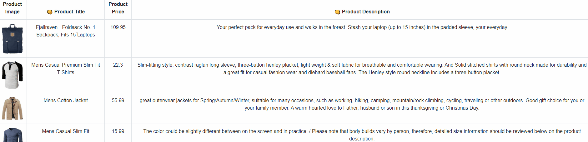
Hence, we can now group the information based on table header as shown in the demo below:
 View Website
 View Website
 View Website
Pagination
The next feature we are going to integrate into our React table is the pagination feature. For this, we need to import the usePagination hook from the react-table as shown in the code snippet below:
import {
  useTable,
  useFilters,
  useSortBy,
  useGroupBy,
  useExpanded,
  usePagination
} from "react-table";
Along with associating the usePagination hook with useTable hook, we need to import all the necessary methods offered by usePagination hook as shown in the code snippet below:
const {
    getTableProps,
    getTableBodyProps,
    headerGroups,
    prepareRow,
    setFilter,
		/// for pagination below
    page,
    canPreviousPage,
    canNextPage,
    pageOptions,
    pageCount,
    gotoPage,
    nextPage,
    previousPage,
    setPageSize,
    state: { pageIndex, pageSize }
  } = useTable(
Here, we have imported all the methods related to changing of pages.
The association code is provided in the code snippet below:
} = useTable(
    {
      columns,
      data
    },
    useFilters,
    useGroupBy,
    useSortBy,
    useExpanded,
    usePagination
  );
Lastly, we need to add the pagination control by making use of the imported methods as shown in the code snippet below:
<form className="inline">
        <div className="form-row">
          <div className="form-group input-group col-md-2">
            <ul className="pagination">
              <li
                class={!canPreviousPage ? "page-item disabled" : "page-item "}
              >
                <a className="page-link" onClick={() => gotoPage(0)}>
                  {"<<"}
                </a>
              </li>
              <li
                class={!canPreviousPage ? "page-item disabled" : "page-item "}
              >
                <a className="page-link" onClick={() => previousPage()}>
                  {"<"}
                </a>
              </li>
              <li class={!canNextPage ? "page-item disabled" : "page-item "}>
                <a className="page-link" onClick={() => nextPage()}>
                  {">"}
                </a>
              </li>
              <li class={!canNextPage ? "page-item disabled" : "page-item "}>
                <a
                  className="page-link"
                  onClick={() => gotoPage(pageCount - 1)}
                >
                  {">>"}
                </a>
              </li>
            </ul>
          </div>
          <div className="form-group input-group col-md-2">
            <input
              className="form-control"
              type="number"
              defaultValue={pageIndex + 1}
              onChange={(e) => {
                const page = e.target.value ? Number(e.target.value) - 1 : 0;
                gotoPage(page);
              }}
              style={{ width: "100px" }}
            />
          </div>
          <div className="form-group input-group col-md-2">
            <select
              className="custom-select"
              value={pageSize}
              onChange={(e) => {
                setPageSize(Number(e.target.value));
              }}
            >
              {[10, 20, 30, 40, 50].map((pageSize) => (
                <option key={pageSize} value={pageSize}>
                  Show {pageSize}
                </option>
              ))}
            </select>
          </div>
          <span>
            Page{" "}
            <strong>
              {pageIndex + 1} of {pageOptions.length}
            </strong>{" "}
            | Go to page:{" "}
          </span>
        </div>
      </form>
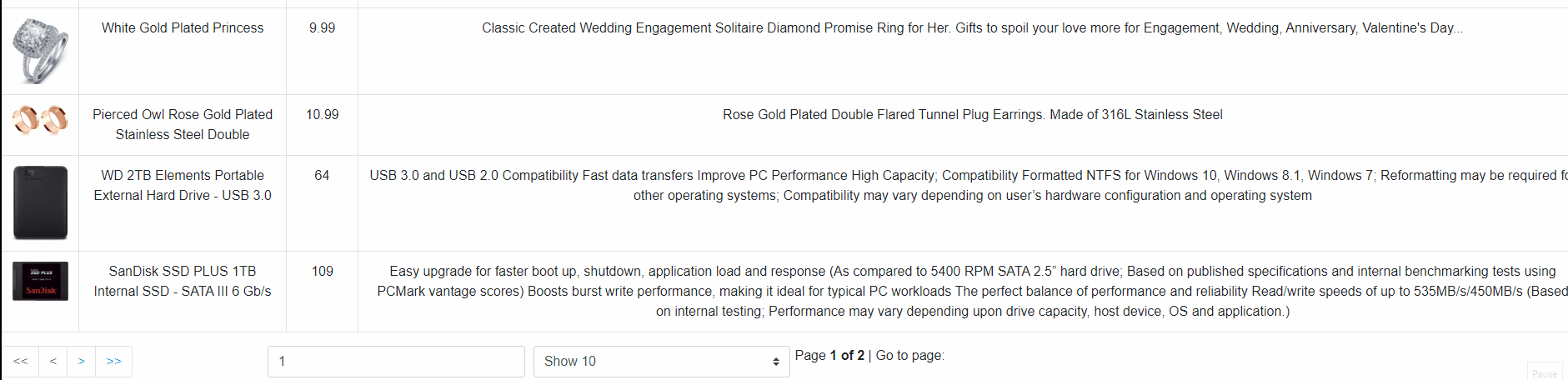
Hence, we will get the pagination control at the bottom of the table from which we can change the pages of the table to show different data as demonstrated in the demo below:
Finally, we have successfully applied the grouping and the pagination feature to our React table from the previous tutorial.
Conclusion
The main goal of this tutorial was to explore the grouping and pagination feature provided by the react-table package. The implementations were simple and easy to understand. We were able to implement the grouping as well as pagination feature by means of hooks provided by the react-table package. These features make the table even more efficient for data searching and representation. The pagination helps to make the table clear and concise and easy to navigate through large amounts of data.
The overall code, as well as the demo for this tutorial, is available on Codesandbox.
Comments (0)