
Intro
Responsive Design it seems like when studying code no matter the framework, language, or project there is always something discussing responsive design. What does that mean exactly? The all knowing website Wikipedia defines it as:
“An approach to web design that makes web pages render well on a variety of devices and window or screen sizes from minimum to maximum display size.”
So what we are looking to build with our projects are adaptive user interfaces no matter what device the user chooses to use. Normally with vanilla CSS we use media queries and set the proper styling for each break point. This can be tiresome and tedious when doing it from scratch but with tailwind it is super simple. Tailwind makes it super simple by using responsive utility variants.
Utility Variants
But what does that mean exactly? Tailwind is a utility-first CSS framework which means building complex components from a constrained set of primitive utilities. Below you will find Figure 1.1 and Figure 1.2 that shows an example of the two approaches to writing CSS. Both of which can be found in the tailwind documentation.
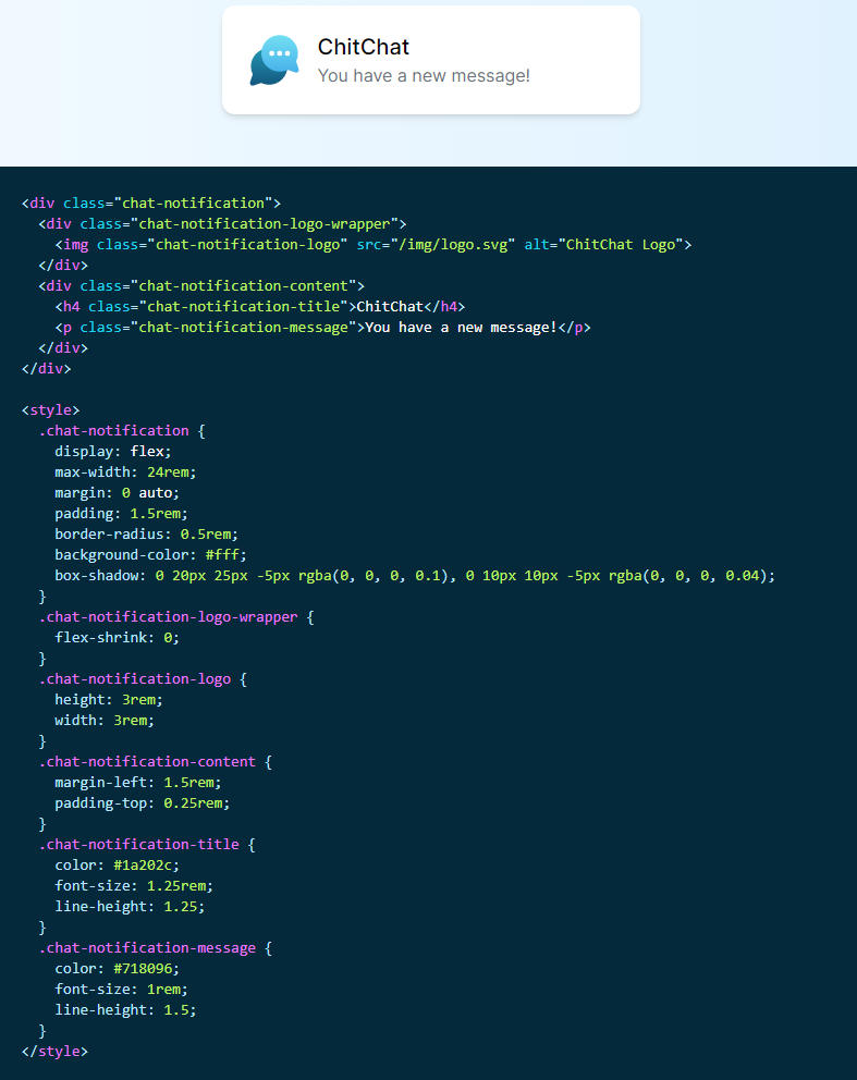 Figure 1.1
Figure 1.1 has a lot going on just to make a simple alert box. Now this isn’t awful but you can imagine as your project grows so will your code. Now you have to worry about creating new class names, remembering which class names you used, and then on top of all of that you have to make each element responsive for multiple screen sizes. Next we’ll look at Figure 1.2 and we see something much different.
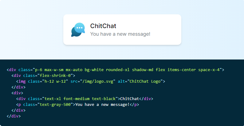 Figure 1.2
Figure 1.2 shows just how much we can clean up. No more coming up with complex class names or writing out multiple lines of code for each element while still implementing a completely custom component design. Another benefit which was huge for me was that making changes seemed a lot safer. When you work with the global CSS you may never know what you may be breaking making a change. Since the HTML classes are local so that means you are setting up styling rules specifically to that element and nothing else. This helps tremendously with container classes. It would take me hours when I first started learning css figuring out rules, hierarchies, and specificity. Not that these things aren’t important, but do we really want to spend our valuable time fighting with css flexbox on a sign up modal? I think our time could be better served elsewhere.
Breakpoints
If using utilities helps make styling a breeze setting up our responsive design is just as simple. There are 5 Breakpoint prefixes that we must know if we want to take advantage of tailwind’s responsive utility variants. These 5 are:
 View Website
 View Website
 View Website
.png) Figure 1.3
Figure 1.3
When adding a breakpoint utility all you need is add the breakpoint name followed by a colon (:) and then add the utility you would like to override when the screen size reaches the minimum breakpoint. Below is an example:
<img class=”w-16 md:w-32 lg:w-48” src=”...”>
Now doesn’t that look much simpler than 80 lines of code to change a specific element for a specific screen size? As stated before using one example for one element may not sound like a lot but when you are working on large projects where there will be multiple changes for multiple different screen sizes this method of styling saves you potentially hours depending on project size.
Mobile First
Tailwind uses a mobile first breakpoint system which means that unprefixed utilities take effect on all screen sizes, while prefixed utilities(ones that use “sm” or larger) only take effect at the specified breakpoint and above. With the way consumers use the internet no matter what you should probably be using the mobile first approach to building apps.
So when you are writing code make sure you use this method:
<div class=”text-center sm: text-left”></div>
Hammer it in your head. Use unprefixed utilities to target mobile, and override them at larger breakpoints.
For an example that you can see and play around with use my pokedex web app (still working) and adjust the screen size and see how the layout changes.
Learn more about tailwind’s responsive design or just learn more about tailwind itself take a look at the documentation here.
Comments (0)