
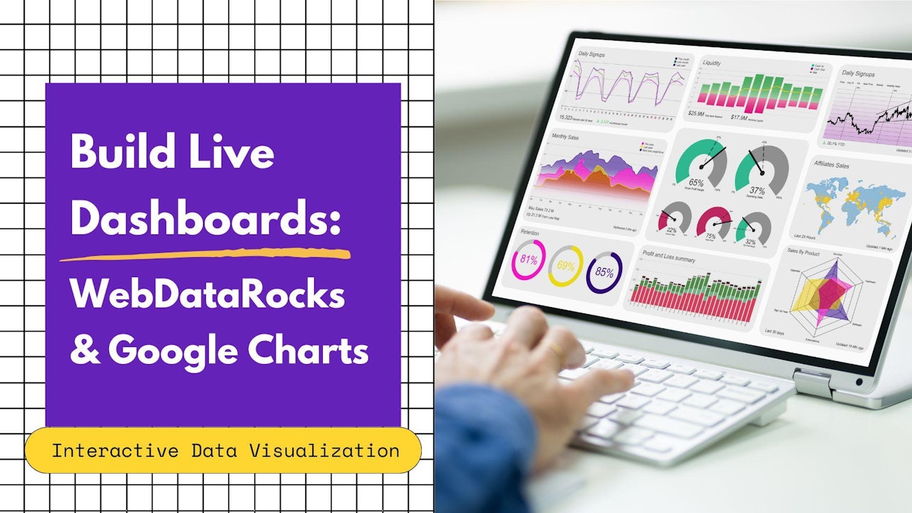
In my previous tutorial, I explored the combination of WebDataRocks with Charts.js and found it to be a powerful duo. Today, I'll be diving into another combination: WebDataRocks with Google Charts.
Why combine these two tools?
- WebDataRocks Pivot Table: Organize and manipulate your data with ease. Slice, dice, and analyze to uncover hidden insights.
- Google Charts: Transform your data into beautiful and informative charts that tell a clear story.
So let’s try to build a dynamic dashboard featuring both a table and a chart. As you manipulate the data, watch how the chart updates in real-time. This tutorial will walk you through the process of building this interactive dashboard.
For this tutorial, let's work on a case study: calculating the average price of products by category and displaying the distribution as a pie chart, one of the oldest and classy statistical charts.
Step 1: Load Up Your Data
There are two ways to load your data: 1.Function for JSON Data: Write a function that returns an array of JSON objects representing your data.
function getJSONData() {
    return [{
            "Color": "green",
            "Country": "Canada",
            "State": "Ontario",
            "City": "Toronto",
            "Price": 174,
            "Quantity": 22
        },
        {
            "Color": "red",
            "Country": "USA",
            "State": "California",
            "City": "Los Angeles",
            "Price": 166,
            "Quantity": 19
        }
    ]
}
2. URL to CSV/JSON File: Alternatively, you can provide a URL to a CSV or JSON file containing your data.
- Data Returned by getJSONData() Function
- Data Loaded via a URL to CSV/JSON File Below is how the report configuration might appear:
var pivot = new WebDataRocks({
    container: "#wdr-component",
    toolbar: true,
    report: {
    dataSource: {
        "data": getJSONData()
      },
    });
or
var pivot = new WebDataRocks({
    container: "#wdr-component",
    toolbar: true,
    report: {
      dataSource: {
        filename: https://cdn.webdatarocks.com/data/data.csv
      },
    });
Step 2: Slice and Dice Your Data
Now comes the fun part! Use WebDataRocks to organize your data. Drag and drop fields to rows, columns, and values. Apply aggregation functions (like average) to summarize your data. In our example, we'll put the "Category" in rows and "Country" in columns. We'll apply the "average" function to the "Price" field. By default, all data will be summarized. You can also highlight cells based on conditions.
Step 3: Connect to Google Charts
Time to bring our data to life visually! We'll connect WebDataRocks to Google Charts using a handy Flexmonster Connector . This allows you to seamlessly transfer your data to Google Charts for visualization.
Include Libraries: Add the Google Charts loader script and WebDataRocks Connector for Google Charts to your webpage:
 View Website
 View Website
 View Website
<script src="https://www.gstatic.com/charts/loader.js"></script>
<script src="https://cdn.webdatarocks.com/latest/webdatarocks.googlecharts.js"></script>
Create a Chart Container: Define a container element (e.g., a <div>) where your chart will be displayed:
<div id="googlechartContainer"></div>
Event Handler for Pivot Completion: Add an event handler to the pivot instance to know when the pivot table is ready to display data:
reportcomplete: function() {
	pivot.off("reportcomplete");
	pivotTableReportComplete = true;
	createGoogleChart();
}
Flags for Completion: Create flags to track when the report and chart are loaded:
var pivotTableReportComplete = false;
var googleChartsLoaded = false;
Load Google Charts Library: Finally, load the chart library from Google Charts:
google.charts.load('current', {'packages':['corechart']});
Step 4 Displaying Data in the Chart
Here's where the magic happens! Callback Setup: Let’s set the onGoogleChartsLoaded() Function as a Callback:
google.charts.setOnLoadCallback(onGoogleChartsLoaded);
Function Definitions: we’ll define a createGoogleChart() and onGoogleChartsLoaded() functions:
function createGoogleChart() {
	if (googleChartsLoaded) {
		pivot.googlecharts.getData({ type: "pie" }, // specify the chart type
			drawChart,
			drawChart
		);
	}
}
function onGoogleChartsLoaded() {
    googleChartsLoaded = true;
    if (pivotTableReportComplete) {
        createGoogleChart();
    }
}
Draw the chart: drawChart() function as callbackHandler and updateHandler arguments to the webdatarocks.googlecharts.getData() method.
And here is a function that will be called once the data is ready and updated. It will be responsible for drawing and redrawing the chart. Also, here you can choose the type of chart you need.
function drawChart(_data) {
	var data = google.visualization.arrayToDataTable(_data.data);
	var options = {
		title: _data.options.title,
		height: 300,
                legend: { position: 'top' }
};
	var chart = new google.visualization.PieChart(document.getElementById('googlechartContainer'));
	chart.draw(data, options);
}
We created a captivating Pie Chart to showcase the distribution of your data. The code provided will guide you through defining the chart type and customizing its appearance.
Customization of the chart : Want a 3D effect?!
We've got you covered! Just use the is3D option to true.
To further customize your chart, I recommend exploring the Google Chart Documentation. There, you’ll find detailed information on how to fine-tune your chart to meet your specific requirements. 📊🔍
Step 5. Enjoy Interactive Data Visualization!
Now that everything is set up, play around with your data in WebDataRocks Pivot Table. Filter, sort, and manipulate your data to see the pie chart update dynamically, reflecting the changes in real-time. This interactive visualization keeps your data analysis engaging.
Comments (1)