There is a wide range of dashboard creation tools available in the market due to the popularity of data visualization dashboards.
Dashboards typically offer interactive features that facilitate data visualization, incorporating elements such as charts, graphs, controls, grids, and pivot tables. This combination of components significantly enhances comprehension of the data at hand.
In this tutorial, I’ve decided to share my experience on how to create data visualization dashboards easily and without any cost ( all you need its just your time). I will guide you through a step-by-step process of combining two free JavaScript libraries such as WebDataRocks Pivot Table and Chart.js, to create visualizations that will help you to understand your data and show its valuable patterns and insights. We’ll create a dashboard that you can embed into your own project or application.
Let’s start with the first tool, as with WebDataRocks it is pretty straightforward. You can refer to the Quick Start guide for a simple and easy introduction. Then we'll explore Charts.js, an open-source JavaScript charting library that has quickly gained popularity among developers and data analysts. Before diving into a data visualization tutorial, it's important to prepare your data. Data preparation for analysis involves defining the analysis objective, gathering the relevant data from various sources, cleaning and removing inconsistencies, and transforming the data into a suitable format for analysis.
Once your dataset is ready follow the next steps:
Step 1: Install WebDataRocks
You have three options for adding a pivot table to your project.
Download a package to your project.
Use a CDN to add WebDataRocks scripts and styles to your HTML page:
<link href="https://cdn.webdatarocks.com/latest/webdatarocks.min.css" rel="stylesheet"> <script src="https://cdn.webdatarocks.com/latest/webdatarocks.toolbar.min.js"></script> <script src="https://cdn.webdatarocks.com/latest/webdatarocks.js"></script>
Install WebDataRocks as an npm package:
 View Website
 View Website
 View Website
npm i webdatarocks
Next, add the container where you want to display the pivot table:
<div id="pivot-container"></div>
Initialize the pivot table instance on your page by writing this JS code:
var pivot = new WebDataRocks({
    container: "#pivot-container",
    toolbar: true,
    report: {
        dataSource: {
            filename: "https://cdn.webdatarocks.com/data/data.csv"
        }
    }
});
Step 2: Create a report
Now that you see the pivot table is rendered on the page and filled with data, it’s time to define a slice – a fundamental part of the report which defines fields on the grid overall.
Define a slice like in the snippet below:
"slice": {
    "rows": [{
        "uniqueName": "Country",
        "sort": "asc"
    }],
    "columns": [{
        "uniqueName": "Measures"
    }],
    "measures": [{
        "uniqueName": "Profit",
        "aggregation": "sum"
    }]
}
At this step, choose an aggregation function to apply to your measures. You can change it anytime later. If you want to create a custom measure, take advantage of calculated values.
Step 3: Customizing appearance
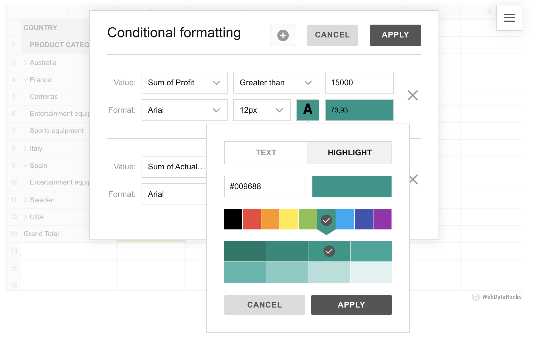
To highlight the values on which you need to focus, apply conditional formatting via UI:

Webdatarocks offers many different customization options so you can easily configure it to your project’s style.
Step 4: Install ChartJS into your project
You also have two options for adding this library to your app:
Use a CDN to add the link to the library to the
section of your HTML page:<script src="https://cdnjs.cloudflare.com/ajax/libs/Chart.js/2.7.2/Chart.js">Or use an npm package:
npm install chart.js --save
Then, define where the chart will be rendered by adding an HTML5 Canvas placeholder and set the size of this canvas:
<canvas id="polarChart" width="800 height="500"></canvas>
Adding an ID to the canvas element is necessary for the library to know in which container chart will be rendered. When adding multiple charts, every ID must be unique. Create a canvas context:
var ctx = document.getElementById("polarChart").getContext('2d');
Step 5: Pass the data from the pivot table to the charts
Let’s add a real-time interaction between the components.
We need to do the following: wait until the data is ready, get the data from the pivot table, prepare it to the format required for charts, and create a chart.
Firstly, we get the data from the pivot table as soon as the pivot table is rendered:
reportcomplete: function() {
	pivot.off("reportcomplete");
	createPolarAreaChart();
}
The second step is to define createPolarAreaChart(), which will get the data we need from the pivot table. To achieve that, we used the getData() method. It requests the data from the current report and asynchronously passes it to callbackHandler and updateHandler. Additionally, you can define which data you’d like to get. callbackHandler should draw the chart and updateHandler should redraw the chart on updates. The third step is to draw the chart. We prepare the data to the format required for the polar chart , set the necessary options for the chart and render it.
Result
Mission accomplished! Now you have a responsive dashboard with data visualization capabilities of charts and pivot table:
Thank you for reading, and enjoy your journey of creating dashboards for your project!


Comments (0)