Doing courses and tutorials is great, but sometimes is difficult to evaluate how much are we actually learning. Watching video after video and coding along with the instructor gives us very good guidance, but it is not a realistic scenario. In a real-world job, we will have to solve problems and start figuring things out by ourselves (with the help of Google, of course 😉). So, to test how much I was actually learning during the JavaScript course I was doing I decided to make a simple To-Do app in HTML, CSS and vanilla JavaScript.
👉 You can take a look at the finished live project here. 👈
What did I want to implement in the project?
As my very first JavaScript project, I decided to apply the following concepts around Object Oriented Programming (OOP):
- Classes
- Properties
- Methods (private and public)
I also wanted to experiment with the DOM manipulation, and use dates, which had been a synonym of headaches for me in the past on other scripting languages 😖.
Finally, I also wanted to experiment with the whole process of building a website from scratch, starting with the user stories, the definition of features, and the design stage, and finishing with the testing and deployment, to gain a feel of how much work (and time) was involved in the operation.
Time management
Speaking about time, to gain insights about how much time the different tasks demanded, and to start gaining experience on calculating how much time projects like this one will take me to complete, I used a time harvesting tool during the whole process.
I used Clockify for this, as it is my preferred tool and I have been using it for a couple of years now.
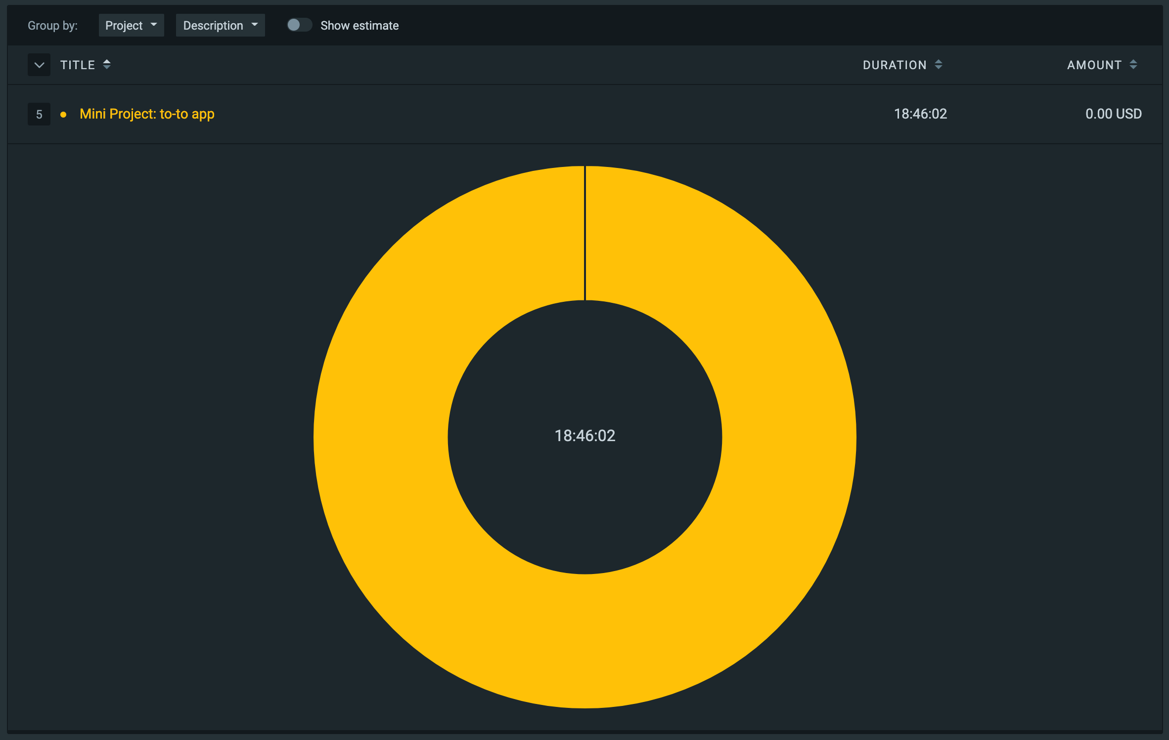
At the end of the project, I could see that the whole undertaking took almost 19 hours to be completed. Apart from the almost one hour of designing on Figma, and almost 2.5 hours of the initial HTML and CSS code, the bulk of the time was allocated between complex CSS and JavaScript coding tasks.
 View Website
 View Website
 View Website
Workflow
The workflow I chose to follow to build the project looks like this:
Initial planning
- Define user stories
- Define features based on user stories
- Create a flow chart linking the features
- Define the architecture the program will have (due to the simplicity of this project, I skipped this step)
Design
- Search for inspiration
- Define colour scheme and typography
- Make a graphic design of the site
Code
- Build HTML structure
- Build the needed CSS to implement the graphic design into actual code
- Build JavaScript code to implement the features defined during the initial planning
Review and deploy
- Test for browser compatibility
- Test for responsiveness
- Validate HTML and CSS code
- Deploy the project
Initial planning
The initial planning for this project was somewhat simple due to its low complexity.
User stories
I started by putting myself in the shoes of the users and, thus, I could write the following user stories:
- As a user, I want to be able to create a new to-do item, specifying a due date, so I can keep track of what I need to do.
- As a user, I want to be able to check off the completed items.
- As a user, I want to be able to delete items, so I can remove unwanted or erroneous tasks.
- As a user, I want to see all the to-do items I have added, even if I reload the page (actually, this user story was born from the feedback I received on the application).
Defining features
Based on the previously defined user stories, I proceeded to determine the features that the To-Do app will implement. I also include some nice to have features to improve the user experience.
- Show the current date.
- Creation of to-do items, including the due date.
- Completion of to-do items.
- Deletion of to-do items.
- Storage of to-do items on user's device.
- Change background gradient according to time of day.
- Responsive design (mobile-first).
Going visual: making a flowchart
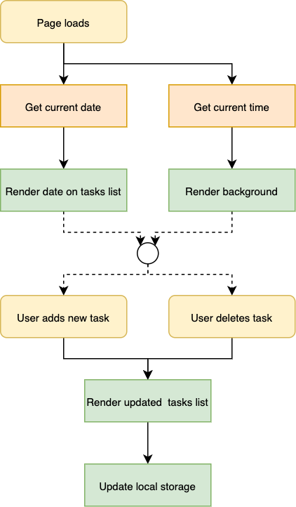
Having all the features written down is great, but I have found that usually looking to a graphical representation of the features shines more light on how the application should behave. This is why I built the following flowchart.
Defining tasks on Kanban board
I decided to use a framework to address the defined features and start working on them. In this case, I chose to use a Kanban board, because the project is fairly simple and because I have experience managing projects on this type of board. I could have used an Agile framework, but I don't have experience with it.
I used ClickUp for building the Kanban board, but I could have chosen Asana, Trello, Notion, or GitHub Projects. I chose ClickUp because I wanted to learn how to use it, and the free version of it showed some promising features.
It's worth mentioning that I also included the project workflow in the Kanban board, so I could keep track of all the needed actions to complete the project, from the initial planning stage to the final deployment.
I started by inputting all the tasks that were related to the project, and assigning the correspondent tag to each task:
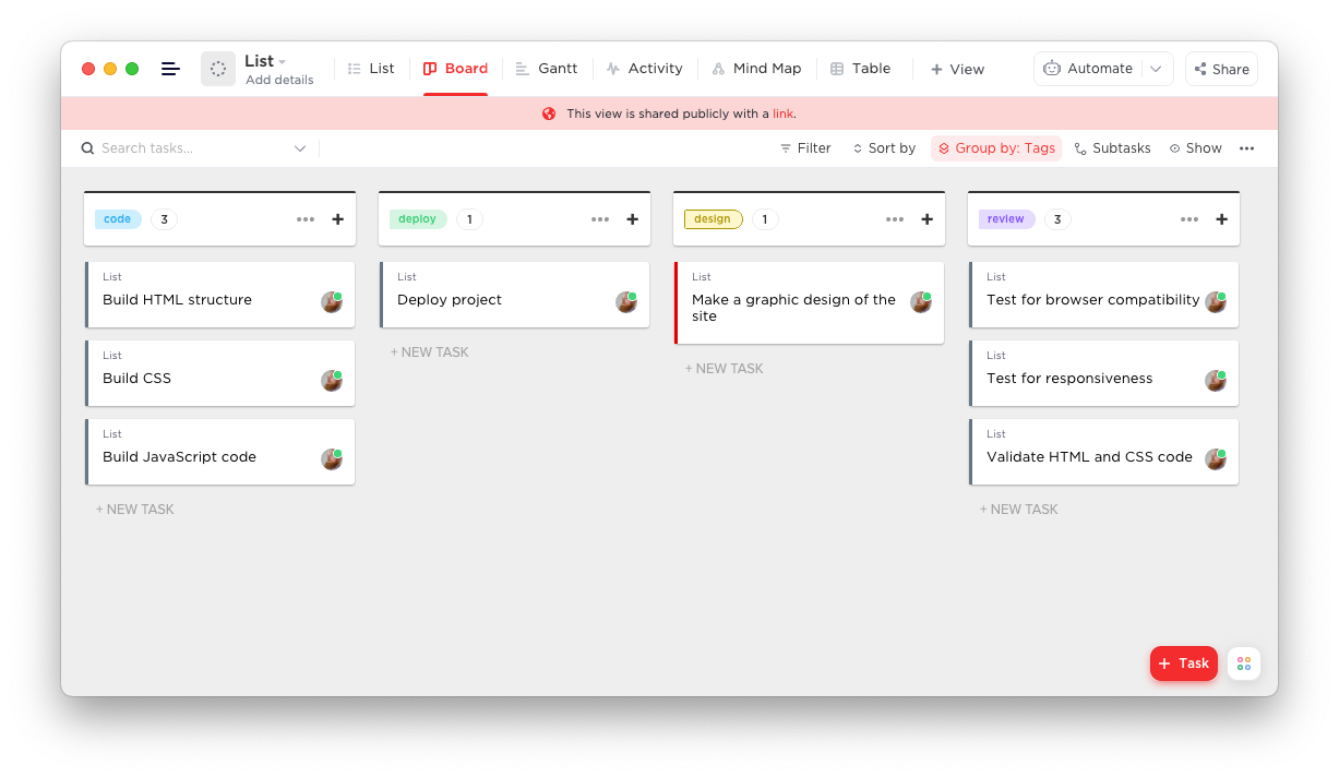
All the tasks were assigned to the "TO DO" column, making them available to start working on them.
During the project, the Kanban board was useful to keep track of what needed to get done. This is a snapshot of how it looked during the project:
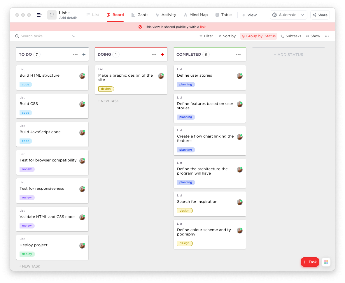
You can take a closer look at the board here.
Design
I'm not a design expert, and my main focus on this project was set on the code side of the application. That being said, I often do my best effort to come up with a design that is pleasing to the eye, always keeping in mind the importance of a good user experience.
Searching for inspiration
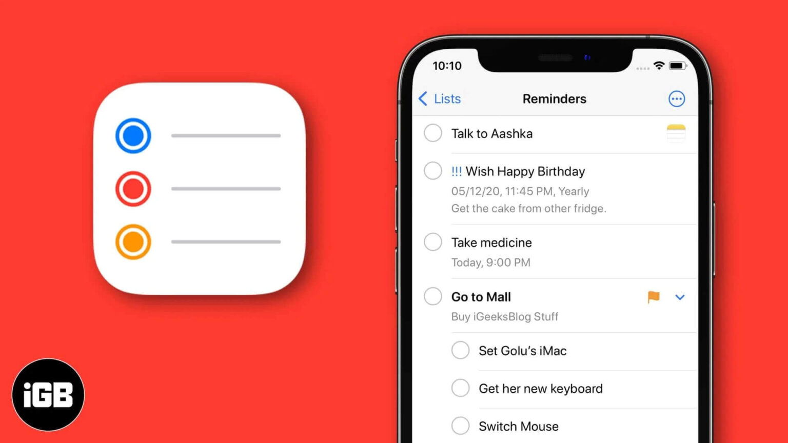
As I didn't want to allocate too much time to this phase, hence I googled to-do lists designs to jump-start my design inspiration. I came across several great designs, and I decided to take inspiration from the Apple Reminders app:
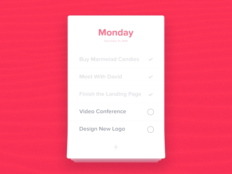
I also got inspired by Sergiu Radu's work:
Defining the colour scheme and fonts
Next, I decided to use warm colours for the app, so I search for some cool gradients on uiGradients ( this is my favourite! 😎).
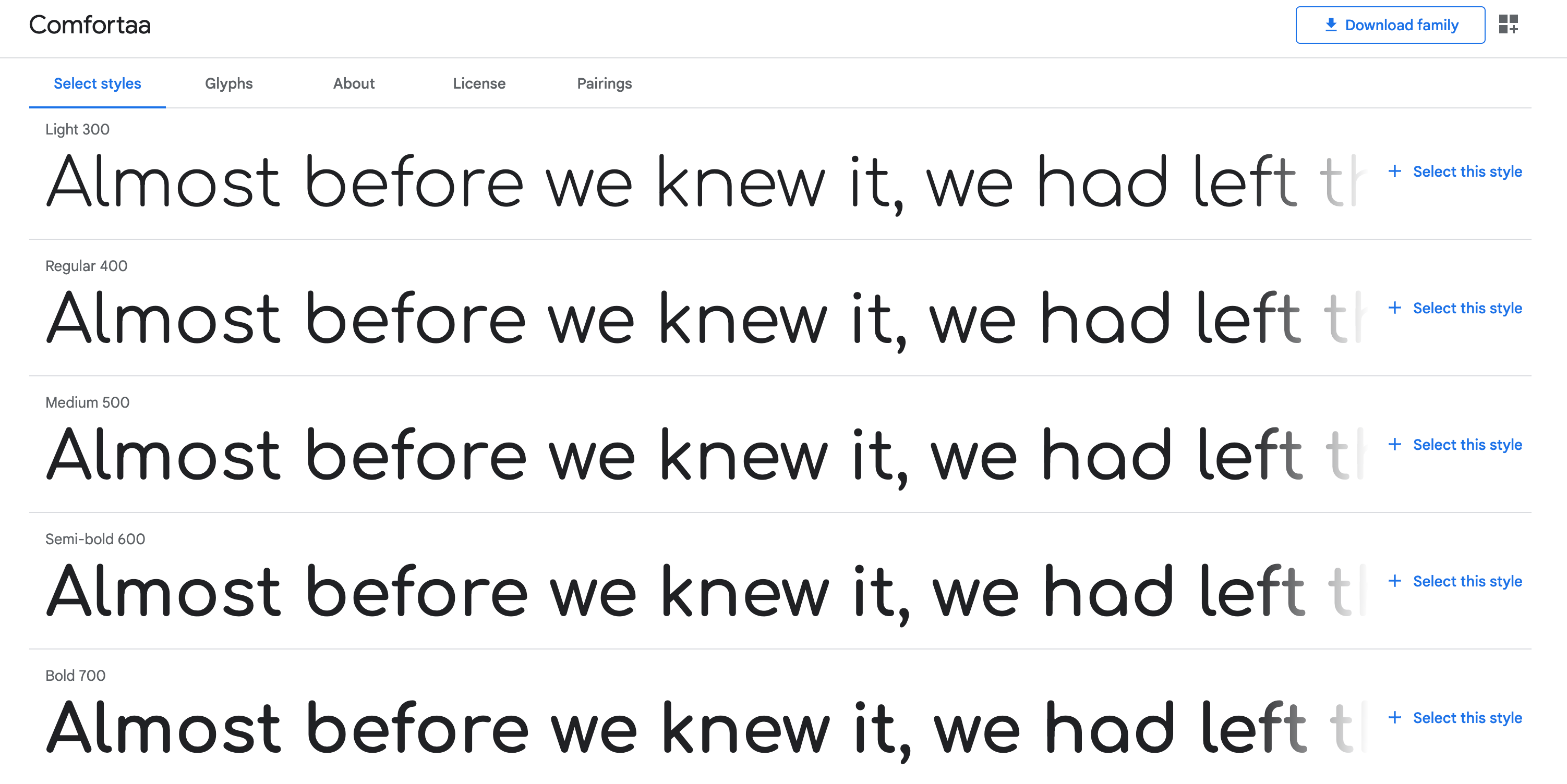
Regarding fonts, I used Google fonts to get the Comfortaa font for its Apple-like look.
Designing for desktop and mobile
To make the actual design I used Figma. In it, I combined the ideas that I gathered from the previous step, and the design ended up looking like this :
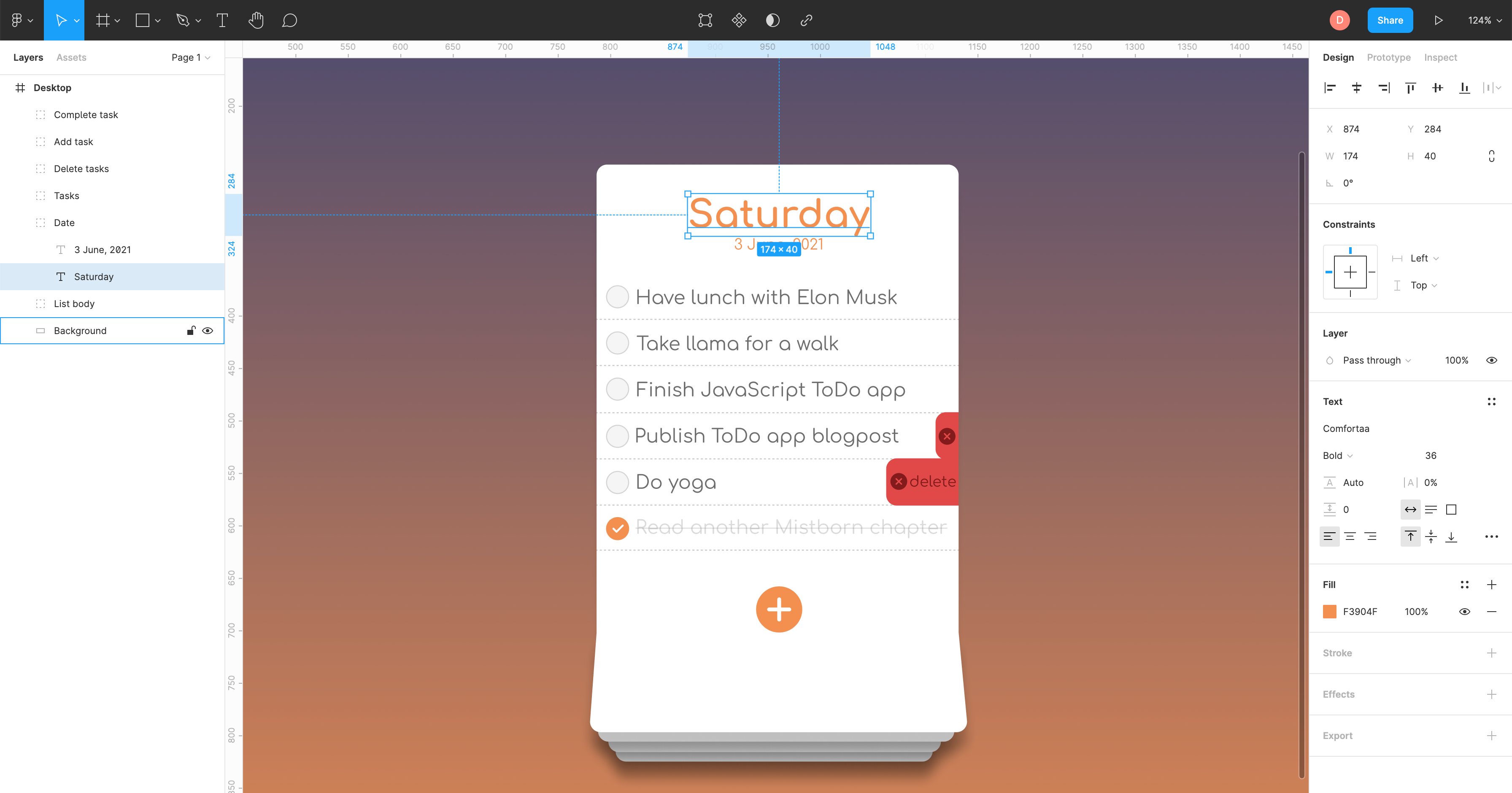
I focused on doing just one design that could work on a desktop computer as well as on a mobile device because I wanted to make focus on the JavaScript section of the project and not so much on dealing with responsiveness.
Coding the foundations: HTML, CSS and JavaScript
Starting point: HTML
Once I had a clear idea of what I needed to do, I started working on the HTML by defining the semantic elements I was going to use, and the classes I most likely was going to need.
You can take a look at the code here.
The classes names are a bit funny, but more on that on the "Lessons learned" section.
Going crazy with CSS
As the app had unique design features (I'm looking at you "bottom section of the to-do list" 😠), I spent a great deal of time working on CSS. I must admit that often I find CSS harder than JavaScript, but that might be due to a lack of experience with it.
Using JavaScript to make everything come to life
Once I had the basics of HTML and CSS in place, I started working on the JavaScript code.
I decided to create a single class called App with a constructor containing the buttons used to create, complete and delete tasks, the actual list of items (an array of objects), and all the involved event listeners.
The App class also included a series of private methods that handled the behaviour of the modal that gets activated when a new task is being created, the changing background according to the time of the day, the behaviour of the tasks, the handling of due dates, and the initialisation of the application, among other things.
You can take a look at the code here.
Testing the app and asking for feedback
During the building process, I was constantly testing how the app was behaving. Doing this triggered a series of modifications to the HTML and CSS code.
I asked friends and family to test the app, and they suggested that the items in the task list should be able to remain on the app despite updating the page. This is why I implemented the use of local storage. I included this as a user story for convenience whilst writing this article.
Publishing
I used Git to keep track of the changes in the project and to be able to publish it on GitHub so I could share it with others.
In this case, I used GitHub pages to deploy and publish the project due to its simplicity and educational purposes, but I could have used Netlify or my own hosting service.
Lessons learned
Thanks to this project I could have a taste of how much work an application like this one takes.
I learned about the importance of structuring HTML in a meaningful semantic way, and how a good HTML structure can make our lives easy when we start working on CSS and JavaScript in later stages of the project.
I underestimated CSS 😅. The classes names are a bit funny and messy, so in the future, I'll try to implement BEM notation and maybe SASS. I discovered that some behaviour that initially thought of was in the realm of JavaScript can easily be achieved with CSS, such as animations on elements.
Regarding JavaScript, this was the first time I coded following the OOP paradigm and, despite feeling a bit out of my element, I now can see the potential that following this paradigm has.
🗞️ NEWSLETTER - If you want to hear about my latest articles and interesting software development content, subscribe to my newsletter. I will be giving away a Udemy course among my newsletter subscribers if we go over 100 during the month of November 2021!
🐦 TWITTER - Follow me on Twitter. The project has a lot of room for improvement, but I wanted to live it like that to have a "snapshot" of my knowledge and skills up to the point in time where I was working on it.



Comments (0)