Hey buddy, for the web newbies I've something fun today. Let's talk about something amazing, the Typewriter animation.
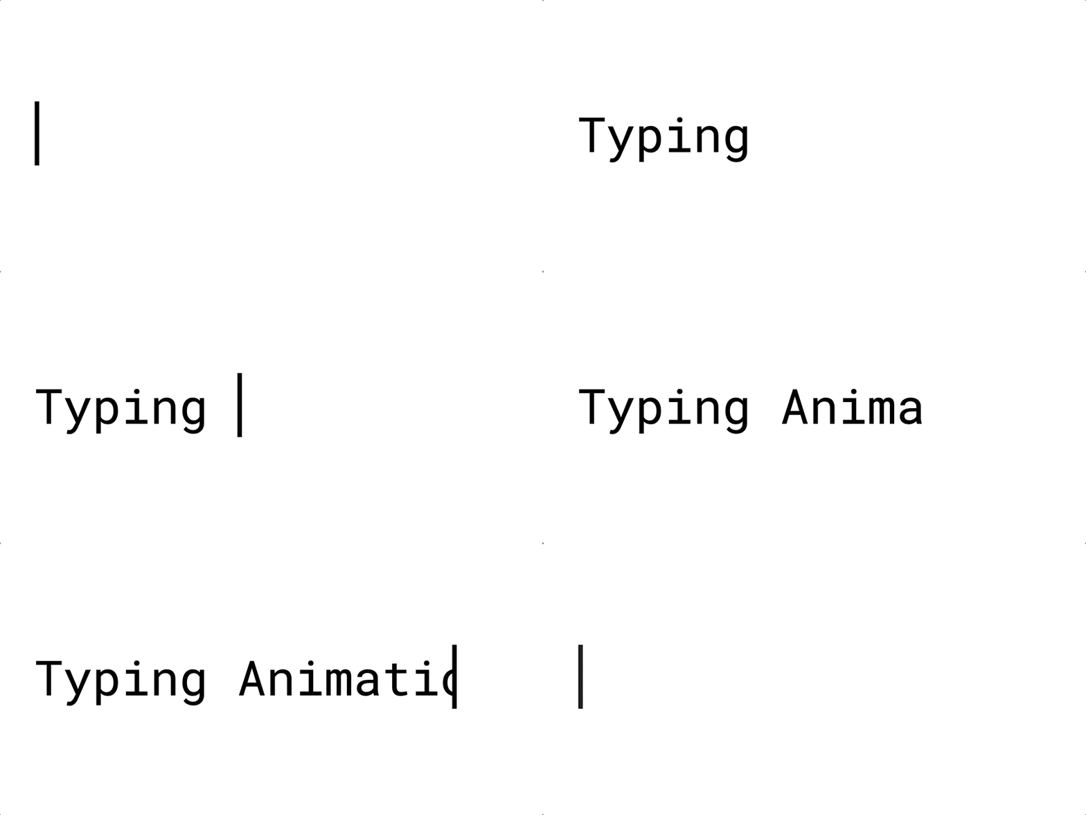
It looks like this: 👇
 After long research, I found that it could be summarised into 4 steps:
Step 1: Write the HTML code
Write the HTML code to display the text.
<div class="writer">
    <div class="writer-text">Happy to contribute for OSS-Cameroon blog</div>
</div>
Step 2: Choosing an appropriate font
choose a monospace font type, like "Courier New", something sans-serif too. This is to simply ensure that the animation property takes one character at a time since monospace fonts are always of equal width.
.writer {
    font-family: Courier, monospace;
	display: inline-block;
}
Step 3: Using the CSS animation property
This effect is being achieved by playing with the width property of our text varying it from 0 to 100% in a linear fashion.
The beautiful blinking cursor that wipes and or wipes away the text is achieved by border-color animated from solid to transparent.
Step 4: Performing animation in a fixed number of steps and intervals
Our focus here is the animation-timing-function property which seems like a realistic typing effect.
What am I doing here? :sweat_smile:
- Pushing the characters one at a time in a cool and realistic fashion.
- Specifying the number of frames( steps by steps series of frames and the intervals between them).
.writer-text {
    display: inline-block;
  	overflow: hidden;
  	letter-spacing: 2px;
 	animation: typing 5s steps(30, end), blink .75s step-end infinite;
    white-space: nowrap;
    font-size: 30px;
    font-weight: 700;
    border-right: 4px solid orange;
    box-sizing: border-box;
}
The keyframes :sweat_smile:
 View Website
 View Website
 View Website
@keyframes typing {
    from {
        width: 0%
    }
    to {
        width: 100%
    }
}

@keyframes blink {
    from, to {
        border-color: transparent
    }
    50% {
        border-color: orange;
    }
}
Full code:
<!DOCTYPE html>
<html>
<head>
    <style>
        .writer {
        font-family: Courier, monospace;
        display: inline-block;
        }
        .writer-text {
            display: inline-block;
            overflow: hidden;
            letter-spacing: 2px;
            animation: typing 5s steps(30, end), blink .75s step-end infinite;
            white-space: nowrap;
            font-size: 30px;
            font-weight: 700;
            border-right: 4px solid orange;
            box-sizing: border-box;
        }

        @keyframes typing {
            from {
                width: 0%
            }
            to {
                width: 100%
            }
        }

        @keyframes blink {
            from, to {
                border-color: transparent
            }
            50% {
                border-color: orange;
            }
        }
    </style>
    <body>
        <div class="writer">
            <div class="writer-text">Twinkle, twinkle, little star.</div>
        </div>

    </body>
</html>
### The result:
<div class="writer">
    <div class="writer-text">
    Happy to contribute for OSS-Cameroon blog.
    </div>
</div>

## Conclusion 💗

Open source is a great way to contribute to the community. Getting to know the community is a great way to contribute to the community and make things better.


Comments (1)