
One of my favourite technologies when building UI interfaces for websites is Tailwind CSS and Flowbite.
Tailwind CSS is a rapidly growing CSS framework due to its utility-first approach when using classes. This makes it very easy to build pages directly from your HTML without having to code in CSS files and also maintain the same classes throughout projects.
Flowbite is the most popular component library built with the utility classes from Tailwind CSS including interactive elements such as dropdowns, modals, navbars, carousel sliders, and more.
Today I want to show you how you can build an avatar component using Tailwind CSS and Flowbite.
Tailwind CSS Avatar
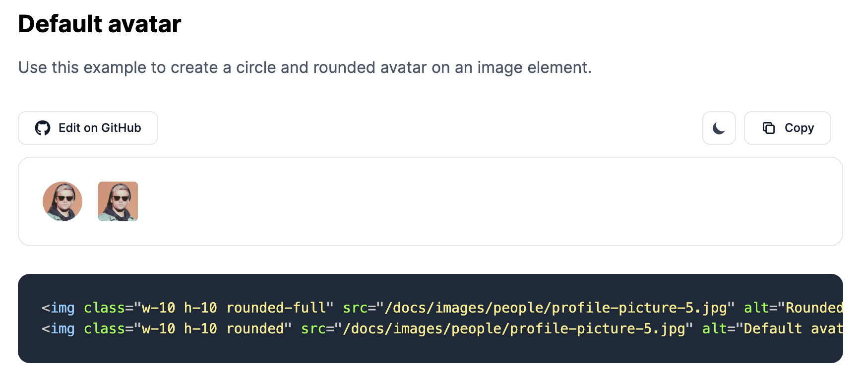
The avatar component can be used as a visual identifier of a user profile on a website. It usually consists of an image element.
Let's check out a simple example from Flowbite:
<img class="w-10 h-10 rounded-full" src="https://flowbite.com/docs/images/people/profile-picture-5.jpg" alt="Rounded avatar">
As you can see, all we needed to do is apply the rounded-full class to the image element.
Let's create a more interesting style for the avatar component using a border:
 View Website
 View Website
 View Website
<img class="w-10 h-10 p-1 rounded-full ring-2 ring-gray-300 dark:ring-gray-500" src="https:/flowbite.com/docs/images/people/profile-picture-5.jpg" alt="Bordered avatar">

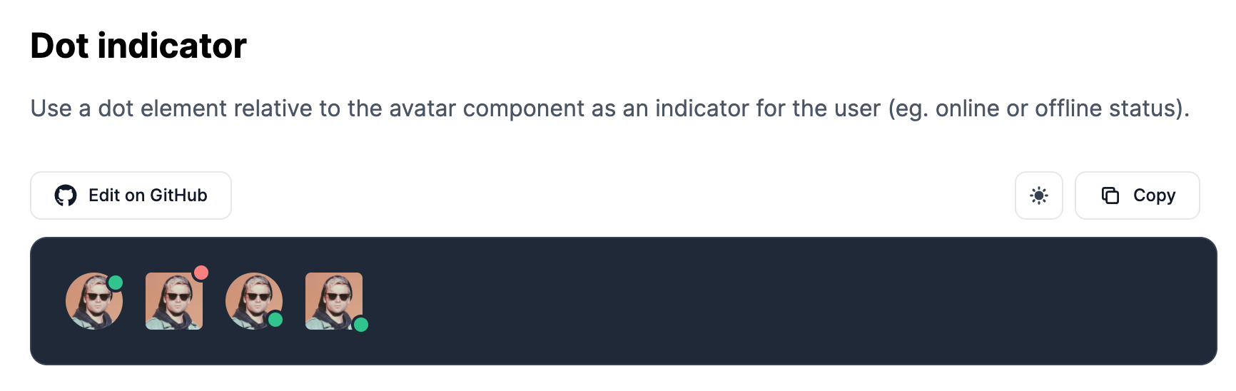
Awesome! We can take another example from Flowbite by adding a green or red dot relative to the image to show the online status of a user:
<div class="relative">
    <img class="w-10 h-10 rounded-full" src="https://flowbite.com/docs/images/people/profile-picture-5.jpg" alt="">
    <span class="top-0 left-7 absolute  w-3.5 h-3.5 bg-green-400 border-2 border-white dark:border-gray-800 rounded-full"></span>
</div>
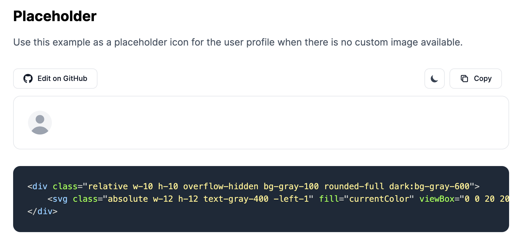
If the user doesn't set an avatar by default you can also use the following SVG example as a placeholder:
<div class="relative w-10 h-10 overflow-hidden bg-gray-100 rounded-full dark:bg-gray-600">
    <svg class="absolute w-12 h-12 text-gray-400 -left-1" fill="currentColor" viewBox="0 0 20 20" xmlns="http://www.w3.org/2000/svg"><path fill-rule="evenodd" d="M10 9a3 3 0 100-6 3 3 0 000 6zm-7 9a7 7 0 1114 0H3z" clip-rule="evenodd"></path></svg>
</div>
You can check out more Tailwind CSS Avatar examples on Flowbite.
Flowbite - Tailwind CSS Components
If you want to get access to more Tailwind CSS components you can check out the Flowbite component library which includes up to 30 components such as dropdowns, modals, navbars, and more.
Comments (0)