
CSS Flexbox is the latest craze to hit the streets of browser layouts. By using CSS flexbox you have a ton of new attributes to apply to your CSS elements to make your layouts easier to accomplish and much more 'flexible'. Checkout this quick example of flexbox below:
As an example, let's say that you have 5 boxes next to eachother that are each 20% in width and then you add a 1 pixel border to the right of your boxes. Awe! Crap, that just jacked up your layouts and now the last block has collapsed below the rest of them :(
Well, thanks to Flexbox we don't have to worry about percentages and fixed widths, by using flexbox our boxes and layouts can now flex to their container!
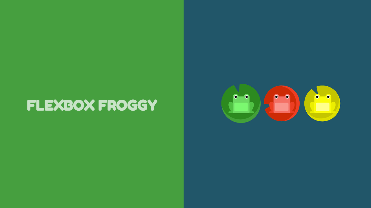
It may seem like there's a lot to learn with flexbox, but after you start getting in the mix of it, it can be really easy and fun. One of the better resources that we have found on the web for learning CSS flexbox is Flexbox Froggy. In this interactive lesson/game you try to advance to the next level by moving the frog to their appropriate lillypad using CSS flexbox. Be sure to checkout this awesome resource here: http://flexboxfroggy.com/

Here are a few other resources that will help you learn more about Flexbox:
- http://www.w3schools.com/css/css3_flexbox.asp
- https://css-tricks.com/snippets/css/a-guide-to-flexbox/
- http://learnlayout.com/flexbox.html
If there are any other links worth sharing on learning flexbox, feel free to post them in the comments below :)
 View Website
 View Website
 View Website
Comments (0)