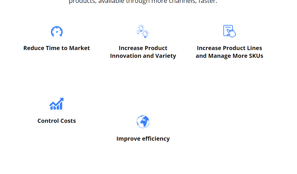
Help! How can I make these five images center three on top and center two on next row?
Help! I need to have the three images on the top row and two images right beneath it. All center. Must also be mobile responsive.

Currently have:
.making-list img{ margin-bottom: 20px; } .making-list p{ font-size: 20px; font-weight: 400; line-height: 27px; text-align: center; }
				<div class="col-md-4 making-list">
				     <img src="http://www.centricsoftware.com/wp-content/uploads/2019/08/Timer.png" alt="Timer">
					 <p><b>Reduce Time to Market</b></p>
				 </div>
				<div class="col-md-4 making-list">
				     <img src="http://www.centricsoftware.com/wp-content/uploads/2019/08/Icons_50x50_Bulb-1.png" alt="Light bulb">
					 <p><b>Increase Product Innovation and Variety</b></p>
				 </div>
				   <div class="col-md-4 making-list">
				     <img src="http://www.centricsoftware.com/wp-content/uploads/2019/08/Hand.png" alt="Hand checking skus" >
					 <p><b>Increase Product Lines and Manage More SKUs</b></p>
				 </div>
				   <div class="col-md-4 making-list">
				     <img src="http://www.centricsoftware.com/wp-content/uploads/2019/08/Icons_50x50_Graph-1.png" alt="Increase graph">
					 <p><b>Control Costs</b></p>
				</div>
				   <div class="col-md-4 making-list">
				     <img src="http://www.centricsoftware.com/wp-content/uploads/2019/08/Earth.png" alt="earth" class="center">
					 <p><b>Improve efficiency</b></p>
				 </div>
			   </div>
Dear doug-brenton,
The addtion of all cols in each row in Bootstrap should not greater than 12. Means the Grid System of Bootstrap can devid a web page into maximum 12 parts. Example:- col-md-4, col-md-4, col-md-4. So addition of all cols as follow 4 + 4 + 4 = 12. So, we can take maximum 3 col-md-4 in one row.
Hre you are taking 5 cols-4 in a single row. col-md-4, col-md-4, col-md-4,col-md-4, col-md-4 So the addition of all cols as follows 4 + 4 + 4 + 4 + 4 = 20 And 20 is greater than 12. So this is wrong. Here maximum 3 col-md-4 can be place in a single row.
See more below examples
- row -> col-sm-2 , col-sm-4, col-sm4 . Total 10 - Correct
- row -> col-sm-2 , col-sm-4, col-sm4 , col-sm-4. Total 14 - Wrong
- row -> col-sm-6, col-sm-3. Total = 9 - Correct
So overall maximum addition of cols can be 12. It doesn mater that we use xs, sm, md, or lg, etc. I hope, you got the concept of use of grid system. Now we come to the solution of your problem
You should use 3 col-md-4 in one row. And use 2 col-md-6 in another row. Code is as follow
Below 3 cols-md-4 should be in one row
<div class="col-md-4 making-list"></div>
<div class="col-md-4 making-list"></div>
<div class="col-md-4 making-list"></div>
Below 2 cols-md-6 should be in one row
<div class="col-md-6 making-list"></div>
<div class="col-md-6 making-list"></div>
Now, give text-align: center to the class making-list.
.making-list { text-align:center; }
I hope, your problem will be solved. Thanks for post query. This is my first try to help on DevDojo. Please visit for more interesting tips and tricks. CodingTuting


