PLATFORM
-
Tails
Create websites with TailwindCSS
-
Blocks
Design blocks for your website
-
Wave
Start building the next great SAAS
-
Pines
Alpine & Tailwind UI Library
-
Auth
Plug'n Play Authentication for Laravel
-
Designer comingsoon
Create website designs with AI
-
DevBlog comingsoon
Blog platform for developers
-
Static
Build a simple static website
-
SaaS Adventure
21-day program to build a SAAS
Sorry, this video is only available to Pro accounts.
Upgrade your account to get access to all content.
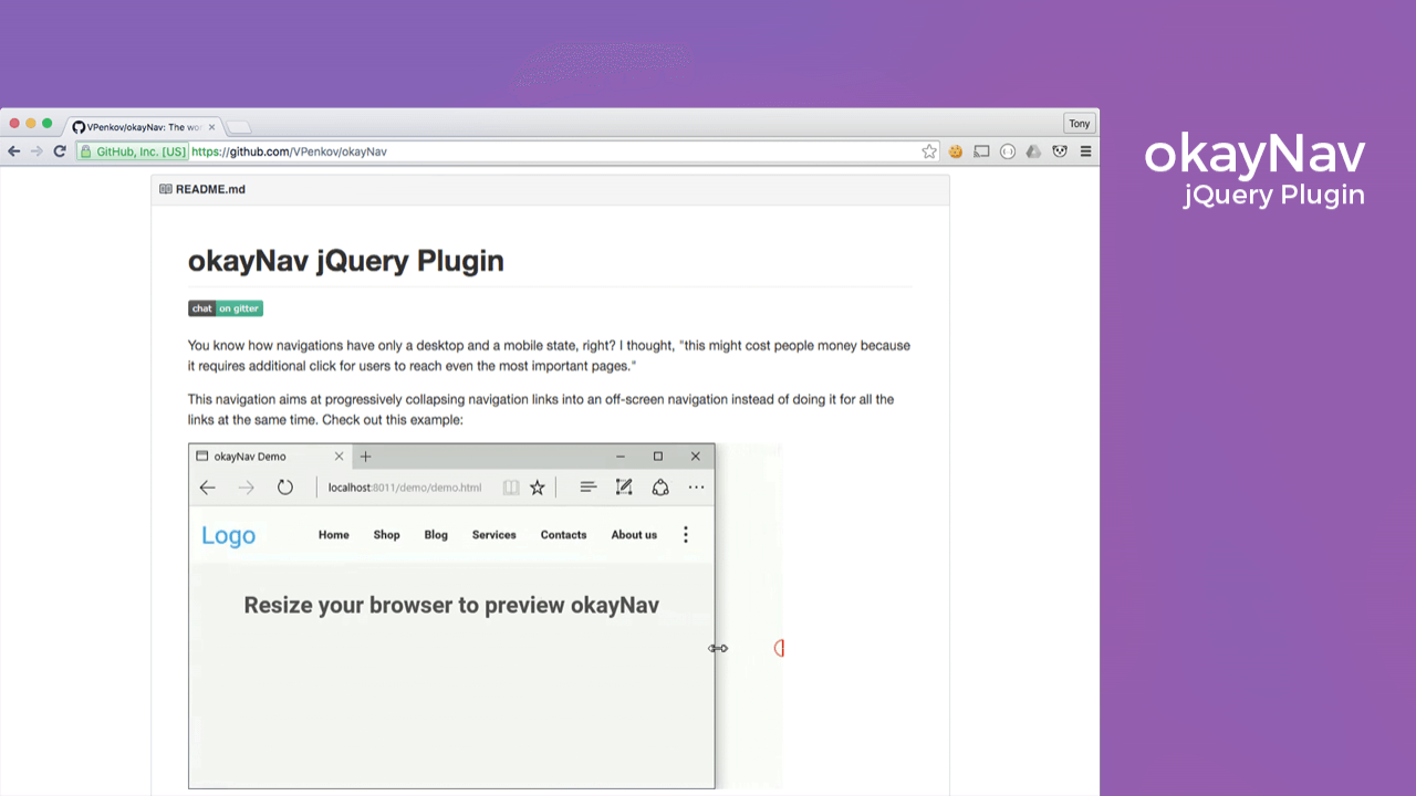
okayNav jQuery Plugin
Created on March 18th, 2016

okayNav is a simple to use jQuery plugin that lets you turn any regular menu into a responsive menu. Be sure to checkout okayNav here: https://github.com/VPenkov/okayNav
Below you will find the code to the files we used in the video:
index.html
<!DOCTYPE html>
<html>
<head>
	<title>Okay Nav</title>
	<link rel="stylesheet" type="text/css" href="style.css">
	<link rel="stylesheet" type="text/css" href="okaynav.css">
</head>
<body>

	<nav id="mynav" class="okayNav">
		<ul>
			<li><a href="#">Home</a></li>
			<li><a href="#">Nav 1</a></li>
			<li><a href="#">Nav 2</a></li>
			<li><a href="#">Nav 3</a></li>
			<li><a href="#">Nav 4</a></li>
			<li><a href="#">Nav 5</a></li>
			<li><a href="#">Nav 6</a></li>
			<li><a href="#">Nav 7</a></li>
			<li><a href="#">Nav 8</a></li>
		</ul>
	</nav>

	<script src="https://ajax.googleapis.com/ajax/libs/jquery/1.12.0/jquery.min.js"></script>
	<script type="text/javascript" src="okaynav.js"></script>
	<script>
	$(document).ready(function(){
		$('#mynav').okayNav();
	});
	</script>


</body>
</html>
style.css
body{
	padding:0px;
	margin:0px;
	text-align:center;
}

#mynav ul{
	margin:0px auto;
	padding:0px;
	border:0px;
	display:block;
}

#mynav ul li{
	display:inline-block;
	margin:0px;
	clear:both;
}

#mynav ul li a{
	padding:10px;
	display:block;
}
Thanks for watching and make sure to include the CSS and the Javascript files from the okayNav github page: https://github.com/VPenkov/okayNav
Community Sponsors
 SAAS Adventure Learn how to create your own Software as a Service.
Comments (0)