-
Tails
Create websites with TailwindCSS
-
Blocks
Design blocks for your website
-
Wave
Start building the next great SAAS
-
Pines
Alpine & Tailwind UI Library
-
Auth
Plug'n Play Authentication for Laravel
-
Designer comingsoon
Create website designs with AI
-
DevBlog comingsoon
Blog platform for developers
-
Static
Build a simple static website
-
SaaS Adventure
21-day program to build a SAAS
Sorry, this video is only available to Pro accounts.
Upgrade your account to get access to all content.
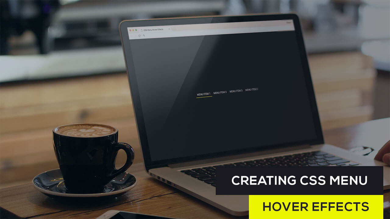
Creating CSS Menu Hover Effects
Created on September 23rd, 2017

CSS Menu Hover Effects look really nice and they are really easy to create. In this video we will show you how to create an awesome CSS Menu Hover Effect using the After and Before pseudo elements. As you hover over each menu item you will see that the before and after elements will animate from a width of 0 to 50% on each side causing a really nice hover effect.
Check out the Menu Hover Effects Demo that we create in the video, and below is the index.html and style.css file created in the video:
index.html
<!DOCTYPE html>
<html>
<head>
	<title>CSS Menu Hover Effects</title>
	<link rel="stylesheet" type="text/css" href="style.css">
	<link href="https://fonts.googleapis.com/css?family=Roboto" rel="stylesheet">
</head>
<body>

	<ul>
		<li><a href="#_">Menu Item 1</a></li>
		<li><a href="#_">Menu Item 2</a></li>
		<li><a href="#_">Menu Item 3</a></li>
		<li><a href="#_">Menu Item 4</a></li>
	</ul>

</body>
</html>
style.css
html, body{ margin:0px; padding:0px; }

body{
	display:flex;
	flex-direction: column;
	justify-content: center;
	align-items: center;
	min-height:100vh;
	background:#1b1d1d;
	font-family: 'Roboto', sans-serif;
}

ul, li{
	list-style: none;
	padding:0px;
	margin:0px;
}

li{
	display:inline-block;
}

li a {
	padding:10px;
	display:block;
	text-decoration: none;
	text-transform: uppercase;
	color:#ddd;
	position:relative;
}

li a:after{
	content:'';
	width:0%;
	transition:all 0.3s ease;
	left:50%;
}

li a:before{
	content:'';
	width:0%;
	transition:all 0.3s ease;
	left:50%;
}

li a:hover:after{
	content:'';
	position:absolute;
	bottom:0px;
	left:50%;
	background:#FFDA00;
	height:3px;
	width:50%;
}

li a:hover:before{
	content:'';
	position:absolute;
	bottom:0px;
	left:0px;
	background:#FFDA00;
	height:3px;
	width:50%;
}
Community Sponsors
 SAAS Adventure Learn how to create your own Software as a Service.
Comments (0)