Rachel Chen — Design Reference
quiet paper, one ember mark
Source: https://www.rachelchen.tech
Theme: light
Category: Portfolio
Mood: light, minimal, editorial, calm, airy, typographic
Captured: 2026-11-22
Overview
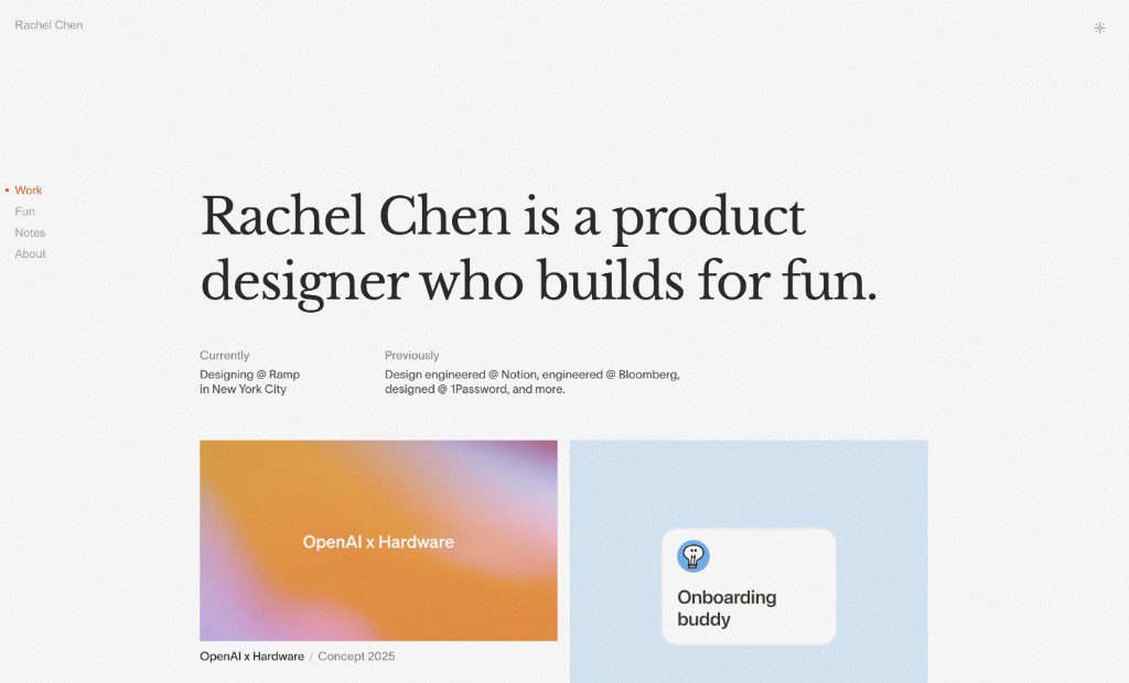
A near-white, almost paper-grain portfolio where a single 64px Libre Baskerville sentence does all the shouting and everything else whispers in 15px grotesque. Structure comes from alignment and air, not boxes: a left rail of nav links, a wide reading column, and a two-up grid of flat colour-field project tiles. One warm ember orange marks the active state and nothing else, so the eye always knows where it is.
Technically it is an exercise in restraint: a #f3f2f0 ground, a slate-ink #32404f foreground, and every other surface, border and secondary text derived as an alpha mix of that one ink (4–20% for surfaces, 5–20% for hairlines, 55–58% for muted text). There are no shadows, no radii on content (tiles are hard 0px rectangles), no filled buttons — links and ghost buttons carry all interaction. Density is comfortable-to-airy: a 8px base with 6/8/16/24/32px gaps and 24px padding as the workhorse, plus very large vertical breathing room above the hero.
Tokens — Colors
| Name |
Value |
Token |
Role |
| Paper Grain |
#f3f2f0 |
--color-background |
Page ground on every view; a warm off-white with a faint noise texture, never pure white. |
| Cool Paper |
#e6e8eb |
--color-surface-muted |
Secondary flat surface — menu sheet backdrop, inert tile fill, chat input bar. |
| Slate Ink |
#32404f |
--color-foreground |
All primary text: the serif hero, project titles, body copy, icons. |
| Ink 55% |
#8a939d |
--color-foreground-light |
Secondary text — labels ('Currently'), inactive nav links, years, metadata after the slash. |
| Ember |
#e65f2e |
--color-primary |
The single accent: active nav link and its square bullet, 'Now' row marker, focus ring, selection tint. |
| Ember Wash |
#fbeae3 |
--color-primary-muted |
10% ember over paper — text selection highlight and hover tint on accent links. |
| Apricot Field |
#e98d34 |
--color-tile-warm |
Flat colour-field thumbnail for the OpenAI x Hardware project tile. |
| Eucalyptus Field |
#e8f0ee |
--color-tile-cool |
Flat colour-field thumbnail for the Notion project tile. |
| Hairline |
#e8e9ea |
--color-border |
5% ink rules under the mobile nav bar and between list rows; the only structural line in the design. |
| Edge Strong |
#d2d6da |
--color-border-strong |
20% ink border on inputs and the chat composer; also tile outlines where used. |
| Signal Blue |
#007fff |
--color-media-blue |
Appears only inside project artwork/gradients; never a UI colour. |
| Midnight Field |
#001445 |
--color-media-ink |
Deep navy within project imagery and gradient fields; basis for the dark twin's ground. |
Semantic roles
| Role |
Value |
| background |
#f3f2f0 |
| surface |
#eeedeb |
| surface raised |
#ffffff |
| border |
#e8e9ea |
| text |
#32404f |
| text muted |
#8a939d |
| primary |
#e65f2e |
| primary text |
#ffffff |
| accent |
#fbeae3 |
Tokens — Typography
- Display: Libre Baskerville (400) — fallbacks: Lora, Georgia, Times New Roman, serif. Used for exactly one thing per page: the hero sentence and the RacheLLM greeting. Regular weight only, tightened with negative tracking.
- Body: twkLausanne (400) — fallbacks: Inter, Helvetica Neue, Arial, sans-serif. Licensed grotesque carrying 100% of UI and body text at 15px/1.5, weight 400 only. Fall back to Inter at the same metrics; Arial is the system substitute the site itself falls back to.
| Role |
Size |
Line height |
Weight |
Letter spacing |
Family |
| Display / H1 |
64px |
80px |
400 |
-0.03em |
display |
| Display Mobile |
40px |
1.22 |
400 |
-0.03em |
display |
| Serif Lead |
28px |
1.3 |
400 |
-0.02em |
display |
| Body |
15px |
1.5 |
400 |
normal |
body |
| Nav Link |
15px |
1 |
400 |
normal |
body |
| Separator / Meta |
16px |
1.5 |
400 |
normal |
body |
| Caption |
13px |
1.5 |
400 |
normal |
body |
Tokens — Spacing & Layout
- Base unit: 8px
- Density: comfortable
- Container max width: 1152px
- Section gap: 64px
- Card padding: 0px (tiles are bleed images; caption sits 12px below)
- Scale: 4px, 6px, 8px, 12px, 16px, 24px, 32px, 40px, 56px, 64px, 96px, 240px
Tokens — Radius
| Element |
Value |
| project tile / thumbnail |
0px |
| input / chat composer |
0px |
| ghost button & link |
0px |
| active-nav bullet |
0px (3px square) |
| icon button hit area |
9999px |
Tokens — Shadows
| Name |
Value |
Usage |
| none |
none |
The design uses zero shadows; elevation is communicated by surface tint and whitespace only. |
Components
Primary action (ember link-button) (button)
| Property |
Value |
| background |
transparent |
| color |
#e65f2e |
| border |
none |
| radius |
0px |
| padding |
0px |
| font size |
15px |
| font weight |
400 |
| shadow |
none |
| hover |
underline 1px with 0.15em offset; colour holds at #e65f2e |
There are no filled CTAs. The 'primary' is an inline ember-coloured text action (e.g. Email) at 23px line box height.
Ghost / text button (button)
| Property |
Value |
| background |
transparent |
| color |
#32404f |
| border |
none |
| radius |
0px |
| padding |
0px |
| font size |
15px |
| font weight |
400 |
| shadow |
none |
| hover |
color → #8a939d, 150ms ease |
Used for Email/Resume style actions and the theme-toggle sun icon (16px stroke glyph, top-right, 24px inset).
Left-rail nav (nav)
| Property |
Value |
| background |
transparent |
| color |
#8a939d |
| border |
none |
| radius |
0px |
| padding |
0px |
| font size |
15px |
| font weight |
400 |
| shadow |
none |
| hover |
color → #32404f |
Vertical stack of 4 links, 26px apart, left-aligned at x≈24px, vertically parked at the hero baseline. Active item is #e65f2e and prefixed by a 3px ember square sitting ~12px to its left in the gutter.
Project tile (card)
| Property |
Value |
| background |
#e98d34 | #e8f0ee (flat colour field or screenshot) |
| color |
#32404f |
| border |
none |
| radius |
0px |
| padding |
0px |
| font size |
15px |
| font weight |
400 |
| shadow |
none |
| hover |
opacity 0.9 or subtle 1.01 scale, 200ms ease-out |
4:3-ish rectangle (≈441×150 at desktop two-up, 32px column gap). Caption below: title in #32404f, a '/' and the status/year in #8a939d, 16px below the image.
Résumé row (other)
| Property |
Value |
| background |
transparent |
| color |
#32404f |
| border |
none |
| radius |
0px |
| padding |
0 0 16px 0 |
| font size |
15px |
| font weight |
400 |
| shadow |
none |
| hover |
none |
Two-column list: year column at 15px #8a939d (the current row reads 'Now' in #e65f2e), then company in #32404f with role in #8a939d on the next line, 6px gap.
Chat composer (RacheLLM) (input)
| Property |
Value |
| background |
#eeedeb |
| color |
#32404f |
| border |
1px solid #d2d6da |
| radius |
0px |
| padding |
14px 16px |
| font size |
15px |
| font weight |
400 |
| shadow |
none |
| hover |
border-color → rgba(50,64,79,0.4) |
Full-bleed bottom bar with placeholder 'Ask about Rachel…' in #8a939d and a 16px ↑ submit glyph flush right. Focus: 1px #e65f2e ring, no glow.
Suggested prompt link (link)
| Property |
Value |
| background |
transparent |
| color |
#32404f |
| border |
none |
| radius |
0px |
| padding |
10px 0 |
| font size |
17px |
| font weight |
400 |
| shadow |
none |
| hover |
color → #e65f2e |
Prefixed by an ↳ glyph in #8a939d at 8px gap; stacked with 24px rhythm under the serif greeting.
Layout
Two-zone desktop frame: a sticky left rail (~24px from the edge, 200px wide) holding the wordmark top-left and the vertical nav parked at the hero's optical baseline, and a content column starting at x≈251px running to ~1148px (≈900px of measure). The hero sentence breaks over two lines at ~840px, followed by a two-column 'Currently / Previously' meta block (labels in muted, values in ink, 24px below), then a two-up project grid with 32px gutters. Vertical rhythm is generous — roughly 240px of air above the hero, 64px between sections, 24px within blocks. The /about page drops the hero entirely and runs a single 360px-wide prose column over a two-column timeline, keeping the same rail.
Imagery
Project thumbnails are either flat, saturated colour fields (apricot #e98d34, eucalyptus #e8f0ee) acting as abstract placeholders, or crisp product screenshots and dot-grid brand lockups shot edge-to-edge in the rectangle. No photography of people, no rounded corners, no drop shadows, no overlay text on imagery — the caption always lives outside and below. Gradient artwork (sky blues, lavender #ddd0fc, navy #001445) appears only inside the work, never as chrome.
Motion
Near-silent. Colour transitions on links and nav (120–180ms ease) and a gentle opacity/scale shift on tile hover (200ms ease-out). The theme toggle rotates its sun glyph on switch. No scroll-jacking, no parallax; at most a short fade-up on first paint of the hero and grid.
Responsive
Below ~768px the left rail converts into a horizontal top bar: Work · Fun · Notes · About laid out inline at 15px with ~24px gaps, active item still ember, sitting above a 1px #e8e9ea hairline, with the theme-toggle sun pinned right — a bar, not a drawer or full-screen overlay. The hero drops to ~40px/1.2 serif and breaks over four lines; the Currently/Previously pair unstacks from two columns into sequential label-above-value blocks with 24px between them. Project tiles become a single full-bleed column at 24px side padding, each with its caption directly beneath, and vertical rhythm compresses from 64px to ~40px. The RacheLLM chat is a mobile-first full-screen sheet with its own header (serif wordmark, reset and close icons) and a bottom-docked composer.
Do
- Keep exactly one serif statement per page at 64px/80px with -0.03em tracking; everything else is 15px twkLausanne.
- Derive every surface, border and muted text from alpha mixes of #32404f (4%, 5%, 10%, 20%, 55%) rather than picking new greys.
- Reserve #e65f2e for a single active or current state per view — nav item, 'Now' row, focus ring.
- Let whitespace do the structuring: 240px above the hero, 64px between sections, no boxes or dividers beyond 1px hairlines.
- Keep project imagery hard-edged at 0px radius with captions outside the frame, title in ink and metadata in muted after a '/'.
- Ground the page on #f3f2f0 with a faint grain, never pure #ffffff.
Don't
- Don't add box-shadows or elevation — the system records zero shadows.
- Don't round the project tiles, inputs or buttons; pill radius is reserved for icon hit areas only.
- Don't make a filled orange CTA button; actions are text links in ember or ink.
- Don't introduce a second accent hue — the blues, lavenders and navies live inside artwork only.
- Don't bold anything; the whole site runs at weight 400, so use colour and size for hierarchy.
- Don't centre the content — the left rail plus left-aligned column is the signature.
- Don't collapse mobile nav into a hamburger drawer; it stays an inline horizontal bar.
Agent prompt
Build a light, airy editorial portfolio on a warm off-white #f3f2f0 ground (add a 2–3% noise texture, never pure white) with slate-ink #32404f text. Load Libre Baskerville 400 for display and twkLausanne 400 (fallback Inter, then Arial) for everything else: one hero sentence at 64px/80px, letter-spacing -0.03em, in Libre Baskerville, and all other text at 15px/1.5 weight 400. Derive the greys from the ink: muted text rgba(50,64,79,.55) ≈ #8a939d, hairlines rgba(50,64,79,.05) ≈ #e8e9ea, strong borders rgba(50,64,79,.2) ≈ #d2d6da, subtle surfaces #eeedeb / #e6e8eb. Use exactly one accent, ember #e65f2e, for the active nav link (with a 3px ember square bullet in the gutter), the 'Now' timeline row, focus rings, and 10% selection tint #fbeae3 — no filled buttons anywhere; primary actions are ember text links, secondary are ink text links that fade to #8a939d on hover. Layout: fixed left rail at 24px holding the wordmark top-left and a vertical nav (Work/Fun/Notes/About, 26px apart) aligned to the hero baseline; content column from x≈251px to 1148px, ~240px of air above the hero, 64px section gaps, 8px base unit with 6/8/16/24/32px gaps and 24px padding. Project grid is two-up with 32px gutters: hard 0px-radius rectangles filled with flat colour fields (#e98d34 apricot, #e8f0ee eucalyptus) or edge-to-edge screenshots, captioned below as ink title + muted ' / status year'. Zero box-shadows, zero rounded corners except circular icon hit areas; motion limited to 150ms colour fades and a 200ms tile opacity shift. On mobile the rail becomes an inline horizontal nav bar over a 1px hairline, the serif hero drops to ~40px over four lines, and tiles stack full-width at 24px side padding.
CSS custom properties
/* Rachel Chen — CSS custom properties. Generated from style.json */
:root {
  /* Palette */
  --color-background: #f3f2f0; /* Page ground on every view; a warm off-white with a faint noise texture, never pure white. */
  --color-surface-muted: #e6e8eb; /* Secondary flat surface — menu sheet backdrop, inert tile fill, chat input bar. */
  --color-foreground: #32404f; /* All primary text: the serif hero, project titles, body copy, icons. */
  --color-foreground-light: #8a939d; /* Secondary text — labels ('Currently'), inactive nav links, years, metadata after the slash. */
  --color-primary: #e65f2e; /* The single accent: active nav link and its square bullet, 'Now' row marker, focus ring, selection tint. */
  --color-primary-muted: #fbeae3; /* 10% ember over paper — text selection highlight and hover tint on accent links. */
  --color-tile-warm: #e98d34; /* Flat colour-field thumbnail for the OpenAI x Hardware project tile. */
  --color-tile-cool: #e8f0ee; /* Flat colour-field thumbnail for the Notion project tile. */
  --color-border: #e8e9ea; /* 5% ink rules under the mobile nav bar and between list rows; the only structural line in the design. */
  --color-border-strong: #d2d6da; /* 20% ink border on inputs and the chat composer; also tile outlines where used. */
  --color-media-blue: #007fff; /* Appears only inside project artwork/gradients; never a UI colour. */
  --color-media-ink: #001445; /* Deep navy within project imagery and gradient fields; basis for the dark twin's ground. */

  /* Semantic roles */
  --background: #f3f2f0;
  --surface: #eeedeb;
  --surface-raised: #ffffff;
  --border: #e8e9ea;
  --text: #32404f;
  --text-muted: #8a939d;
  --primary: #e65f2e;
  --primary-text: #ffffff;
  --accent: #fbeae3;

  /* Typography */
  --font-display: 'Libre Baskerville', Lora, Georgia, 'Times New Roman', serif;
  --font-body: twkLausanne, Inter, 'Helvetica Neue', Arial, sans-serif;
  --text-display-h1: 64px;
  --text-display-h1--line-height: 80px;
  --text-display-h1--letter-spacing: -0.03em;
  --text-display-h1--font-weight: 400;
  --text-display-mobile: 40px;
  --text-display-mobile--line-height: 1.22;
  --text-display-mobile--letter-spacing: -0.03em;
  --text-display-mobile--font-weight: 400;
  --text-serif-lead: 28px;
  --text-serif-lead--line-height: 1.3;
  --text-serif-lead--letter-spacing: -0.02em;
  --text-serif-lead--font-weight: 400;
  --text-body: 15px;
  --text-body--line-height: 1.5;
  --text-body--letter-spacing: normal;
  --text-body--font-weight: 400;
  --text-nav-link: 15px;
  --text-nav-link--line-height: 1;
  --text-nav-link--letter-spacing: normal;
  --text-nav-link--font-weight: 400;
  --text-separator-meta: 16px;
  --text-separator-meta--line-height: 1.5;
  --text-separator-meta--letter-spacing: normal;
  --text-separator-meta--font-weight: 400;
  --text-caption: 13px;
  --text-caption--line-height: 1.5;
  --text-caption--letter-spacing: normal;
  --text-caption--font-weight: 400;

  /* Spacing */
  --space-1: 4px;
  --space-2: 6px;
  --space-3: 8px;
  --space-4: 12px;
  --space-5: 16px;
  --space-6: 24px;
  --space-7: 32px;
  --space-8: 40px;
  --space-9: 56px;
  --space-10: 64px;
  --space-11: 96px;
  --space-12: 240px;
  --container: 1152px;
  --section-gap: 64px;

  /* Radius */
  --radius-project-tile-thumbnail: 0px;
  --radius-input-chat-composer: 0px;
  --radius-ghost-button-link: 0px;
  --radius-active-nav-bullet: 0px (3px square);
  --radius-icon-button-hit-area: 9999px;

  /* Shadows */
  --shadow-none: none;
}
Tailwind v4 theme
/* Rachel Chen — Tailwind CSS v4 theme. Import after tailwindcss: @import "tailwindcss"; then paste this block. */
@theme {
  --color-background: #f3f2f0;
  --color-surface-muted: #e6e8eb;
  --color-foreground: #32404f;
  --color-foreground-light: #8a939d;
  --color-primary: #e65f2e;
  --color-primary-muted: #fbeae3;
  --color-tile-warm: #e98d34;
  --color-tile-cool: #e8f0ee;
  --color-border: #e8e9ea;
  --color-border-strong: #d2d6da;
  --color-media-blue: #007fff;
  --color-media-ink: #001445;
  --color-background: #f3f2f0;
  --color-surface: #eeedeb;
  --color-surface-raised: #ffffff;
  --color-border: #e8e9ea;
  --color-text: #32404f;
  --color-text-muted: #8a939d;
  --color-primary: #e65f2e;
  --color-primary-text: #ffffff;
  --color-accent: #fbeae3;
  --font-display: 'Libre Baskerville', Lora, Georgia, 'Times New Roman', serif;
  --font-body: twkLausanne, Inter, 'Helvetica Neue', Arial, sans-serif;
  --text-display-h1: 64px;
  --text-display-h1--line-height: 80px;
  --text-display-h1--letter-spacing: -0.03em;
  --text-display-h1--font-weight: 400;
  --text-display-mobile: 40px;
  --text-display-mobile--line-height: 1.22;
  --text-display-mobile--letter-spacing: -0.03em;
  --text-display-mobile--font-weight: 400;
  --text-serif-lead: 28px;
  --text-serif-lead--line-height: 1.3;
  --text-serif-lead--letter-spacing: -0.02em;
  --text-serif-lead--font-weight: 400;
  --text-body: 15px;
  --text-body--line-height: 1.5;
  --text-body--letter-spacing: normal;
  --text-body--font-weight: 400;
  --text-nav-link: 15px;
  --text-nav-link--line-height: 1;
  --text-nav-link--letter-spacing: normal;
  --text-nav-link--font-weight: 400;
  --text-separator-meta: 16px;
  --text-separator-meta--line-height: 1.5;
  --text-separator-meta--letter-spacing: normal;
  --text-separator-meta--font-weight: 400;
  --text-caption: 13px;
  --text-caption--line-height: 1.5;
  --text-caption--letter-spacing: normal;
  --text-caption--font-weight: 400;
  --radius-project-tile-thumbnail: 0px;
  --radius-input-chat-composer: 0px;
  --radius-ghost-button-link: 0px;
  --radius-active-nav-bullet: 0px (3px square);
  --radius-icon-button-hit-area: 9999px;
  --shadow-none: none;
  --container-site: 1152px;
}
Theme tokens — light + dark
The shadcn-named layer DevDojo Sites speaks (bg-background, text-foreground, bg-primary, rounded-medium…). Paste into site.css after @import "tailwindcss" to restyle any site in this look.
/* Rachel Chen — DevDojo theme tokens (light + dark). Generated from style.json. */
/* Drop into site.css after @import "tailwindcss": bg-background, text-foreground, bg-primary, border-border, rounded-medium… all read these. Dark mode: estimated — the site has no dark scheme, so the .dark half is a plausible twin of its palette. */
@custom-variant dark (&:where(.dark, .dark *));

:root {
    color-scheme: light;

    --background: #f3f2f0;
    --foreground: #32404f;
    --card: #ffffff; /* estimated */
    --card-foreground: #32404f;
    --popover: #f3f2f0; /* estimated */
    --popover-foreground: #32404f; /* estimated */
    --primary: #e65f2e;
    --primary-foreground: #ffffff;
    --secondary: #e6e8eb;
    --secondary-foreground: #32404f;
    --muted: #eeedeb;
    --muted-foreground: #8a939d;
    --accent: #fbeae3;
    --accent-foreground: #e65f2e; /* estimated */
    --destructive: #c0392b; /* estimated */
    --destructive-foreground: #ffffff; /* estimated */
    --border: rgba(50,64,79,0.08);
    --input: rgba(50,64,79,0.2);
    --ring: #e65f2e;

    --radius-small: 0px;
    --radius-medium: 0px;
    --radius-large: 0px;
    --radius: var(--radius-medium);

    --font-display: 'Libre Baskerville', Lora, Georgia, 'Times New Roman', serif;
    --font-body: twkLausanne, Inter, 'Helvetica Neue', Arial, sans-serif;
}

.dark {
    color-scheme: dark;
    /* estimated from the light palette */

    --background: #1a1a1a;
    --foreground: #e6e8eb;
    --card: #232323;
    --card-foreground: #e6e8eb;
    --popover: #232323;
    --popover-foreground: #e6e8eb;
    --primary: #e65f2e;
    --primary-foreground: #ffffff;
    --secondary: #2c2c2c;
    --secondary-foreground: #e6e8eb;
    --muted: #242628;
    --muted-foreground: #8a939d;
    --accent: #3a2419;
    --accent-foreground: #e98d34;
    --destructive: #e05a4a;
    --destructive-foreground: #1a1a1a;
    --border: rgba(230,232,235,0.1);
    --input: rgba(230,232,235,0.2);
    --ring: #e65f2e;
}

@theme inline {
    --color-background: var(--background);
    --color-foreground: var(--foreground);
    --color-card: var(--card);
    --color-card-foreground: var(--card-foreground);
    --color-popover: var(--popover);
    --color-popover-foreground: var(--popover-foreground);
    --color-primary: var(--primary);
    --color-primary-foreground: var(--primary-foreground);
    --color-secondary: var(--secondary);
    --color-secondary-foreground: var(--secondary-foreground);
    --color-muted: var(--muted);
    --color-muted-foreground: var(--muted-foreground);
    --color-accent: var(--accent);
    --color-accent-foreground: var(--accent-foreground);
    --color-destructive: var(--destructive);
    --color-destructive-foreground: var(--destructive-foreground);
    --color-border: var(--border);
    --color-input: var(--input);
    --color-ring: var(--ring);
    --radius-small: var(--radius-small);
    --radius-medium: var(--radius-medium);
    --radius-large: var(--radius-large);
    --font-display: var(--font-display);
    --font-body: var(--font-body);
}
Rachel Chen — Style Reference
quiet paper, one ember mark
Theme: light · Mood: light, minimal, editorial, calm, airy, typographic
A near-white, almost paper-grain portfolio where a single 64px Libre Baskerville sentence does all the shouting and everything else whispers in 15px grotesque. Structure comes from alignment and air, not boxes: a left rail of nav links, a wide reading column, and a two-up grid of flat colour-field project tiles. One warm ember orange marks the active state and nothing else, so the eye always knows where it is.
Tokens — Colors
| Name |
Value |
Token |
Role |
| Paper Grain |
#f3f2f0 |
--background |
Page ground on every view; a warm off-white with a faint noise texture, never pure white. |
| Cool Paper |
#e6e8eb |
--surface-muted |
Secondary flat surface — menu sheet backdrop, inert tile fill, chat input bar. |
| Slate Ink |
#32404f |
--foreground |
All primary text: the serif hero, project titles, body copy, icons. |
| Ink 55% |
#8a939d |
--foreground-light |
Secondary text — labels ('Currently'), inactive nav links, years, metadata after the slash. |
| Ember |
#e65f2e |
--primary |
The single accent: active nav link and its square bullet, 'Now' row marker, focus ring, selection tint. |
| Ember Wash |
#fbeae3 |
--primary-muted |
10% ember over paper — text selection highlight and hover tint on accent links. |
| Apricot Field |
#e98d34 |
--tile-warm |
Flat colour-field thumbnail for the OpenAI x Hardware project tile. |
| Eucalyptus Field |
#e8f0ee |
--tile-cool |
Flat colour-field thumbnail for the Notion project tile. |
| Hairline |
#e8e9ea |
--border |
5% ink rules under the mobile nav bar and between list rows; the only structural line in the design. |
| Edge Strong |
#d2d6da |
--border-strong |
20% ink border on inputs and the chat composer; also tile outlines where used. |
| Signal Blue |
#007fff |
--media-blue |
Appears only inside project artwork/gradients; never a UI colour. |
| Midnight Field |
#001445 |
--media-ink |
Deep navy within project imagery and gradient fields; basis for the dark twin's ground. |
Tokens — Typography
- Display: Libre Baskerville (Lora, Georgia, Times New Roman, serif) — weights 400
- Body: twkLausanne (Inter, Helvetica Neue, Arial, sans-serif) — weights 400
Tokens — Radius
| Element |
Value |
| project tile / thumbnail |
0px |
| input / chat composer |
0px |
| ghost button & link |
0px |
| active-nav bullet |
0px (3px square) |
| icon button hit area |
9999px |
Do
- Keep exactly one serif statement per page at 64px/80px with -0.03em tracking; everything else is 15px twkLausanne.
- Derive every surface, border and muted text from alpha mixes of #32404f (4%, 5%, 10%, 20%, 55%) rather than picking new greys.
- Reserve #e65f2e for a single active or current state per view — nav item, 'Now' row, focus ring.
- Let whitespace do the structuring: 240px above the hero, 64px between sections, no boxes or dividers beyond 1px hairlines.
- Keep project imagery hard-edged at 0px radius with captions outside the frame, title in ink and metadata in muted after a '/'.
- Ground the page on #f3f2f0 with a faint grain, never pure #ffffff.
Don't
- Don't add box-shadows or elevation — the system records zero shadows.
- Don't round the project tiles, inputs or buttons; pill radius is reserved for icon hit areas only.
- Don't make a filled orange CTA button; actions are text links in ember or ink.
- Don't introduce a second accent hue — the blues, lavenders and navies live inside artwork only.
- Don't bold anything; the whole site runs at weight 400, so use colour and size for hierarchy.
- Don't centre the content — the left rail plus left-aligned column is the signature.
- Don't collapse mobile nav into a hamburger drawer; it stays an inline horizontal bar.
{
  "$name": "Rachel Chen",
  "$source": "https://www.rachelchen.tech",
  "$theme": "light",
  "$generated": "inspiration library",
  "color": {
    "background": {
      "$type": "color",
      "$value": "#f3f2f0",
      "$description": "Page ground on every view; a warm off-white with a faint noise texture, never pure white."
    },
    "surface-muted": {
      "$type": "color",
      "$value": "#e6e8eb",
      "$description": "Secondary flat surface — menu sheet backdrop, inert tile fill, chat input bar."
    },
    "foreground": {
      "$type": "color",
      "$value": "#32404f",
      "$description": "All primary text: the serif hero, project titles, body copy, icons."
    },
    "foreground-light": {
      "$type": "color",
      "$value": "#8a939d",
      "$description": "Secondary text — labels ('Currently'), inactive nav links, years, metadata after the slash."
    },
    "primary": {
      "$type": "color",
      "$value": "#e65f2e",
      "$description": "The single accent: active nav link and its square bullet, 'Now' row marker, focus ring, selection tint."
    },
    "primary-muted": {
      "$type": "color",
      "$value": "#fbeae3",
      "$description": "10% ember over paper — text selection highlight and hover tint on accent links."
    },
    "tile-warm": {
      "$type": "color",
      "$value": "#e98d34",
      "$description": "Flat colour-field thumbnail for the OpenAI x Hardware project tile."
    },
    "tile-cool": {
      "$type": "color",
      "$value": "#e8f0ee",
      "$description": "Flat colour-field thumbnail for the Notion project tile."
    },
    "border": {
      "$type": "color",
      "$value": "#e8e9ea",
      "$description": "5% ink rules under the mobile nav bar and between list rows; the only structural line in the design."
    },
    "border-strong": {
      "$type": "color",
      "$value": "#d2d6da",
      "$description": "20% ink border on inputs and the chat composer; also tile outlines where used."
    },
    "media-blue": {
      "$type": "color",
      "$value": "#007fff",
      "$description": "Appears only inside project artwork/gradients; never a UI colour."
    },
    "media-ink": {
      "$type": "color",
      "$value": "#001445",
      "$description": "Deep navy within project imagery and gradient fields; basis for the dark twin's ground."
    }
  },
  "role": {
    "background": {
      "$type": "color",
      "$value": "#f3f2f0"
    },
    "surface": {
      "$type": "color",
      "$value": "#eeedeb"
    },
    "surface_raised": {
      "$type": "color",
      "$value": "#ffffff"
    },
    "border": {
      "$type": "color",
      "$value": "#e8e9ea"
    },
    "text": {
      "$type": "color",
      "$value": "#32404f"
    },
    "text_muted": {
      "$type": "color",
      "$value": "#8a939d"
    },
    "primary": {
      "$type": "color",
      "$value": "#e65f2e"
    },
    "primary_text": {
      "$type": "color",
      "$value": "#ffffff"
    },
    "accent": {
      "$type": "color",
      "$value": "#fbeae3"
    }
  },
  "fontFamily": {
    "display": {
      "$type": "fontFamily",
      "$value": [
        "Libre Baskerville",
        "Lora",
        "Georgia",
        "Times New Roman",
        "serif"
      ],
      "$description": "Used for exactly one thing per page: the hero sentence and the RacheLLM greeting. Regular weight only, tightened with negative tracking."
    },
    "body": {
      "$type": "fontFamily",
      "$value": [
        "twkLausanne",
        "Inter",
        "Helvetica Neue",
        "Arial",
        "sans-serif"
      ],
      "$description": "Licensed grotesque carrying 100% of UI and body text at 15px/1.5, weight 400 only. Fall back to Inter at the same metrics; Arial is the system substitute the site itself falls back to."
    }
  },
  "typography": {
    "display-h1": {
      "$type": "typography",
      "$value": {
        "fontFamily": "{fontFamily.display}",
        "fontSize": "64px",
        "lineHeight": "80px",
        "fontWeight": 400,
        "letterSpacing": "-0.03em"
      }
    },
    "display-mobile": {
      "$type": "typography",
      "$value": {
        "fontFamily": "{fontFamily.display}",
        "fontSize": "40px",
        "lineHeight": "1.22",
        "fontWeight": 400,
        "letterSpacing": "-0.03em"
      }
    },
    "serif-lead": {
      "$type": "typography",
      "$value": {
        "fontFamily": "{fontFamily.display}",
        "fontSize": "28px",
        "lineHeight": "1.3",
        "fontWeight": 400,
        "letterSpacing": "-0.02em"
      }
    },
    "body": {
      "$type": "typography",
      "$value": {
        "fontFamily": "{fontFamily.body}",
        "fontSize": "15px",
        "lineHeight": "1.5",
        "fontWeight": 400,
        "letterSpacing": "normal"
      }
    },
    "nav-link": {
      "$type": "typography",
      "$value": {
        "fontFamily": "{fontFamily.body}",
        "fontSize": "15px",
        "lineHeight": "1",
        "fontWeight": 400,
        "letterSpacing": "normal"
      }
    },
    "separator-meta": {
      "$type": "typography",
      "$value": {
        "fontFamily": "{fontFamily.body}",
        "fontSize": "16px",
        "lineHeight": "1.5",
        "fontWeight": 400,
        "letterSpacing": "normal"
      }
    },
    "caption": {
      "$type": "typography",
      "$value": {
        "fontFamily": "{fontFamily.body}",
        "fontSize": "13px",
        "lineHeight": "1.5",
        "fontWeight": 400,
        "letterSpacing": "normal"
      }
    }
  },
  "spacing": {
    "1": {
      "$type": "dimension",
      "$value": "4px"
    },
    "2": {
      "$type": "dimension",
      "$value": "6px"
    },
    "3": {
      "$type": "dimension",
      "$value": "8px"
    },
    "4": {
      "$type": "dimension",
      "$value": "12px"
    },
    "5": {
      "$type": "dimension",
      "$value": "16px"
    },
    "6": {
      "$type": "dimension",
      "$value": "24px"
    },
    "7": {
      "$type": "dimension",
      "$value": "32px"
    },
    "8": {
      "$type": "dimension",
      "$value": "40px"
    },
    "9": {
      "$type": "dimension",
      "$value": "56px"
    },
    "10": {
      "$type": "dimension",
      "$value": "64px"
    },
    "11": {
      "$type": "dimension",
      "$value": "96px"
    },
    "12": {
      "$type": "dimension",
      "$value": "240px"
    }
  },
  "radius": {
    "project-tile-thumbnail": {
      "$type": "dimension",
      "$value": "0px"
    },
    "input-chat-composer": {
      "$type": "dimension",
      "$value": "0px"
    },
    "ghost-button-link": {
      "$type": "dimension",
      "$value": "0px"
    },
    "active-nav-bullet": {
      "$type": "dimension",
      "$value": "0px (3px square)"
    },
    "icon-button-hit-area": {
      "$type": "dimension",
      "$value": "9999px"
    }
  },
  "shadow": {
    "none": {
      "$type": "shadow",
      "$value": "none",
      "$description": "The design uses zero shadows; elevation is communicated by surface tint and whitespace only."
    }
  },
  "component": {
    "primary-action-ember-link-button": {
      "kind": "button",
      "background": "transparent",
      "color": "#e65f2e",
      "border": "none",
      "radius": "0px",
      "padding": "0px",
      "font_size": "15px",
      "font_weight": 400,
      "shadow": "none",
      "hover": "underline 1px with 0.15em offset; colour holds at #e65f2e",
      "notes": "There are no filled CTAs. The 'primary' is an inline ember-coloured text action (e.g. Email) at 23px line box height."
    },
    "ghost-text-button": {
      "kind": "button",
      "background": "transparent",
      "color": "#32404f",
      "border": "none",
      "radius": "0px",
      "padding": "0px",
      "font_size": "15px",
      "font_weight": 400,
      "shadow": "none",
      "hover": "color → #8a939d, 150ms ease",
      "notes": "Used for Email/Resume style actions and the theme-toggle sun icon (16px stroke glyph, top-right, 24px inset)."
    },
    "left-rail-nav": {
      "kind": "nav",
      "background": "transparent",
      "color": "#8a939d",
      "border": "none",
      "radius": "0px",
      "padding": "0px",
      "font_size": "15px",
      "font_weight": 400,
      "shadow": "none",
      "hover": "color → #32404f",
      "notes": "Vertical stack of 4 links, 26px apart, left-aligned at x≈24px, vertically parked at the hero baseline. Active item is #e65f2e and prefixed by a 3px ember square sitting ~12px to its left in the gutter."
    },
    "project-tile": {
      "kind": "card",
      "background": "#e98d34 | #e8f0ee (flat colour field or screenshot)",
      "color": "#32404f",
      "border": "none",
      "radius": "0px",
      "padding": "0px",
      "font_size": "15px",
      "font_weight": 400,
      "shadow": "none",
      "hover": "opacity 0.9 or subtle 1.01 scale, 200ms ease-out",
      "notes": "4:3-ish rectangle (≈441×150 at desktop two-up, 32px column gap). Caption below: title in #32404f, a '/' and the status/year in #8a939d, 16px below the image."
    },
    "r-sum-row": {
      "kind": "other",
      "background": "transparent",
      "color": "#32404f",
      "border": "none",
      "radius": "0px",
      "padding": "0 0 16px 0",
      "font_size": "15px",
      "font_weight": 400,
      "shadow": "none",
      "hover": "none",
      "notes": "Two-column list: year column at 15px #8a939d (the current row reads 'Now' in #e65f2e), then company in #32404f with role in #8a939d on the next line, 6px gap."
    },
    "chat-composer-rachellm": {
      "kind": "input",
      "background": "#eeedeb",
      "color": "#32404f",
      "border": "1px solid #d2d6da",
      "radius": "0px",
      "padding": "14px 16px",
      "font_size": "15px",
      "font_weight": 400,
      "shadow": "none",
      "hover": "border-color → rgba(50,64,79,0.4)",
      "notes": "Full-bleed bottom bar with placeholder 'Ask about Rachel…' in #8a939d and a 16px ↑ submit glyph flush right. Focus: 1px #e65f2e ring, no glow."
    },
    "suggested-prompt-link": {
      "kind": "link",
      "background": "transparent",
      "color": "#32404f",
      "border": "none",
      "radius": "0px",
      "padding": "10px 0",
      "font_size": "17px",
      "font_weight": 400,
      "shadow": "none",
      "hover": "color → #e65f2e",
      "notes": "Prefixed by an ↳ glyph in #8a939d at 8px gap; stacked with 24px rhythm under the serif greeting."
    }
  }
}