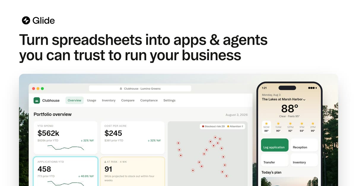
Glide — Design Reference
warm-paper workshop for everyday software
Source: https://www.glideapps.com
Theme: light
Category: SaaS
Mood: light, minimal, warm, photographic, typographic, calm
Captured: 2026-10-24
Overview
A calm, confident light-mode SaaS look: pure white pages with warm off-white panels, near-black type and buttons, and very little colour. The things that stand out are a heavy, tightly tracked grotesk for headlines, a serif used only for testimonials and big stats, and large cut-out photos of real places (a stage rig, a warehouse) sitting on white like props in a showroom. One dark band breaks up the long page, and aqua shows up only in small tags.
Technically it runs on Booton in odd variable weights (450 body, 575 headings) with negative tracking of about -0.02em, plus the Affairs serif for quotes and numbers. The neutrals are warm (#f5f5f2, #edede8, #eae6df) and the text is #000 and #5e5e5c. Buttons are pills in #171715, cards use 12–16px radii on flat warm-grey fills with almost no shadow, and the AI prompt box is the one raised object, with a soft long shadow. Spacing sits on a 4px grid with roomy 96–120px gaps between sections, all centred in a 1360px container.
Tokens — Colors
| Name |
Value |
Token |
Role |
| Paper White |
#ffffff |
--color-background |
Page background, card fills on integrations, prompt box and secondary pill button |
| Ink |
#000000 |
--color-foreground |
Headlines, body text, nav links; also the selected-product tile in the mobile menu |
| Soot |
#171715 |
--color-primary |
Primary pill button fill (Get started, Build it, Start for free) and input text |
| Graphite Band |
#1a1a1a |
--color-inverse-surface |
Full-width dark security/governance section and inverse surfaces |
| Slate Text |
#5e5e5c |
--color-muted-foreground |
Subheads, descriptions, sidebar filter links, secondary copy |
| Linen |
#f5f5f2 |
--color-secondary |
Pricing cards, mobile 'Glide Classic' tile, subtle card fills, hairline on white cards |
| Warm Mist |
#fbfbf9 |
--color-surface-subtle |
Large soft section grounds behind product screenshots |
| Oat |
#edede8 |
--color-tertiary |
Tertiary surface and divider lines in lists and tables |
| Sand |
#eae6df |
--color-surface-warm |
Warm feature cards (32px padding, 8px radius) |
| Pebble Line |
#d9dad3 |
--color-border |
1px outline on category chips and filter pills |
| Aqua Mist |
#e8f8fb |
--color-accent |
Tinted pill fill for use-case suggestion buttons and the 'Coming soon' tag |
| Deep Teal |
#0a4c55 |
--color-accent-foreground |
Text on aqua-tinted pills |
| Glide Aqua |
#099da2 |
--color-brand |
Accessible brand teal for 'Coming soon' label text and brand links |
| Raspberry |
#d92c55 |
--color-destructive |
Negative/error state colour from the design tokens |
Semantic roles
| Role |
Value |
| background |
#ffffff |
| surface |
#f5f5f2 |
| surface raised |
#ffffff |
| border |
#d9dad3 |
| text |
#000000 |
| text muted |
#5e5e5c |
| primary |
#171715 |
| primary text |
#ffffff |
| accent |
#e8f8fb |
| success |
#00824c |
| warning |
#c08000 |
| danger |
#d92c55 |
Tokens — Typography
- Display: Booton (575, 600, 700) — fallbacks: Inter Tight, Inter, Helvetica Neue, Arial, sans-serif. Variable grotesk. Headlines at weight 575 with -0.02em tracking and line-height 1.0–1.1. That in-between weight is what gives it its feel.
- Body: Booton (400, 450, 500, 600) — fallbacks: Inter, Helvetica Neue, Arial, sans-serif. Body at 16px/24px weight 450; nav and buttons at 14px, weight 450–600.
- Accent: Affairs (450) — fallbacks: Newsreader, Source Serif 4, Georgia, serif. Serif used only for testimonial quotes (28–40px) and giant stat numerals (92–184px, tracking about -0.03em).
| Role |
Size |
Line height |
Weight |
Letter spacing |
Family |
| Stat Numeral |
184px |
1.05 |
450 |
-5.52px |
accent |
| Display |
72px |
1 |
575 |
-1.44px |
display |
| H1 |
60px |
1 |
575 |
-1.2px |
display |
| H2 |
48px |
1 |
575 |
-0.96px |
display |
| Quote |
36px |
1.2 |
450 |
-0.36px |
accent |
| H3 / Price |
30px |
1.3 |
600 |
-0.3px |
display |
| Lead |
20px |
1.4 |
450 |
normal |
body |
| Body |
16px |
24px |
450 |
normal |
body |
| Small / UI |
14px |
20px |
450 |
normal |
body |
Tokens — Spacing & Layout
- Base unit: 4px
- Density: spacious
- Container max width: 1360px
- Section gap: 120px
- Card padding: 20px
- Scale: 4px, 6px, 8px, 12px, 16px, 20px, 24px, 32px, 48px, 56px, 96px, 120px
Tokens — Radius
| Element |
Value |
| Buttons, chips, search field |
9999px |
| Sidebar filter items, small nav buttons |
6px |
| Warm feature cards |
8px |
| Pricing cards |
12px |
| Integration and content cards |
16px |
| AI prompt box |
20px |
| Large media panels |
24px |
Tokens — Shadows
| Name |
Value |
Usage |
| Hairline lift |
0px 0px 1px 0px rgba(0,0,0,0.16), 0px 1px 2px 0px rgba(0,0,0,0.05) |
AI prompt box resting edge and subtle white cards |
| Flat light |
0px 1px 2px 0px rgba(0,0,0,0.05), 0px 0px 1px 0px rgba(0,0,0,0.16), 0px 0px 2px 0px rgba(0,0,0,0.1) |
White 'Contact sales' pill on white |
| Small drop |
0px 2px 5px -2px rgba(0,0,0,0.25) |
Small controls, avatars and toggles |
| Overlay float |
0px 0px 0px 1px rgba(0,0,0,0.1), 0px 7px 15px 0px rgba(0,0,0,0.1), 0px 27px 27px 0px rgba(0,0,0,0.08), 0px 60px 36px 0px rgba(0,0,0,0.06), 0px 106px 43px 0px rgba(0,0,0,0.02) |
Hero prompt composer and floating product screenshots: a long, soft, layered fall-off |
| Inset gloss |
inset 0px 1px 0px 0px rgba(255,255,255,0.5) |
Top highlight on dark pills over imagery |
Components
Primary pill button (button)
| Property |
Value |
| background |
#171715 |
| color |
#ffffff |
| border |
none |
| radius |
9999px |
| padding |
0 14px (height 32px); 0 20px at height 40px |
| font size |
14px |
| font weight |
450 |
| shadow |
none |
| hover |
background #000000 |
Get started / Build it / Start for free. On mobile menus it becomes full-width at about 56px tall.
Secondary white pill (button)
| Property |
Value |
| background |
#ffffff |
| color |
#000000 |
| border |
none |
| radius |
9999px |
| padding |
0 20px |
| font size |
14px |
| font weight |
575 |
| shadow |
0px 0px 2px rgba(0,0,0,0.1), 0px 0px 1px rgba(0,0,0,0.16), 0px 1px 2px rgba(0,0,0,0.05) |
| hover |
background #fafafa |
Contact sales. The shadow ring stands in for a border, height 40px.
Soft grey pill (button)
| Property |
Value |
| background |
rgba(0,0,0,0.06) |
| color |
#000000 |
| border |
none |
| radius |
9999px |
| padding |
0 20px |
| font size |
14px |
| font weight |
450 |
| shadow |
none |
| hover |
background rgba(0,0,0,0.1) |
Show more / Reset / Build for me. Tertiary actions.
Aqua suggestion chip (badge)
| Property |
Value |
| background |
#e8f8fb |
| color |
#0a4c55 |
| border |
none |
| radius |
9999px |
| padding |
16px 24px |
| font size |
16px |
| font weight |
600 |
| shadow |
none |
| hover |
background #cefafc |
Use-case prompts (portal, dashboard). A small version with #099da2 text holds the 'COMING SOON' label inside an outlined announcement pill.
AI prompt composer (input)
| Property |
Value |
| background |
#ffffff |
| color |
#171715 |
| border |
none |
| radius |
20px |
| padding |
12px 20px |
| font size |
16px |
| font weight |
450 |
| shadow |
0px 0px 0px 1px rgba(0,0,0,0.1), 0px 7px 15px rgba(0,0,0,0.1), 0px 27px 27px rgba(0,0,0,0.08), 0px 60px 36px rgba(0,0,0,0.06) |
| hover |
focus keeps the shadow; caret #171715 |
Borderless textarea with grey placeholder text. The bottom row has a paperclip 'Upload spreadsheet' link on the left and a black 'Build it' pill on the right.
Filter chip (button)
| Property |
Value |
| background |
transparent |
| color |
#000000 |
| border |
1px solid #d9dad3 |
| radius |
9999px |
| padding |
6px 14px |
| font size |
14px |
| font weight |
600 |
| shadow |
none |
| hover |
background #f5f5f2 |
Industry filters on customers. The sidebar variant has no border, 6px 12px padding, 8px radius, text #5e5e5c, and an active fill of #f5f5f2.
Content card (card)
| Property |
Value |
| background |
#ffffff |
| color |
#000000 |
| border |
1px solid #edede8 |
| radius |
16px |
| padding |
20px |
| shadow |
none |
| font size |
16px |
| font weight |
575 |
| hover |
border-color #d9dad3 |
Integration tiles: a 32px logo, a bold title, then a two-line description in #5e5e5c, clamped. Pricing cards use #f5f5f2 fill and 12px radius instead. The featured plan is #0e0e0d with a blurred photo and an inverted white CTA.
Top navigation (nav)
| Property |
Value |
| background |
#ffffff |
| color |
#000000 |
| border |
none |
| radius |
0 |
| padding |
12px 40px |
| font size |
14px |
| font weight |
450 |
| shadow |
none |
| hover |
item background rgba(0,0,0,0.06), radius 6px |
Logo on the left, five centred text links, and Log in / white Contact sales pill / black Get started pill on the right. No divider line.
Layout
Centred 1360px container. Heroes are centred: an announcement pill, a 60–72px headline on two lines, a grey lead paragraph about 700px wide, then the floating prompt composer. Sections are separated by 96–120px of white, with left-aligned two-tone headings (black line plus grey line) above 3-up card carousels or wide product screenshots on warm #fbfbf9 panels. One full-bleed #1a1a1a band handles security content. Pricing is a 5-column card row with check-list features below and #edede8 dividers. The integrations page uses a left filter sidebar with a 4-column card grid.
Imagery
Photoreal, cut-out 3D-ish scenes of real workplaces (concert stage rig, warehouse, job sites) set straight on white, with no frame. Plenty of documentary customer photography: small squares scattered around the customers hero, plus tall cards with a dark gradient and a serif quote. Product UI is shown in laptop and phone mockups. Colourful rounded-square app icons are used in grids. No illustrations and no gradient blobs.
Motion
Restrained. Hover states are colour or fill shifts (about 150–200ms ease). Carousels page with small circular arrow buttons. The prompt placeholder cycles through example requests like a typewriter. Logo strips and icon grids drift gently. No bouncy or springy motion.
Responsive
On phones the nav shrinks to the logo, a black 'Sign up' pill, a text 'Log in' and a hamburger. The hamburger opens a full-screen white sheet with a black 'Glide · Selected' product tile and a #f5f5f2 'Glide Classic' tile (8px radius). Links sit stacked at about 28px weight 600 with chevrons for submenus, followed by full-width pills: black 'Start building' and a grey rgba(0,0,0,0.06) 'Build for me'. The hero headline stays centred and wraps to four lines at about 44px. The lead text stays centred, the prompt composer goes nearly edge to edge with ~24px gutters, and the hero image swaps to a cropped single building. Grids collapse to one column, carousels become swipeable, and section gaps drop to about 64px.
Do
- Set headlines in Booton at weight 575 with about -0.02em tracking and line-height 1.0–1.1
- Write section titles as two tones: the first clause in #000000, the continuation in #5e5e5c
- Make every button a pill (9999px). Black #171715 is primary; a white pill with a shadow ring is secondary
- Use warm neutrals (#f5f5f2, #edede8, #eae6df, #fbfbf9) for surfaces, never cool greys
- Save the Affairs serif for testimonials and oversized stat numerals
- Make the AI prompt composer the only strongly raised element, with a long layered soft shadow
Don't
- Don't use aqua as a big fill or as the main CTA colour; it belongs in small tags and suggestion chips
- Don't add visible borders to primary cards; use flat warm fills or a 1px #edede8 hairline
- Don't use regular 400/700 weights for headings; the 575 in-between weight is the signature
- Don't use gradients, glows or illustrated mascots; use real photography and product UI
- Don't square off buttons or chips; only sidebar filters use small 6–8px radii
- Don't crowd sections; keep 96–120px between them
Agent prompt
Build a calm, warm-minimal light SaaS page: white #ffffff ground, text #000000 with secondary copy #5e5e5c, and warm surfaces #f5f5f2 / #fbfbf9 / #edede8 / #eae6df. Typeface is Booton (fallback Inter Tight): headlines weight 575, 60–72px, line-height 1, letter-spacing -0.02em; body 16px/24px weight 450; UI 14px. Use the Affairs serif (fallback Newsreader) only for 36px quotes and giant stat numbers. All buttons are pills: primary #171715 with white text, 14px, height 32–40px; secondary is white with a 0 0 1px rgba(0,0,0,.16), 0 1px 2px rgba(0,0,0,.05) ring; tertiary is rgba(0,0,0,.06). Accent only as aqua chips (#e8f8fb fill, #0a4c55 text, #099da2 labels). Cards are flat, 12–16px radius, 20px padding, no shadow, or a 1px #edede8 hairline. The hero is centred: an announcement pill, a two-line headline, a grey lead, then a white 20px-radius prompt box with a long layered soft shadow, an 'Upload spreadsheet' link and a black 'Build it' pill. Use cut-out photoreal workplace imagery on white, 1360px container, 4px grid, 96–120px section gaps, two-tone section headings, and one full-bleed #1a1a1a band.
CSS custom properties
/* Glide — CSS custom properties. Generated from style.json */
:root {
  /* Palette */
  --color-background: #ffffff; /* Page background, card fills on integrations, prompt box and secondary pill button */
  --color-foreground: #000000; /* Headlines, body text, nav links; also the selected-product tile in the mobile menu */
  --color-primary: #171715; /* Primary pill button fill (Get started, Build it, Start for free) and input text */
  --color-inverse-surface: #1a1a1a; /* Full-width dark security/governance section and inverse surfaces */
  --color-muted-foreground: #5e5e5c; /* Subheads, descriptions, sidebar filter links, secondary copy */
  --color-secondary: #f5f5f2; /* Pricing cards, mobile 'Glide Classic' tile, subtle card fills, hairline on white cards */
  --color-surface-subtle: #fbfbf9; /* Large soft section grounds behind product screenshots */
  --color-tertiary: #edede8; /* Tertiary surface and divider lines in lists and tables */
  --color-surface-warm: #eae6df; /* Warm feature cards (32px padding, 8px radius) */
  --color-border: #d9dad3; /* 1px outline on category chips and filter pills */
  --color-accent: #e8f8fb; /* Tinted pill fill for use-case suggestion buttons and the 'Coming soon' tag */
  --color-accent-foreground: #0a4c55; /* Text on aqua-tinted pills */
  --color-brand: #099da2; /* Accessible brand teal for 'Coming soon' label text and brand links */
  --color-destructive: #d92c55; /* Negative/error state colour from the design tokens */

  /* Semantic roles */
  --background: #ffffff;
  --surface: #f5f5f2;
  --surface-raised: #ffffff;
  --border: #d9dad3;
  --text: #000000;
  --text-muted: #5e5e5c;
  --primary: #171715;
  --primary-text: #ffffff;
  --accent: #e8f8fb;
  --success: #00824c;
  --warning: #c08000;
  --danger: #d92c55;

  /* Typography */
  --font-display: Booton, 'Inter Tight', Inter, 'Helvetica Neue', Arial, sans-serif;
  --font-body: Booton, Inter, 'Helvetica Neue', Arial, sans-serif;
  --font-accent: Affairs, Newsreader, 'Source Serif 4', Georgia, serif;
  --text-stat-numeral: 184px;
  --text-stat-numeral--line-height: 1.05;
  --text-stat-numeral--letter-spacing: -5.52px;
  --text-stat-numeral--font-weight: 450;
  --text-display: 72px;
  --text-display--line-height: 1;
  --text-display--letter-spacing: -1.44px;
  --text-display--font-weight: 575;
  --text-h1: 60px;
  --text-h1--line-height: 1;
  --text-h1--letter-spacing: -1.2px;
  --text-h1--font-weight: 575;
  --text-h2: 48px;
  --text-h2--line-height: 1;
  --text-h2--letter-spacing: -0.96px;
  --text-h2--font-weight: 575;
  --text-quote: 36px;
  --text-quote--line-height: 1.2;
  --text-quote--letter-spacing: -0.36px;
  --text-quote--font-weight: 450;
  --text-h3-price: 30px;
  --text-h3-price--line-height: 1.3;
  --text-h3-price--letter-spacing: -0.3px;
  --text-h3-price--font-weight: 600;
  --text-lead: 20px;
  --text-lead--line-height: 1.4;
  --text-lead--letter-spacing: normal;
  --text-lead--font-weight: 450;
  --text-body: 16px;
  --text-body--line-height: 24px;
  --text-body--letter-spacing: normal;
  --text-body--font-weight: 450;
  --text-small-ui: 14px;
  --text-small-ui--line-height: 20px;
  --text-small-ui--letter-spacing: normal;
  --text-small-ui--font-weight: 450;

  /* Spacing */
  --space-1: 4px;
  --space-2: 6px;
  --space-3: 8px;
  --space-4: 12px;
  --space-5: 16px;
  --space-6: 20px;
  --space-7: 24px;
  --space-8: 32px;
  --space-9: 48px;
  --space-10: 56px;
  --space-11: 96px;
  --space-12: 120px;
  --container: 1360px;
  --section-gap: 120px;

  /* Radius */
  --radius-buttons-chips-search-field: 9999px;
  --radius-sidebar-filter-items-small-nav-buttons: 6px;
  --radius-warm-feature-cards: 8px;
  --radius-pricing-cards: 12px;
  --radius-integration-and-content-cards: 16px;
  --radius-ai-prompt-box: 20px;
  --radius-large-media-panels: 24px;

  /* Shadows */
  --shadow-hairline-lift: 0px 0px 1px 0px rgba(0,0,0,0.16), 0px 1px 2px 0px rgba(0,0,0,0.05);
  --shadow-flat-light: 0px 1px 2px 0px rgba(0,0,0,0.05), 0px 0px 1px 0px rgba(0,0,0,0.16), 0px 0px 2px 0px rgba(0,0,0,0.1);
  --shadow-small-drop: 0px 2px 5px -2px rgba(0,0,0,0.25);
  --shadow-overlay-float: 0px 0px 0px 1px rgba(0,0,0,0.1), 0px 7px 15px 0px rgba(0,0,0,0.1), 0px 27px 27px 0px rgba(0,0,0,0.08), 0px 60px 36px 0px rgba(0,0,0,0.06), 0px 106px 43px 0px rgba(0,0,0,0.02);
  --shadow-inset-gloss: inset 0px 1px 0px 0px rgba(255,255,255,0.5);
}
Tailwind v4 theme
/* Glide — Tailwind CSS v4 theme. Import after tailwindcss: @import "tailwindcss"; then paste this block. */
@theme {
  --color-background: #ffffff;
  --color-foreground: #000000;
  --color-primary: #171715;
  --color-inverse-surface: #1a1a1a;
  --color-muted-foreground: #5e5e5c;
  --color-secondary: #f5f5f2;
  --color-surface-subtle: #fbfbf9;
  --color-tertiary: #edede8;
  --color-surface-warm: #eae6df;
  --color-border: #d9dad3;
  --color-accent: #e8f8fb;
  --color-accent-foreground: #0a4c55;
  --color-brand: #099da2;
  --color-destructive: #d92c55;
  --color-background: #ffffff;
  --color-surface: #f5f5f2;
  --color-surface-raised: #ffffff;
  --color-border: #d9dad3;
  --color-text: #000000;
  --color-text-muted: #5e5e5c;
  --color-primary: #171715;
  --color-primary-text: #ffffff;
  --color-accent: #e8f8fb;
  --color-success: #00824c;
  --color-warning: #c08000;
  --color-danger: #d92c55;
  --font-display: Booton, 'Inter Tight', Inter, 'Helvetica Neue', Arial, sans-serif;
  --font-body: Booton, Inter, 'Helvetica Neue', Arial, sans-serif;
  --font-accent: Affairs, Newsreader, 'Source Serif 4', Georgia, serif;
  --text-stat-numeral: 184px;
  --text-stat-numeral--line-height: 1.05;
  --text-stat-numeral--letter-spacing: -5.52px;
  --text-stat-numeral--font-weight: 450;
  --text-display: 72px;
  --text-display--line-height: 1;
  --text-display--letter-spacing: -1.44px;
  --text-display--font-weight: 575;
  --text-h1: 60px;
  --text-h1--line-height: 1;
  --text-h1--letter-spacing: -1.2px;
  --text-h1--font-weight: 575;
  --text-h2: 48px;
  --text-h2--line-height: 1;
  --text-h2--letter-spacing: -0.96px;
  --text-h2--font-weight: 575;
  --text-quote: 36px;
  --text-quote--line-height: 1.2;
  --text-quote--letter-spacing: -0.36px;
  --text-quote--font-weight: 450;
  --text-h3-price: 30px;
  --text-h3-price--line-height: 1.3;
  --text-h3-price--letter-spacing: -0.3px;
  --text-h3-price--font-weight: 600;
  --text-lead: 20px;
  --text-lead--line-height: 1.4;
  --text-lead--letter-spacing: normal;
  --text-lead--font-weight: 450;
  --text-body: 16px;
  --text-body--line-height: 24px;
  --text-body--letter-spacing: normal;
  --text-body--font-weight: 450;
  --text-small-ui: 14px;
  --text-small-ui--line-height: 20px;
  --text-small-ui--letter-spacing: normal;
  --text-small-ui--font-weight: 450;
  --radius-buttons-chips-search-field: 9999px;
  --radius-sidebar-filter-items-small-nav-buttons: 6px;
  --radius-warm-feature-cards: 8px;
  --radius-pricing-cards: 12px;
  --radius-integration-and-content-cards: 16px;
  --radius-ai-prompt-box: 20px;
  --radius-large-media-panels: 24px;
  --shadow-hairline-lift: 0px 0px 1px 0px rgba(0,0,0,0.16), 0px 1px 2px 0px rgba(0,0,0,0.05);
  --shadow-flat-light: 0px 1px 2px 0px rgba(0,0,0,0.05), 0px 0px 1px 0px rgba(0,0,0,0.16), 0px 0px 2px 0px rgba(0,0,0,0.1);
  --shadow-small-drop: 0px 2px 5px -2px rgba(0,0,0,0.25);
  --shadow-overlay-float: 0px 0px 0px 1px rgba(0,0,0,0.1), 0px 7px 15px 0px rgba(0,0,0,0.1), 0px 27px 27px 0px rgba(0,0,0,0.08), 0px 60px 36px 0px rgba(0,0,0,0.06), 0px 106px 43px 0px rgba(0,0,0,0.02);
  --shadow-inset-gloss: inset 0px 1px 0px 0px rgba(255,255,255,0.5);
  --container-site: 1360px;
}
Theme tokens — light + dark
The shadcn-named layer DevDojo Sites speaks (bg-background, text-foreground, bg-primary, rounded-medium…). Paste into site.css after @import "tailwindcss" to restyle any site in this look.
/* Glide — DevDojo theme tokens (light + dark). Generated from style.json. */
/* Drop into site.css after @import "tailwindcss": bg-background, text-foreground, bg-primary, border-border, rounded-medium… all read these. Dark mode: estimated — the site has no dark scheme, so the .dark half is a plausible twin of its palette. */
@custom-variant dark (&:where(.dark, .dark *));

:root {
    color-scheme: light;

    --background: #ffffff;
    --foreground: #000000;
    --card: #ffffff;
    --card-foreground: #000000;
    --popover: #ffffff; /* estimated */
    --popover-foreground: #000000; /* estimated */
    --primary: #171715;
    --primary-foreground: #ffffff;
    --secondary: #f5f5f2;
    --secondary-foreground: #000000;
    --muted: #f5f5f2;
    --muted-foreground: #5e5e5c;
    --accent: #e8f8fb;
    --accent-foreground: #0a4c55;
    --destructive: #d92c55;
    --destructive-foreground: #ffffff; /* estimated */
    --border: #edede8;
    --input: #d9dad3;
    --ring: #171715; /* estimated */

    --radius-small: 6px;
    --radius-medium: 12px;
    --radius-large: 16px;
    --radius: var(--radius-medium);

    --font-display: Booton, 'Inter Tight', Inter, 'Helvetica Neue', Arial, sans-serif;
    --font-body: Booton, Inter, 'Helvetica Neue', Arial, sans-serif;
}

.dark {
    color-scheme: dark;
    /* estimated from the light palette */

    --background: #0e0e0d;
    --foreground: #fbfbf9;
    --card: #1a1a1a;
    --card-foreground: #fbfbf9;
    --popover: #252525;
    --popover-foreground: #fbfbf9;
    --primary: #fbfbf9;
    --primary-foreground: #171715;
    --secondary: #252525;
    --secondary-foreground: #fbfbf9;
    --muted: #252525;
    --muted-foreground: #a3a3a3;
    --accent: #034244;
    --accent-foreground: #71eaee;
    --destructive: #ff3d64;
    --destructive-foreground: #000000;
    --border: rgba(255,255,255,0.1);
    --input: rgba(255,255,255,0.16);
    --ring: #71eaee;
}

@theme inline {
    --color-background: var(--background);
    --color-foreground: var(--foreground);
    --color-card: var(--card);
    --color-card-foreground: var(--card-foreground);
    --color-popover: var(--popover);
    --color-popover-foreground: var(--popover-foreground);
    --color-primary: var(--primary);
    --color-primary-foreground: var(--primary-foreground);
    --color-secondary: var(--secondary);
    --color-secondary-foreground: var(--secondary-foreground);
    --color-muted: var(--muted);
    --color-muted-foreground: var(--muted-foreground);
    --color-accent: var(--accent);
    --color-accent-foreground: var(--accent-foreground);
    --color-destructive: var(--destructive);
    --color-destructive-foreground: var(--destructive-foreground);
    --color-border: var(--border);
    --color-input: var(--input);
    --color-ring: var(--ring);
    --radius-small: var(--radius-small);
    --radius-medium: var(--radius-medium);
    --radius-large: var(--radius-large);
    --font-display: var(--font-display);
    --font-body: var(--font-body);
}
Glide — Style Reference
warm-paper workshop for everyday software
Theme: light · Mood: light, minimal, warm, photographic, typographic, calm
A calm, confident light-mode SaaS look: pure white pages with warm off-white panels, near-black type and buttons, and very little colour. The things that stand out are a heavy, tightly tracked grotesk for headlines, a serif used only for testimonials and big stats, and large cut-out photos of real places (a stage rig, a warehouse) sitting on white like props in a showroom. One dark band breaks up the long page, and aqua shows up only in small tags.
Tokens — Colors
| Name |
Value |
Token |
Role |
| Paper White |
#ffffff |
--background |
Page background, card fills on integrations, prompt box and secondary pill button |
| Ink |
#000000 |
--foreground |
Headlines, body text, nav links; also the selected-product tile in the mobile menu |
| Soot |
#171715 |
--primary |
Primary pill button fill (Get started, Build it, Start for free) and input text |
| Graphite Band |
#1a1a1a |
--inverse-surface |
Full-width dark security/governance section and inverse surfaces |
| Slate Text |
#5e5e5c |
--muted-foreground |
Subheads, descriptions, sidebar filter links, secondary copy |
| Linen |
#f5f5f2 |
--secondary |
Pricing cards, mobile 'Glide Classic' tile, subtle card fills, hairline on white cards |
| Warm Mist |
#fbfbf9 |
--surface-subtle |
Large soft section grounds behind product screenshots |
| Oat |
#edede8 |
--tertiary |
Tertiary surface and divider lines in lists and tables |
| Sand |
#eae6df |
--surface-warm |
Warm feature cards (32px padding, 8px radius) |
| Pebble Line |
#d9dad3 |
--border |
1px outline on category chips and filter pills |
| Aqua Mist |
#e8f8fb |
--accent |
Tinted pill fill for use-case suggestion buttons and the 'Coming soon' tag |
| Deep Teal |
#0a4c55 |
--accent-foreground |
Text on aqua-tinted pills |
| Glide Aqua |
#099da2 |
--brand |
Accessible brand teal for 'Coming soon' label text and brand links |
| Raspberry |
#d92c55 |
--destructive |
Negative/error state colour from the design tokens |
Tokens — Typography
- Display: Booton (Inter Tight, Inter, Helvetica Neue, Arial, sans-serif) — weights 575/600/700
- Body: Booton (Inter, Helvetica Neue, Arial, sans-serif) — weights 400/450/500/600
- Accent: Affairs (Newsreader, Source Serif 4, Georgia, serif) — weights 450
Tokens — Radius
| Element |
Value |
| Buttons, chips, search field |
9999px |
| Sidebar filter items, small nav buttons |
6px |
| Warm feature cards |
8px |
| Pricing cards |
12px |
| Integration and content cards |
16px |
| AI prompt box |
20px |
| Large media panels |
24px |
Do
- Set headlines in Booton at weight 575 with about -0.02em tracking and line-height 1.0–1.1
- Write section titles as two tones: the first clause in #000000, the continuation in #5e5e5c
- Make every button a pill (9999px). Black #171715 is primary; a white pill with a shadow ring is secondary
- Use warm neutrals (#f5f5f2, #edede8, #eae6df, #fbfbf9) for surfaces, never cool greys
- Save the Affairs serif for testimonials and oversized stat numerals
- Make the AI prompt composer the only strongly raised element, with a long layered soft shadow
Don't
- Don't use aqua as a big fill or as the main CTA colour; it belongs in small tags and suggestion chips
- Don't add visible borders to primary cards; use flat warm fills or a 1px #edede8 hairline
- Don't use regular 400/700 weights for headings; the 575 in-between weight is the signature
- Don't use gradients, glows or illustrated mascots; use real photography and product UI
- Don't square off buttons or chips; only sidebar filters use small 6–8px radii
- Don't crowd sections; keep 96–120px between them
{
  "$name": "Glide",
  "$source": "https://www.glideapps.com",
  "$theme": "light",
  "$generated": "inspiration library",
  "color": {
    "background": {
      "$type": "color",
      "$value": "#ffffff",
      "$description": "Page background, card fills on integrations, prompt box and secondary pill button"
    },
    "foreground": {
      "$type": "color",
      "$value": "#000000",
      "$description": "Headlines, body text, nav links; also the selected-product tile in the mobile menu"
    },
    "primary": {
      "$type": "color",
      "$value": "#171715",
      "$description": "Primary pill button fill (Get started, Build it, Start for free) and input text"
    },
    "inverse-surface": {
      "$type": "color",
      "$value": "#1a1a1a",
      "$description": "Full-width dark security/governance section and inverse surfaces"
    },
    "muted-foreground": {
      "$type": "color",
      "$value": "#5e5e5c",
      "$description": "Subheads, descriptions, sidebar filter links, secondary copy"
    },
    "secondary": {
      "$type": "color",
      "$value": "#f5f5f2",
      "$description": "Pricing cards, mobile 'Glide Classic' tile, subtle card fills, hairline on white cards"
    },
    "surface-subtle": {
      "$type": "color",
      "$value": "#fbfbf9",
      "$description": "Large soft section grounds behind product screenshots"
    },
    "tertiary": {
      "$type": "color",
      "$value": "#edede8",
      "$description": "Tertiary surface and divider lines in lists and tables"
    },
    "surface-warm": {
      "$type": "color",
      "$value": "#eae6df",
      "$description": "Warm feature cards (32px padding, 8px radius)"
    },
    "border": {
      "$type": "color",
      "$value": "#d9dad3",
      "$description": "1px outline on category chips and filter pills"
    },
    "accent": {
      "$type": "color",
      "$value": "#e8f8fb",
      "$description": "Tinted pill fill for use-case suggestion buttons and the 'Coming soon' tag"
    },
    "accent-foreground": {
      "$type": "color",
      "$value": "#0a4c55",
      "$description": "Text on aqua-tinted pills"
    },
    "brand": {
      "$type": "color",
      "$value": "#099da2",
      "$description": "Accessible brand teal for 'Coming soon' label text and brand links"
    },
    "destructive": {
      "$type": "color",
      "$value": "#d92c55",
      "$description": "Negative/error state colour from the design tokens"
    }
  },
  "role": {
    "background": {
      "$type": "color",
      "$value": "#ffffff"
    },
    "surface": {
      "$type": "color",
      "$value": "#f5f5f2"
    },
    "surface_raised": {
      "$type": "color",
      "$value": "#ffffff"
    },
    "border": {
      "$type": "color",
      "$value": "#d9dad3"
    },
    "text": {
      "$type": "color",
      "$value": "#000000"
    },
    "text_muted": {
      "$type": "color",
      "$value": "#5e5e5c"
    },
    "primary": {
      "$type": "color",
      "$value": "#171715"
    },
    "primary_text": {
      "$type": "color",
      "$value": "#ffffff"
    },
    "accent": {
      "$type": "color",
      "$value": "#e8f8fb"
    },
    "success": {
      "$type": "color",
      "$value": "#00824c"
    },
    "warning": {
      "$type": "color",
      "$value": "#c08000"
    },
    "danger": {
      "$type": "color",
      "$value": "#d92c55"
    }
  },
  "fontFamily": {
    "display": {
      "$type": "fontFamily",
      "$value": [
        "Booton",
        "Inter Tight",
        "Inter",
        "Helvetica Neue",
        "Arial",
        "sans-serif"
      ],
      "$description": "Variable grotesk. Headlines at weight 575 with -0.02em tracking and line-height 1.0–1.1. That in-between weight is what gives it its feel."
    },
    "body": {
      "$type": "fontFamily",
      "$value": [
        "Booton",
        "Inter",
        "Helvetica Neue",
        "Arial",
        "sans-serif"
      ],
      "$description": "Body at 16px/24px weight 450; nav and buttons at 14px, weight 450–600."
    },
    "accent": {
      "$type": "fontFamily",
      "$value": [
        "Affairs",
        "Newsreader",
        "Source Serif 4",
        "Georgia",
        "serif"
      ],
      "$description": "Serif used only for testimonial quotes (28–40px) and giant stat numerals (92–184px, tracking about -0.03em)."
    }
  },
  "typography": {
    "stat-numeral": {
      "$type": "typography",
      "$value": {
        "fontFamily": "{fontFamily.accent}",
        "fontSize": "184px",
        "lineHeight": "1.05",
        "fontWeight": 450,
        "letterSpacing": "-5.52px"
      }
    },
    "display": {
      "$type": "typography",
      "$value": {
        "fontFamily": "{fontFamily.display}",
        "fontSize": "72px",
        "lineHeight": "1",
        "fontWeight": 575,
        "letterSpacing": "-1.44px"
      }
    },
    "h1": {
      "$type": "typography",
      "$value": {
        "fontFamily": "{fontFamily.display}",
        "fontSize": "60px",
        "lineHeight": "1",
        "fontWeight": 575,
        "letterSpacing": "-1.2px"
      }
    },
    "h2": {
      "$type": "typography",
      "$value": {
        "fontFamily": "{fontFamily.display}",
        "fontSize": "48px",
        "lineHeight": "1",
        "fontWeight": 575,
        "letterSpacing": "-0.96px"
      }
    },
    "quote": {
      "$type": "typography",
      "$value": {
        "fontFamily": "{fontFamily.accent}",
        "fontSize": "36px",
        "lineHeight": "1.2",
        "fontWeight": 450,
        "letterSpacing": "-0.36px"
      }
    },
    "h3-price": {
      "$type": "typography",
      "$value": {
        "fontFamily": "{fontFamily.display}",
        "fontSize": "30px",
        "lineHeight": "1.3",
        "fontWeight": 600,
        "letterSpacing": "-0.3px"
      }
    },
    "lead": {
      "$type": "typography",
      "$value": {
        "fontFamily": "{fontFamily.body}",
        "fontSize": "20px",
        "lineHeight": "1.4",
        "fontWeight": 450,
        "letterSpacing": "normal"
      }
    },
    "body": {
      "$type": "typography",
      "$value": {
        "fontFamily": "{fontFamily.body}",
        "fontSize": "16px",
        "lineHeight": "24px",
        "fontWeight": 450,
        "letterSpacing": "normal"
      }
    },
    "small-ui": {
      "$type": "typography",
      "$value": {
        "fontFamily": "{fontFamily.body}",
        "fontSize": "14px",
        "lineHeight": "20px",
        "fontWeight": 450,
        "letterSpacing": "normal"
      }
    }
  },
  "spacing": {
    "1": {
      "$type": "dimension",
      "$value": "4px"
    },
    "2": {
      "$type": "dimension",
      "$value": "6px"
    },
    "3": {
      "$type": "dimension",
      "$value": "8px"
    },
    "4": {
      "$type": "dimension",
      "$value": "12px"
    },
    "5": {
      "$type": "dimension",
      "$value": "16px"
    },
    "6": {
      "$type": "dimension",
      "$value": "20px"
    },
    "7": {
      "$type": "dimension",
      "$value": "24px"
    },
    "8": {
      "$type": "dimension",
      "$value": "32px"
    },
    "9": {
      "$type": "dimension",
      "$value": "48px"
    },
    "10": {
      "$type": "dimension",
      "$value": "56px"
    },
    "11": {
      "$type": "dimension",
      "$value": "96px"
    },
    "12": {
      "$type": "dimension",
      "$value": "120px"
    }
  },
  "radius": {
    "buttons-chips-search-field": {
      "$type": "dimension",
      "$value": "9999px"
    },
    "sidebar-filter-items-small-nav-buttons": {
      "$type": "dimension",
      "$value": "6px"
    },
    "warm-feature-cards": {
      "$type": "dimension",
      "$value": "8px"
    },
    "pricing-cards": {
      "$type": "dimension",
      "$value": "12px"
    },
    "integration-and-content-cards": {
      "$type": "dimension",
      "$value": "16px"
    },
    "ai-prompt-box": {
      "$type": "dimension",
      "$value": "20px"
    },
    "large-media-panels": {
      "$type": "dimension",
      "$value": "24px"
    }
  },
  "shadow": {
    "hairline-lift": {
      "$type": "shadow",
      "$value": "0px 0px 1px 0px rgba(0,0,0,0.16), 0px 1px 2px 0px rgba(0,0,0,0.05)",
      "$description": "AI prompt box resting edge and subtle white cards"
    },
    "flat-light": {
      "$type": "shadow",
      "$value": "0px 1px 2px 0px rgba(0,0,0,0.05), 0px 0px 1px 0px rgba(0,0,0,0.16), 0px 0px 2px 0px rgba(0,0,0,0.1)",
      "$description": "White 'Contact sales' pill on white"
    },
    "small-drop": {
      "$type": "shadow",
      "$value": "0px 2px 5px -2px rgba(0,0,0,0.25)",
      "$description": "Small controls, avatars and toggles"
    },
    "overlay-float": {
      "$type": "shadow",
      "$value": "0px 0px 0px 1px rgba(0,0,0,0.1), 0px 7px 15px 0px rgba(0,0,0,0.1), 0px 27px 27px 0px rgba(0,0,0,0.08), 0px 60px 36px 0px rgba(0,0,0,0.06), 0px 106px 43px 0px rgba(0,0,0,0.02)",
      "$description": "Hero prompt composer and floating product screenshots: a long, soft, layered fall-off"
    },
    "inset-gloss": {
      "$type": "shadow",
      "$value": "inset 0px 1px 0px 0px rgba(255,255,255,0.5)",
      "$description": "Top highlight on dark pills over imagery"
    }
  },
  "component": {
    "primary-pill-button": {
      "kind": "button",
      "background": "#171715",
      "color": "#ffffff",
      "border": "none",
      "radius": "9999px",
      "padding": "0 14px (height 32px); 0 20px at height 40px",
      "font_size": "14px",
      "font_weight": 450,
      "shadow": "none",
      "hover": "background #000000",
      "notes": "Get started / Build it / Start for free. On mobile menus it becomes full-width at about 56px tall."
    },
    "secondary-white-pill": {
      "kind": "button",
      "background": "#ffffff",
      "color": "#000000",
      "border": "none",
      "radius": "9999px",
      "padding": "0 20px",
      "font_size": "14px",
      "font_weight": 575,
      "shadow": "0px 0px 2px rgba(0,0,0,0.1), 0px 0px 1px rgba(0,0,0,0.16), 0px 1px 2px rgba(0,0,0,0.05)",
      "hover": "background #fafafa",
      "notes": "Contact sales. The shadow ring stands in for a border, height 40px."
    },
    "soft-grey-pill": {
      "kind": "button",
      "background": "rgba(0,0,0,0.06)",
      "color": "#000000",
      "border": "none",
      "radius": "9999px",
      "padding": "0 20px",
      "font_size": "14px",
      "font_weight": 450,
      "shadow": "none",
      "hover": "background rgba(0,0,0,0.1)",
      "notes": "Show more / Reset / Build for me. Tertiary actions."
    },
    "aqua-suggestion-chip": {
      "kind": "badge",
      "background": "#e8f8fb",
      "color": "#0a4c55",
      "border": "none",
      "radius": "9999px",
      "padding": "16px 24px",
      "font_size": "16px",
      "font_weight": 600,
      "shadow": "none",
      "hover": "background #cefafc",
      "notes": "Use-case prompts (portal, dashboard). A small version with #099da2 text holds the 'COMING SOON' label inside an outlined announcement pill."
    },
    "ai-prompt-composer": {
      "kind": "input",
      "background": "#ffffff",
      "color": "#171715",
      "border": "none",
      "radius": "20px",
      "padding": "12px 20px",
      "font_size": "16px",
      "font_weight": 450,
      "shadow": "0px 0px 0px 1px rgba(0,0,0,0.1), 0px 7px 15px rgba(0,0,0,0.1), 0px 27px 27px rgba(0,0,0,0.08), 0px 60px 36px rgba(0,0,0,0.06)",
      "hover": "focus keeps the shadow; caret #171715",
      "notes": "Borderless textarea with grey placeholder text. The bottom row has a paperclip 'Upload spreadsheet' link on the left and a black 'Build it' pill on the right."
    },
    "filter-chip": {
      "kind": "button",
      "background": "transparent",
      "color": "#000000",
      "border": "1px solid #d9dad3",
      "radius": "9999px",
      "padding": "6px 14px",
      "font_size": "14px",
      "font_weight": 600,
      "shadow": "none",
      "hover": "background #f5f5f2",
      "notes": "Industry filters on customers. The sidebar variant has no border, 6px 12px padding, 8px radius, text #5e5e5c, and an active fill of #f5f5f2."
    },
    "content-card": {
      "kind": "card",
      "background": "#ffffff",
      "color": "#000000",
      "border": "1px solid #edede8",
      "radius": "16px",
      "padding": "20px",
      "shadow": "none",
      "font_size": "16px",
      "font_weight": 575,
      "hover": "border-color #d9dad3",
      "notes": "Integration tiles: a 32px logo, a bold title, then a two-line description in #5e5e5c, clamped. Pricing cards use #f5f5f2 fill and 12px radius instead. The featured plan is #0e0e0d with a blurred photo and an inverted white CTA."
    },
    "top-navigation": {
      "kind": "nav",
      "background": "#ffffff",
      "color": "#000000",
      "border": "none",
      "radius": "0",
      "padding": "12px 40px",
      "font_size": "14px",
      "font_weight": 450,
      "shadow": "none",
      "hover": "item background rgba(0,0,0,0.06), radius 6px",
      "notes": "Logo on the left, five centred text links, and Log in / white Contact sales pill / black Get started pill on the right. No divider line."
    }
  }
}