

We know that forms are an essential component in web apps. They are specially used to interact with the end-users. It helps to collect data from the end-users and perform operations accordingly. They are widely used in Sign-up and Sign-in processes or registering any query. It is a primary component that enables text-based interaction with the end-user. Therefore, how convenient the forms fields are to fill determines the overall user experience of the site as well. Hence, it is very necessary to keep the form component simple, easy, and efficient in a web application.
Here, we are going to explore the integration of form components in React environment by using the react-hook-form package. This package offers performant, flexible, and extensible forms with easy-to-use validation. It is lightweight, adaptable, and also delivers high-performance scale to the forms. Simply put, it delivers a high-performance form with a validation function with just a few lines of code.
So, let's get started!
Installation
In order to install this package, we need to execute the following code in the project terminal:
npm install react-hook-form
Then, we need to the useForm hook provided by the react-hook-form package in the App.js file as shown in the code snippet below:
import { useForm } from "react-hook-form";
Getting started with the implementation
Now, we need to define a state and a function by using the useForm hook as shown in the code snippet below:
export default () => {
  const { register, handleSubmit} = useForm();
Here, the register state function can be kept as a reference to the elements using ref property. This register function can be applied with validation rule later on which will automatically error messages based on input element name property. The handleSubmit function is used to callback the function to be executed after the form has been submitted. This is to be kept in the onSubmit event property of the form element. The overall implementation is shown in the code snippet below:
<form onSubmit={handleSubmit(onSubmit)}>
      <input name="username" type="text" ref={register} />

       <input name="password" type="password" ref={register} />

      <input type="submit" />
 </form>
The onSubmit callback method is provided in the code snippet below:
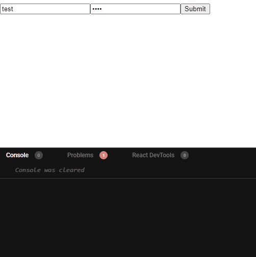
const onSubmit = (data) => console.log(data);
Hence, as the form is submitted handleSubmit function triggers which calls the onSubmit method and logs the input data as demonstrated in the demo below:
 View Website
 View Website
 View Website
Applying Validations
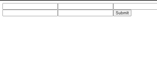
As said before, validation rules are to applied inside the register function from the useForm hook. It registers the rules to the particular input field and triggers the validation process once the user submits the form. Then if the input data is not valid then we can show the error message using the error object that will have the input field name property. The simple implementation of validations in input fields are shown in the code snippet below:
      <input
        name="firstName"
        ref={register({ required: true, minLength: 20 })}
      />
      {errors.firstName && <p>firstName error</p>}
      <input name="age" type="number" ref={register({ min: 18, max: 60 })} />
Hence, we can see the result of validation along with the error message in the demo below:
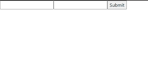
We can also customize our error message by adding a message property along with a value in the validation rule. We can access the message using the name property of the input field as shown in the code snippet below:
    <input
        name="firstName"
        ref={register({ required: true, minLength: {value:20,message:"minimum 20"} })}
      />
      {errors?.firstName && "firstName"+errors?.firstName?.message}
Here, we have allied the tertiary conditional operation for showing the error message.
Hence, we will get the result as shown in the demo below:
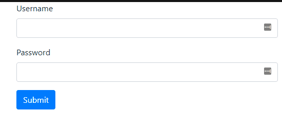
Applying Bootstrap Styles
In this step, we are going to apply the bootstrap styles to our form component. For installation, you can refer to the official documentation.
After the successful installation, we need to import the bootstrap CSS file to our App.js file as shown in the code snippet below:
import "bootstrap/dist/css/bootstrap.css";
Now, we can apply the bootstrap class styles to the template elements as shown in the code snippet below:
<div
    className="m-auto"
  >
    <form className="container wasValidated" onSubmit={handleSubmit(onSubmit)}>
    <div className="form-group">
            <label htmlFor="email">Username</label>

      <input

             className={
              errors?.username ? "is-invalid form-control" : "form-control"
            }
        name="username"
        ref={register({ required: true, minLength: {value:20,message:"require minimum 20"} })}
      />
      <div className="invalid-feedback">{errors?.username?.message}</div>
      </div>
      <div className="form-group">
            <label htmlFor="password">Password</label>
            <input
              name="password"
              ref={register({
                minLength: {
                  value: 8,
                  message: "password must have min length of 8"
                },
                required: {
                  value: true,
                  message: "password is required"
                },
                maxLength: {
                  value: 15,
                  message: "password must have max length of 15"
                }
              })}
              type="password"
              className={
                errors?.password ? "is-invalid form-control" : "form-control"
              }
              id="password"
            />

            <div className="invalid-feedback">{errors?.password?.message}</div>
          </div>

          <button type="submit" className="btn btn-primary">
            Submit
          </button>
    </form>
The above example demonstrates the use of the useForm hook in the form elements along with bootstrap style classes. This will make the form look modern, standard, and intuitive. The result after the addition of bootstrap style is shown in the demo below:
Finally, we have successfully added a complete form with a validation feature using the useForm hook from the react-hook-form package.
Conclusion
The main objective of this tutorial was to explore the use of the useForm hook provided by the react-hook-form package. We can see that the overall validation process becomes simpler and easy by applying this hook. Moreover, we are able to add custom validation messages in the input field references itself which is easily accessible using the input field name property. This makes it easy to display error messages based on individual input fields. Lastly, we also added some style classes from bootstrap to make our form complete in terms of UI as well as functionality.
The overall code and demo of the tutorial is available on codesandbox.
Comments (0)