Brand & product
Pulse
Identity and app design for a health startup that wanted to feel like a coach, not a chart.
- Client
- Pulse Health
- Role
- Design lead
- Year
- 2026
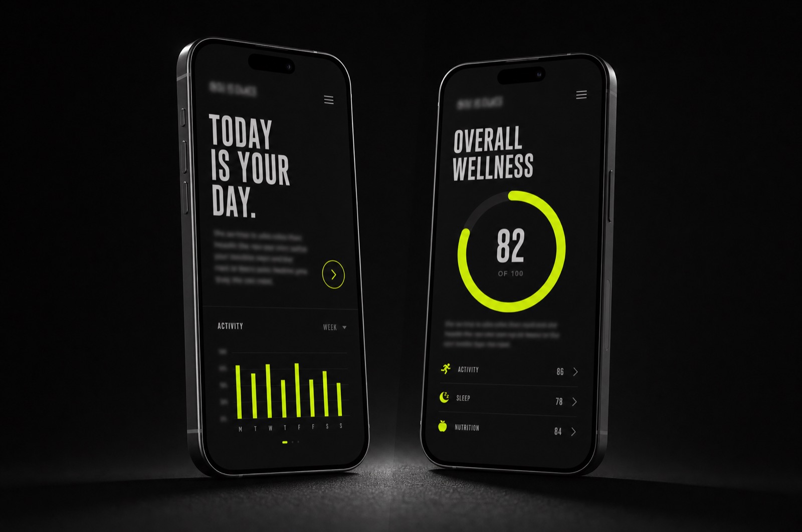
Health apps default to two moods: clinical white or gamified candy. Pulse wanted neither — they wanted the tone of a good coach. Direct, warm, and honest about hard weeks.
An identity built on type
The brand is carried almost entirely by typography: a condensed display face that speaks in short, uppercase encouragements, paired with a humanist text face for the numbers and notes. No mascots, no confetti.
In the product, the day view leads with one sentence — written by the system from your actual data — instead of a ring to close. The sentence changed everything about how the app feels.
The result
We shipped the identity, the marketing site, and the first product release in one coordinated push. Week-four retention beat the category benchmark by double digits, and the App Store reviews kept using the word we designed for: honest.