01
Meridian
An identity for a cartography studio, built from one mark that survives being shrunk to nothing.
- Client
- Meridian Survey
- Year
- 2026
- Role
- Identity and art direction
- Deliverables
- Logo suite, stationery, guidelines
Brand identity
Meridian make survey maps. Their old mark was a compass rose with fourteen points, which is a lovely object at poster size and a grey smudge at sixteen pixels — and sixteen pixels is where most people met it.
Design for the smallest use first
We set the rule early: the mark gets drawn at 16px and only then scaled up. Anything that stopped reading at that size was cut, which took the compass from fourteen points to a single folded quadrant.
It is a harder brief than it sounds. Most identity work is presented at the size that flatters it, and the failure only shows up eighteen months later on a favicon nobody signed off.
A system, not a logo
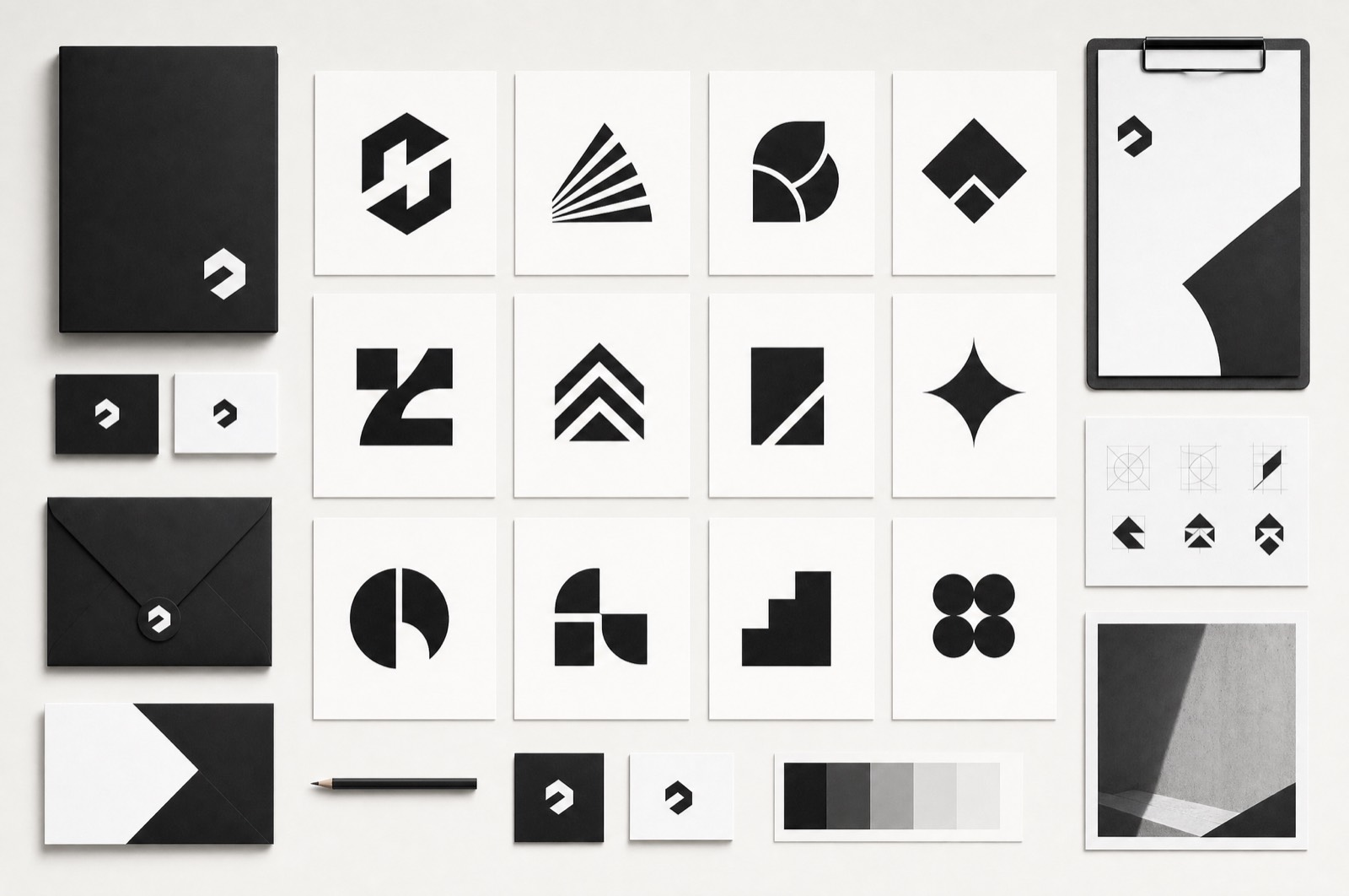
The board shows nineteen marks because a survey company needs a family: the primary, a stacked lockup, a monogram for the seal, and a set of division marks that share the same folded geometry without repeating it. They are drawn on one grid, so a new one can be added in an afternoon without a meeting.
What shipped
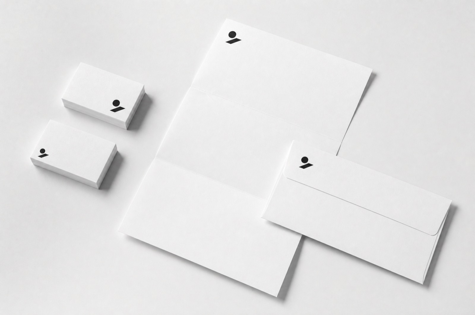
Logo suite, stationery, a forty-page manual, and — the part they use most — a single page explaining which mark to use where, which is the only page anyone ever opens.