03
Foundry
A text face drawn for long reading, released after four years of being not quite finished.
- Client
- Self-initiated
- Year
- 2025
- Role
- Type design
- Deliverables
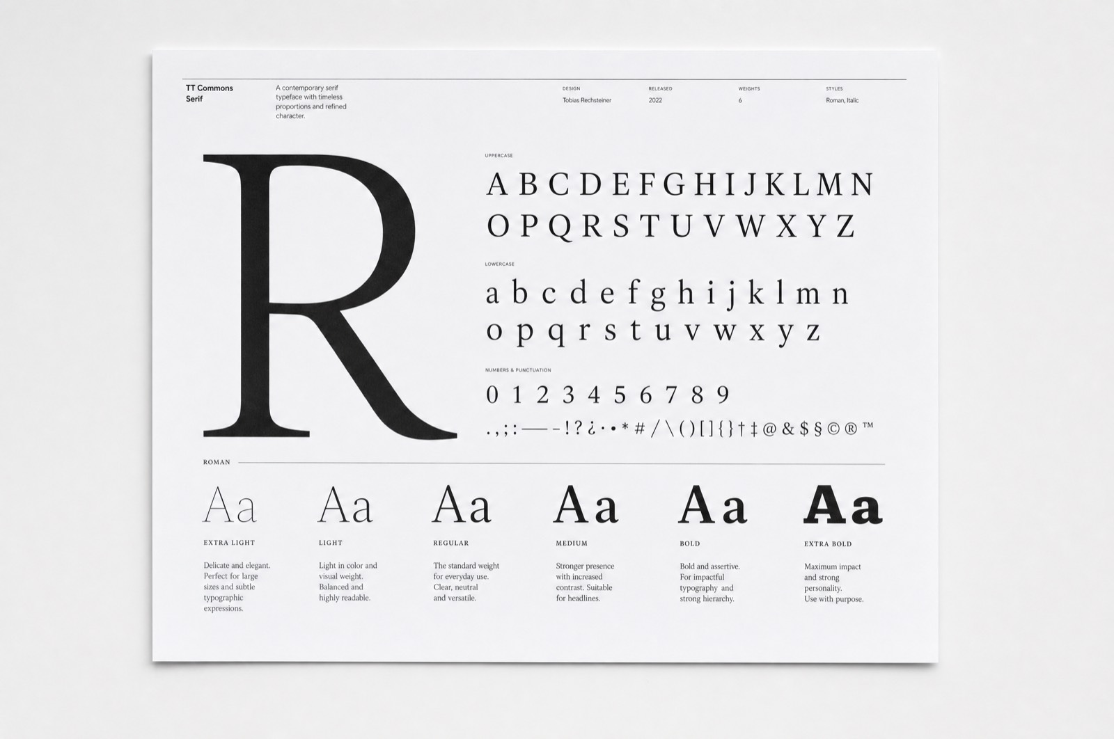
- Six weights, italics, specimen
Typeface
Foundry started as a way to understand what I was choosing when I chose a typeface, and turned into four years of evenings.
Drawn for the paragraph
It is a text face, which means almost every decision is made at eleven point in a block of forty lines rather than at the size a specimen flatters. The counters are open, the x-height is tall enough to hold up on a screen, and the contrast is low enough that it does not sparkle in a long column.
The letters that took the longest
The lowercase g, as always. And the numerals — a face used for long reading needs figures that sit inside the line rather than shouting from it, which meant drawing the oldstyle set first and deriving the lining set from it rather than the other way round.
Releasing it
Six weights with true italics. It is not a large family and it does not try to be a display face at the top end; there are better tools for a headline. What it does is hold a page of text without drawing attention to itself, which was the entire brief.