07
Beacon
A reading app designed around the moment you put the phone down.
- Client
- Beacon
- Year
- 2023
- Role
- Product design
- Deliverables
- iOS and Android design, prototype
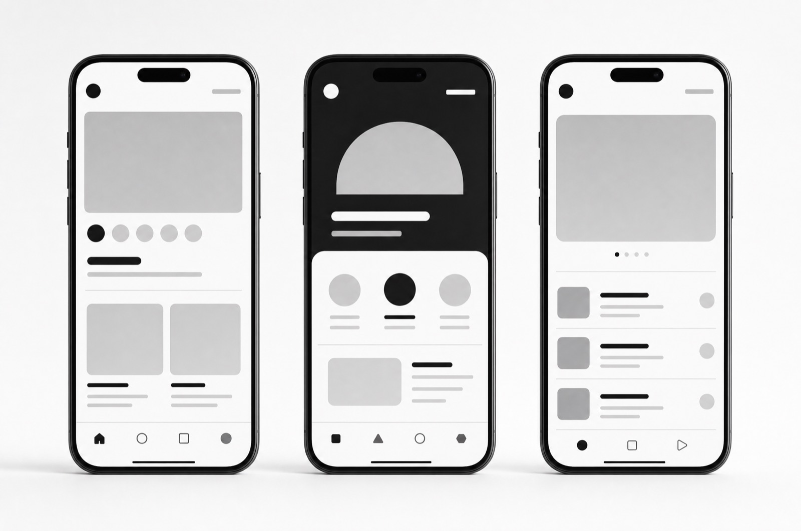
Mobile app
Reading apps are designed around opening them. The interesting moment is the other one — you are three paragraphs in, someone speaks to you, and the app has to still be useful in four days when you come back.
Designing for the return
The library screen leads with what you were last reading and how far in you were, not with a grid of covers. Covers are lovely and they are a browsing interface; the common case is not browsing, it is resuming.
Nothing over the text
While you are reading, the interface is gone completely — no persistent bar, no floating button, no progress ring. Everything comes back on a tap. This was the hardest thing to get signed off and the thing every tester mentioned unprompted.
Type first
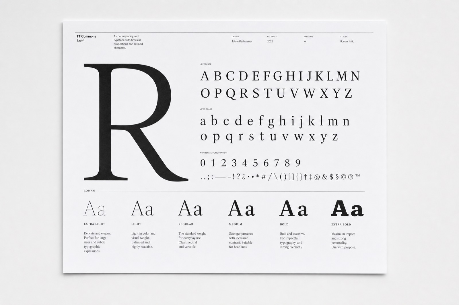
Most of the work was typographic: a measure that holds at three text sizes, line height that grows with the size rather than staying fixed, and margins that widen on a tablet instead of letting the line run to ninety characters.