Skylark · 2024
Rebooking without the panic
When a flight falls through, Skylark hands you a new one — not a phone queue.
- Role
- Product Designer
- Timeline
- Feb – Aug 2024
- Team
- Me, 4 engineers, 1 PM
- Platform
- Mobile app
The problem
A cancelled flight is the worst moment in travel, and most airline apps make it worse: a red banner, a dead rebooking flow, and a phone number. Skylark wanted the opposite — the app should be calmest exactly when the trip isn't.
The approach
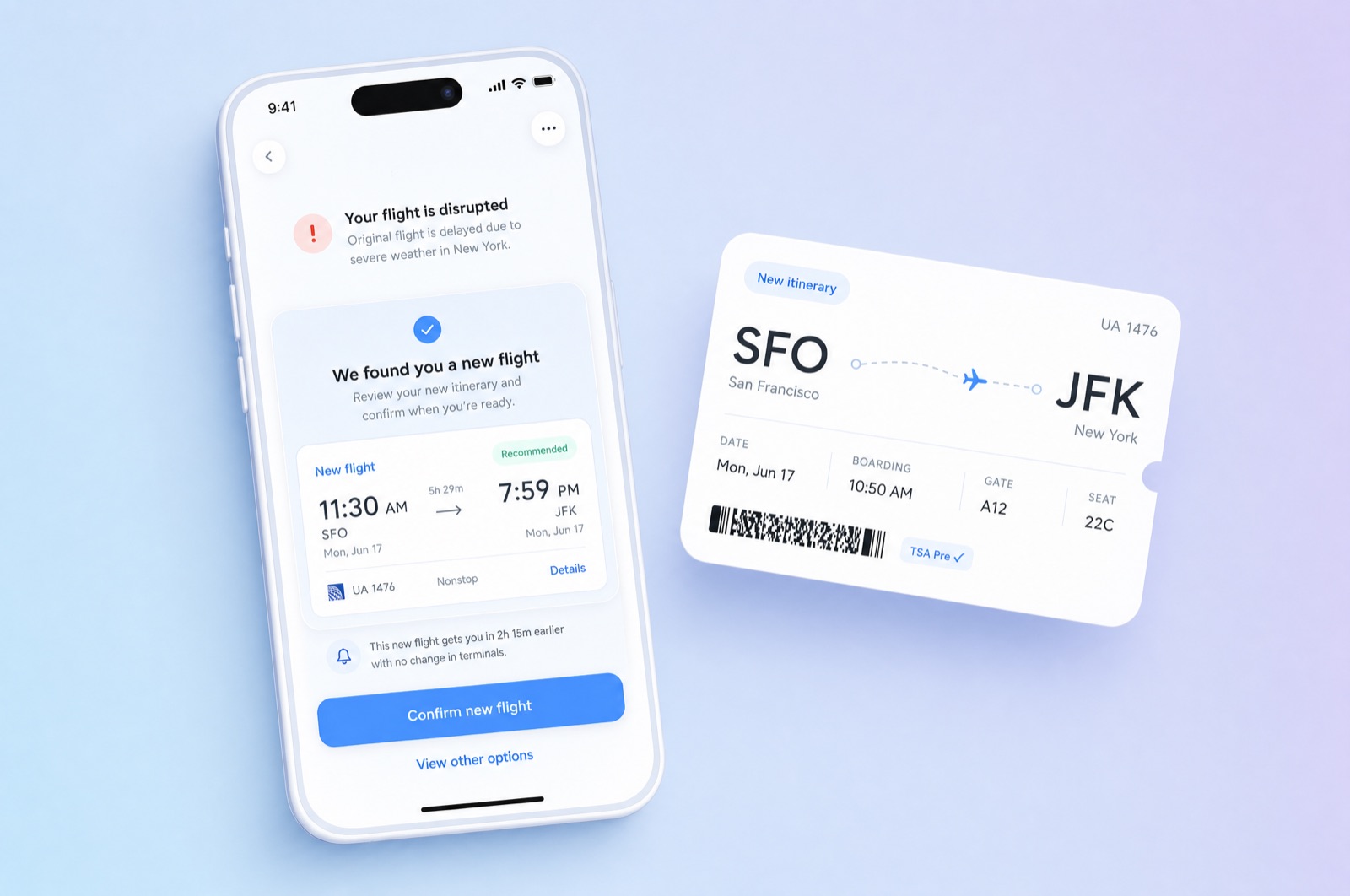
We designed the disruption flow before the happy path. The moment a cancellation lands, the app has already searched: the first screen is "We found you a new flight" with the best option pre-selected, two alternates behind it, and one confirm button. No search form, no fare matrix, no decisions the traveler doesn't need.
The tone mattered as much as the flow. We wrote every string for someone reading at a gate with 4% battery: short sentences, times in bold, nothing cute. The boarding pass updates itself and says so.
What shipped
Rebooking through the app went from 12% of disruptions to 71%, and support calls during irregular operations dropped by half. It remains the project I point to when someone asks what design is for: the interface absorbed the panic so the traveler didn't have to.