Branding
Halden
A calm identity system for a Nordic architecture studio that lets the buildings do the talking.
- Client
- Halden Studio
- Year
- 2026
- Role
- Brand identity
- Services
- Identity, guidelines, print
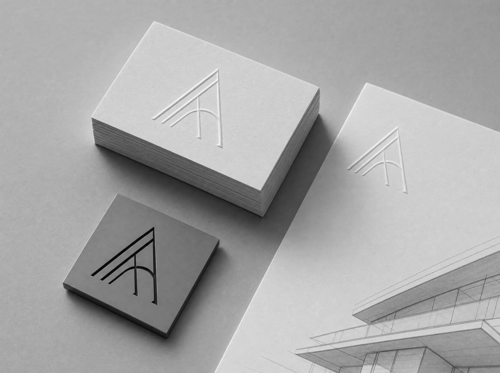
Halden is a twelve-person architecture studio in Oslo with a portfolio of quiet, exacting buildings — and an identity that undersold every one of them. The brief was direct: build a system that photographs as well as the work.
Reduction as a strategy
We stripped the identity to a single wordmark, one serif, and a paper palette borrowed from the studio's own material samples. Every layout rule came from their drawings: hairline strokes, generous margins, and a grid that never breaks.
The identity ships as a compact set of rules rather than a heavy manual. Business cards are blind-embossed, the letterhead carries a single line of type, and project sheets lead with photography at full bleed.
The result
Halden relaunched with the new system across print, site, and proposals. Within a quarter, the studio reported that shortlist invitations had doubled — and that clients kept the cards.