Packaging
Forma
Packaging for a skincare line that treats the shelf like a gallery wall — matte surfaces, exact type, no noise.
- Client
- Forma Skincare
- Year
- 2025
- Role
- Packaging design
- Services
- Packaging, identity, retail
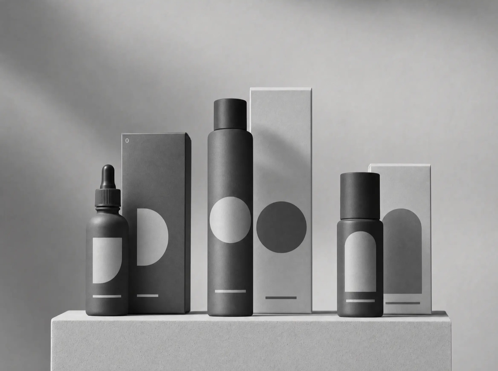
Forma makes a five-product skincare routine and wanted packaging that would read as calmly as the formulas feel. The category default is noise — claims, gradients, gold foil. We went the other way.
The quiet shelf
Every container is matte, every label is a fixed grid of type, and the only variation between products is a single functional line naming what the product does. The boxes open flat into an instruction card, so nothing extra ships in the carton.
Material choices did the branding: heavy uncoated board, soft-touch bottles, and debossed logotype instead of print where the budget allowed.
The result
Forma launched in two hundred stores; the retailer's buyer called it the first skincare line that looks like it belongs next to the candles.