Publishing Art direction 2024
Vellum Press
A cover system for an independent press publishing twelve books a year on a budget that allowed one photograph, total.
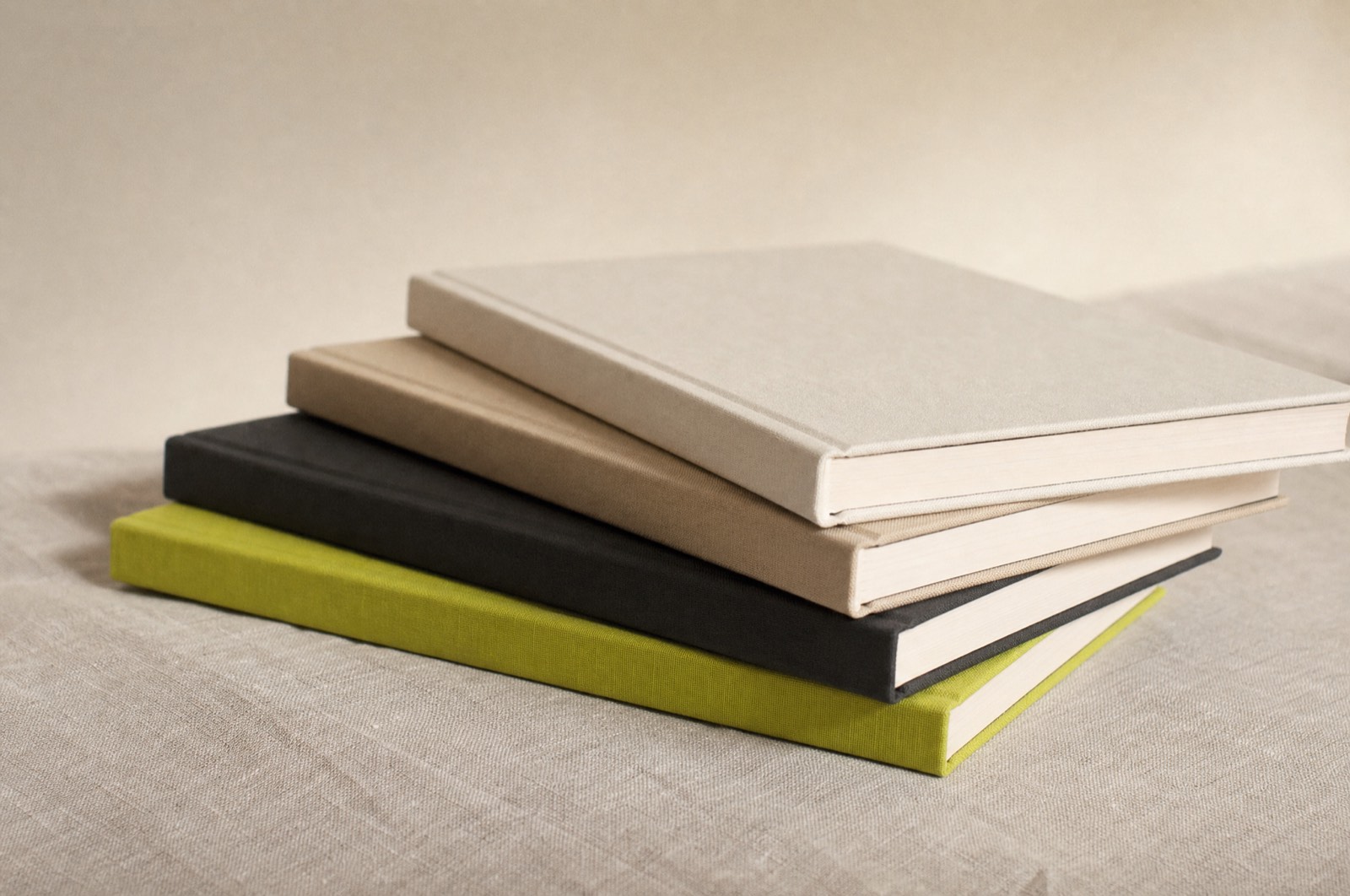
Vellum publishes essays and short criticism — the kind of books that live or die on whether someone picks them up in a shop. They had no photography budget and no illustration budget, and twelve titles a year to design.
Typography as the whole image
With no imagery, the type has to carry the emotional weight, which most cover typography is not asked to do. We built a system with exactly three variables: the size of the title relative to the trim, its vertical position, and one colour from a fixed set of six uncoated inks.
Three variables is enough for hundreds of distinct covers and few enough that a junior designer produces something correct on their first attempt. That was deliberate. The system had to survive me leaving.
The spine test
Every cover is designed spine-first. In a real shop, face-out is a privilege that maybe two titles a season get. If the spine does not work, the book does not exist — so the spine is drawn before the front, and any front that compromises it is wrong by definition.
Design the worst-case display condition first and the good ones take care of themselves.
Ink and paper
Six inks on one uncoated stock, chosen so that any two sit next to each other on a shelf without fighting. The lime is the loudest and it is rationed to one title a season. Restraint that is written into the system is the only kind that survives contact with a launch.
The rules make the decisions now, so we argue about the books instead.
More work
Got something you want made properly?
Tell me what it is, when it needs to exist, and what you have tried already. I answer every email within two days, including the ones I have to say no to.
Currently booking from March 2026.