Apparel Brand system 2024
Northbound
Cycling apparel for people who ride to work rather than race. The identity had to work stitched, printed, reflective, and 4mm tall.
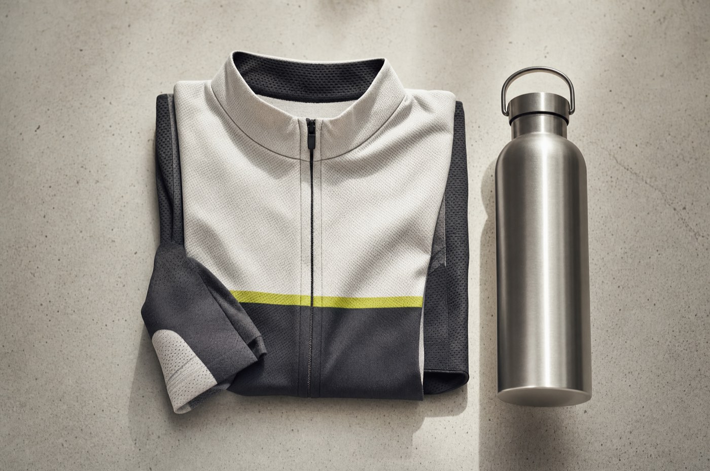
Most cycling brands design for the podium and sell to commuters. Northbound wanted to skip the pretence: the clothes are for a wet Tuesday and an eleven-kilometre ride to an office where you have to look normal afterwards.
Four production methods, one mark
The mark had to be embroidered, screen printed, heat transferred, and cut in reflective vinyl. Each method has a different minimum feature size, and the smallest of them governs. We drew to the embroidery limit and everything else came for free.
That is why it is a shape rather than a wordmark. A wordmark at 4mm stitched is a smudge, and a smudge on a garment is worse than no mark at all.
Reflectivity as design, not safety theatre
The visible identity in daylight is quiet — a tonal shape on the chest. At night, under a headlight, the same shape lights up along with a band across the shoulders. It is the same graphic doing two jobs, which meant one placement to develop rather than a separate safety treatment bolted on.
The system in the factory
The deliverable that mattered was a placement grid: for any garment, where the mark goes, at what size, in which method, with the tolerances the factory actually works to. It is four pages. It has removed roughly a month of back-and-forth per collection.
We stopped designing each garment from scratch. That is months a year back.
More work
Got something you want made properly?
Tell me what it is, when it needs to exist, and what you have tried already. I answer every email within two days, including the ones I have to say no to.
Currently booking from March 2026.