Fintech Product design 2025
Fold
A savings app for people who find money stressful. We redesigned around the two screens that actually get opened, and deleted most of the rest.
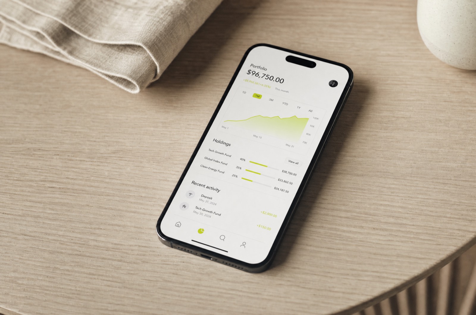
Fold had eleven tabs. The analytics said people used two of them. Everyone at the company knew this and nobody wanted to be the one who suggested deleting the other nine, because each one had been somebody's quarter.
Reading the sessions
We watched forty session recordings before opening a design file. The pattern was not subtle: people opened the app, looked at one number, felt something about it, and left. Median session length was under nine seconds. Everything we had been designing assumed a user who was browsing. There was no browsing.
That reframed the job. The dashboard was not a hub, it was a glance. So it got one number, set enormous, with the context underneath in a size you only read if you have decided to care. Everything else moved behind a single second screen.
Designing the bad days
Financial products are mostly designed for the good state — the balance going up and to the right. The screens people actually remember are the other ones. We drew the overdraft, the failed transfer, the month where the number goes the wrong way, and we drew them first.
Tone did most of the work. No red. No exclamation marks. A failed transfer says what happened and what happens next, in that order, and nothing else. It sounds small; it changed the support queue more than any feature we shipped.
The handover
The system went over as forty-one components with every state drawn, including the ones nobody asks for. The engineering lead's note afterwards was that they had not needed to invent a single screen. That is the metric I care about.
He cut half the product and it got bigger. I still think about that.
More work
Got something you want made properly?
Tell me what it is, when it needs to exist, and what you have tried already. I answer every email within two days, including the ones I have to say no to.
Currently booking from March 2026.